Popup Menus
Logi Analytics managed reporting products include elements that allow developers to display popup menus, offering action choices to the user. Each choice can be custom-defined, with its appearance controlled using style classes, and can have a specific action assigned to it. This topic discusses the use of these elements.
- The Basic Popup Elements
- Controll Popup Size & Location
- Controll Popup Appearance
The Basic Popup Elements
Two elements, Action.Popup Menu and Popup Option, produce the desired popup menu when a related link is clicked.
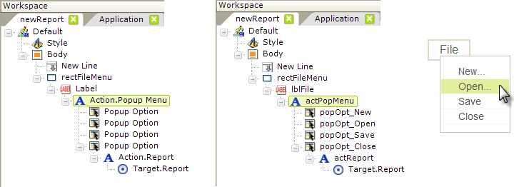
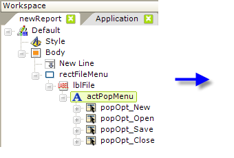
The elements used to create popup menus are shown, above left. The Action.Popup Menu element can be used beneath a number of elements, including Labels and Images. In this example, the Label element is a child of a Rectangle shape element, to give it some borders.
One or more Popup Option elements are added beneath the Action.Popup Menu element. These are the individual items that will appear in the popup menu. The Popup Option element's attributes include an ID, which must be set, and a Caption which defines what text will appear in the popup menu item.
Another Action element is added beneath each Popup Option, defining what action will occur when the popup menu item is clicked. Link Parameters can be added, if desired, to pass values to the target.
Beginning in v10.0.269, you can even add an Action.Popup Menu element beneath a Popup Option element, so that selecting a menu item will display a sub-menu.
In the center example above, the elements have been given IDs that make their purpose a little clearer and, finally, the resulting menu is shown, above right. This is the basic arrangement for producing popup menus and redirecting the user to another report page or a process based on their popup menu selection. The popup menu only appears when the File link is clicked
Add an Image to the Popup Options
The menu item text that appears in the popup menu can be accompanied by an image.
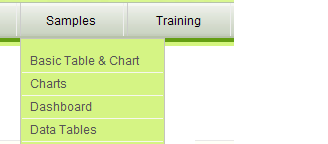
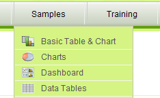
The examples above show a menu with and without the images. To include an image, you need to configure the Popup Option element differently:
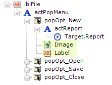
Instead of using the Popup Options element's Caption attribute to set the text that will be displayed, leave it blank and then add an Image and a Label element, as shown above, as child elements. The Action element remains a child of the Popup Option element, rather than of the Image or Label.
Use the onMouseOver Event
You can make the popup menu appear when the mouse is hovered over the main menu link or image, which saves a mouse click:
.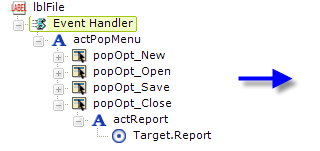
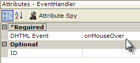
By introducing an Event Handler element between the main menu Label and the Action.Popup elements, as shown above, and setting its DHTML Event attribute to onMouseOver, you can cause the popup to appear when the mouse passes over the label, so clicking the link is not necessary.
When the mouse exits the popup menu area, the menu will be hidden. You may need to modify the Javascript that controls the menu if it doesn't disappear fast enough to suit your needs; see the next section for more information.
Control Popup Location & Size
The Action.Popup Menu element's Popup Location attribute controls where the popup menu will appear:
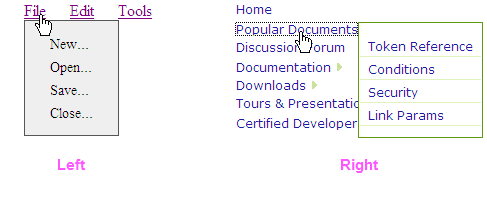
This allows the popup menu to be used with either a horizontal and vertical main menu. The Left popup menu example, shown above left, places it directly below and left-aligned with its parent link. The Right example places the popup menu beside it to the right and top-aligned with its parent link.
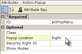
The Popup Location attribute is shown above and its default value is Left.
Two other adjustments can be made to the appearance and behavior of a popup menu, but they must be made by editing a Javascript file that's part of your application. The file name is:
<yourApplicationFolder>\rdTemplate\rdPopup\rdPopup.js
where <yourApplicationFolder> is the folder containing your Logi application. A few caveats before you edit this file:
- This is a system file; if you upgrade the Logi product version your application runs under, it will be overwritten. Keeping a differently-named version of the file containing your edits in the rdPopup directory will preserve a copy of the changes. You have to recreate the edits, of course, in rdPopup.js after an upgrade.
- The default functions in this file could change in future releases of Logi products.
- Changes made here are global and will affect all popups in your application.
- Logi Support can only offer limited support once you start tinkering with these files.
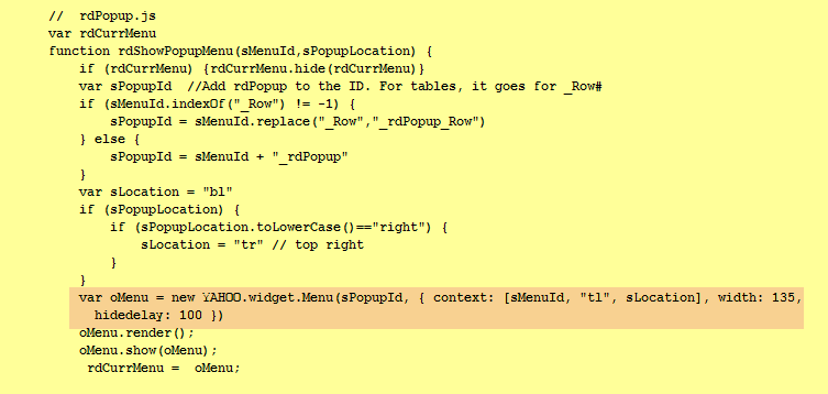
The listing above shows one version of rdPopup.js (your version may contain more code). The line of interest to you starts with "var oMenu" and contains the YAHOO.widget.Menu constructor.
To control the width of the popup menu itself, add the width argument, as shown; the default width is based on the popup menu text length and other factors.
If you feel that the popup menu doesn't disappear quickly enough (or disappears too quickly), use the hidedelay argument to specifiy how quickly, in milliseconds, the popup menu is hidden after the mouse pointer moves out of it.
Logi Analytics uses the YAHOO.widget library for its popup menu and additional information about these and other related arguments can be found on their reference page.
Control Popup Appearance
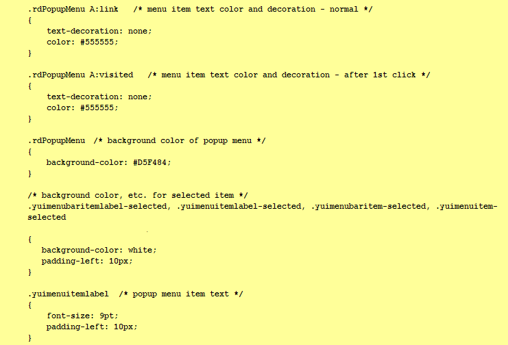
Popup appearance is controlled using style sheet classes. Main menu items (typically Label elements) can be assigned classes of your own design using the style sheet that's part of your Logi application.
A separate existing style sheet controls the appearance of the popup menu but you can override the classes in that style sheet by adding the same classes to your application's style sheet. Here's how they're implemented in DevNet:
