Add Tooltips
"Tooltips", those little balloons that can pop-up when you hover your mouse over an image, link, button, and other elements, provide a fast and easy method of providing additional explanation. They're generally a kind of on-the-spot "mini online help", though they can be much more. This topic discusses the multiple ways in which you can add tooltips to your Logi applications.
- Your Tooltip Options
- The Tooltip Attribute
- The Quicktip Element
- The Tooltip Panel Element
Your Tooltip Options
Logi Info and Logi Report offer several methods for adding tooltips to your Logi application and each is discussed in one of the following sections, which are presented in order of increasing complexity and functionality. Adding tooltips is an excellent idea in situations where a little more explanation would be useful (but it's not worth going to another web page), or there's underlying data that would clutter up a report if all of it was shown at once.
An example of the first case can be found on DevNet on the Support Plan Portal page. Placing your mouse over the help icon (a gray circle with a question mark in it) at the top of the page results in a panel that displays some brief instructions.
An example of the second case can be found built into some Logi super-elements, such as the Analysis Chart and Analysis Grid, which automatically incorporate tooltips into their charts, so that the underlying data value is displayed when the mouse is hovered over different points on the charts.
Given how easy it is to add tooltips, you may not want to consider your application really finished until you do.
The Tooltip Attribute
Many Logi elements have a Tooltip attribute and using it is the easiest way to add a tooltip to your application.
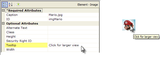
In the example shown above, we see a very common situation: a small "thumbnail" image can be clicked to view a larger image, and this is communicated to the user via a tooltip. The example shows the attributes for the small image on the left, and the resulting tooltip text that's automatically displayed when the mouse hovers over the image, on the right. Tokens can be used in the Tooltip attribute.
Note that this tooltip is limited to text only, can't be controlled dynamically, and provides no easy way to apply style to it in order to change the font size, color, etc.
The Quicktip Element
Introduced in v10.1.46, the Quicktip element is almost as easy to use as the Tooltip attribute but provides a tooltip with a little different look. It can used beneath static Chart, Gauge, Division, and Heatmap Group Column elements, and has been included to automatically provide tooltips for the charts found within the Analysis Chart and Analysis Grid super-elements, and in all v11.2.040+ Chart Canvas charts.
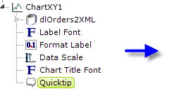
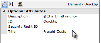
In the example above, we see the Quicktip element beneath a Chart.XY element, and its attributes are also shown. The resulting tooltip that appears when the mouse hovers over the chart line looks like this:
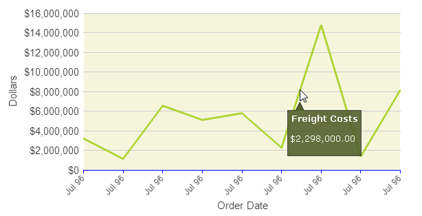
Visually, this is more complex than the basic tooltip we saw earlier. The pop-up panel has space for both a title and a description and includes a small, angular protrusion that points to the cursor, and its color and fonts can be controlled by assigning a theme, in this case Professional Green, to the application.
Tokens can be used in both the Title and Description attributes and the Quicktip element has a Security Right ID attribute, so its appearance can be dynamic, based on security roles. Because the Quicktip is displayed based on the onMouseOver DHTML event, you can't put anything inside the Quicktip itself that a user could click, such as a link.
If you're using Quicktips with a chart that includes Extra Grid Layers and the primary chart datalayer is reduced to zero rows at runtime, for example, because of filtering, then no Quicktips will be shown, not even for the Extra Grid Layer plots.
![]() As of this writing, Quicktips should not be used inside data tables.
As of this writing, Quicktips should not be used inside data tables.
Note that the Quicktip is limited to text only and, as the text gets longer, the panel will get wider and wider until, at some point, the text will automatically wrap to another line. But you can't force it to wrap and the point at which it will wrap is based on font family and size (in the example shown above, it will wrap at 90 characters, so it can get pretty wide before it wraps).
However, you can deliberately add additional lines by adding child Quicktip Row elements beneath the Quicktip, one for each additional line of text you want to include.
The Tooltip Panel Element
The Tooltip Panel element is a flexible option for including more complex tooltips and can be added as a child beneath these elements:
- Button
- Column Cell
- Data Table Column
- Division
- Image
- Label
As an element, the Tooltip Panel can have a variety of child elements, allowing you to get more creative with what you include in the tooltip.

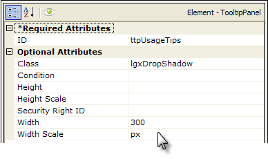
The example above shows an Image element with a Tooltip Panel element placed beneath it, with a child Label element. The Tooltip Panel has a full set of attributes that can be used to customize the tooltip. Let's see what it can look like:
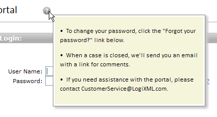
In the example shown above, we see a Tooltip Panel that appears when the mouse cursor hovers over the "help" icon. Style has been used to color the panel background and give it a drop shadow, and the child Label element has been set to HTML format so that the help text will be displayed as an unordered list with bullets.
Note that the Tooltip Panel element has Condition and Security Right ID attributes, so its appearance can be controlled dynamically. For example, separate sets of tooltips for different users are possible.
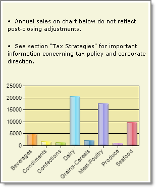
A variety of elements, including Charts, Gauges, Images, SubReports, and others, can be included as children of the Tooltip Panel, as shown in the example above, giving you the opportunity to make your tooltip contain more than just text.