Crosstab Tables
A cross tabulation (often abbreviated as "crosstab") is a table that displays the joint distribution of two or more variables simultaneously. Sometimes called "pivot tables", they make it easy to sort, count, and total their data. The Logi Crosstab Table element makes it easy to implement this kind of table.
- About Crosstab Tables
- Create Crosstab Tables
- Work with Crosstab Table Columns
- Arrange and Size Columns
- Compare, Sort, and Summarize Columns
- Display Column Detail
- Work with the Crosstab Filter
- Plan the Example Crosstab Table
- Build the Basic Table Structure
- Add Extra Crosstab Values
- Summarize Value Rows
- Add a Header Row
- Summarize Value Columns
About Crosstab Tables
The Logi Crosstab Table is a dynamic, data-driven reporting component that consists of the following three data column types:
- Crosstab
- Label
- Value
The Crosstab column is a specified column from the datalayer and each unique value creates a new column in the crosstab table.
The Label column and Value column are also specified by the developer from the datalayer. Each unique value in the Label column creates a new row in the crosstab table. Data from the Value column fills the table out, and the number of value columns is equivalent to the number of unique records in the crosstab column.
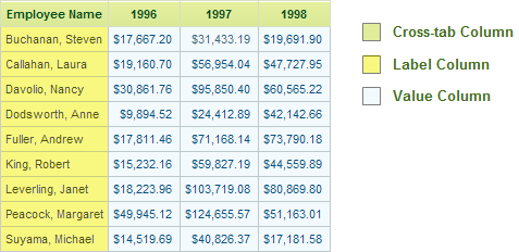
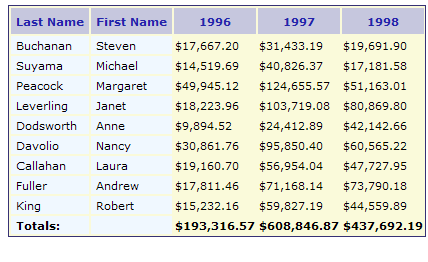
The example above shows each of the data column types and where they appear in a crosstab table.
Each value displayed in the Value columns is the result of an aggregating function, performed on the original data from the specified Value column. The example above displays years for the Crosstab column, employee names for the Label column and a sum of corresponding subtotals for the Value columns. So, when the year is 1996 and the employee is Nancy Davolio, the sum of all corresponding subtotals is $30,861.76.
The following functions are available for aggregating Value columns:
- Any - Displays a value from any of the rows. This can be used when the specified Value column data is a string that isn't appropriate for aggregation; for example, when there's just one record to represent each crosstab cell.
- Average - Returns the average of all corresponding records in the specified Value column.
- Count - Returns the total number of corresponding records in the specified Value column.
- Median - Returns the value that separates the higher half of all values in the specified Value column from the lower half.
- Mode - Returns the value that occurs the most frequently in records in the specified Value column.
- StdDev - (Standard Deviation) Returns a simple measure of the variability of data in records in the specified Value column. A low standard deviation indicates that the values tend to be very close to each other, while a high standard deviation indicates that the values are "spread out" over a large range.
- Sum - Returns the sum of all corresponding records in the specified Value column
![]() In prior versions, aggregations included columns with Null values by default. This behavior has been changed and Null values are now excluded by default. Create the constant rdCalculationsIncludeNulls and set it to True if you want to restore the old behavior.
In prior versions, aggregations included columns with Null values by default. This behavior has been changed and Null values are now excluded by default. Create the constant rdCalculationsIncludeNulls and set it to True if you want to restore the old behavior.
What about differences between columns, either as values or as percentages? The Crosstab Comparison element was introduced in Logi Info v10.0.299 and it can display these differences in a variety of ways. The element is discussed in detail in a later section.
Create Crosstab Tables
Every crosstab table uses the following minimum components:
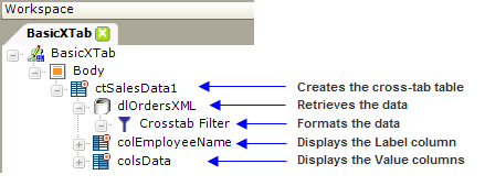
- One Crosstab Table element
- One or more DataLayer elements with a Crosstab Filter element to retrieve and shape the data
- One or more Crosstab Table Label Column elements to display the Label column records
- One or more Crosstab Table Value Columns element to display the Value column records
The elements above define the most basic crosstab table. Other elements, such as Condition Filters, Sort Filters, and Calculated Columns, can be used to manipulate the data in the datalayer in the same way they would be used for any data table or chart.
If you use a Sort Filter beneath your datalayer, its effect on the table display may be different depending on its placement before (above) or after (below) the Crosstab Filter element. This is particularly relevant if your data returns some zero values, and you may want to experiment with this element in different locations in your definition.
You can create a crosstab table in Studio by manually adding the appropriate elements to a report definition or, if your data resides in a SQL database server, you can use the Crosstab Table Wizard built into Studio.
In v11.2.040+, the Crosstab Table Label Column element includes the Scope Row Header attribute. When set to True, the HTML output for data cells will be modified to improve Section 508 accessibility, creating a column which includes header information for each row, changing the <TD> tags to <TH Scope="Row"> tags.
Create a Crosstab Table Using the Wizard
The Crosstab Table Wizard in Studio will walk you through quickly creating a crosstab table, but first be sure your SQL server connection has been configured in the _settings definition. Also, note that the Value column needs to contain numeric data when using this wizard.
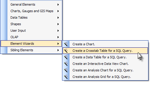
To launch the wizard, in Studio right-click your report definition's Body element or a Division element and select Element Wizards, then Create a Crosstab Table, as shown above.
Answer the wizard's prompts to build the table and when it completes, notice the elements that the wizard has inserted for you and how they're configured.
Work with Crosstab Table Columns
Instead of using the wizard, developers can manually build crosstab tables using two types of crosstab table columns: Label columns and Value columns. Crosstab tables have one Label column by default; the number of Value columns is determined by the number of records found in the specified Crosstab column.
To create a crosstab table Label column:
- In Studio, select the parent Crosstab Table element and add a Crosstab Table Label Column element beneath it.
- Configure any optional attributes for the new label column.
- Add a Label element beneath the new column and use the @Data token to reference values from a column returned by the datalayer.
Next, add a Crosstab Table Value Columns element to create the Value columns for the crosstab table. Value columns contain the results of the aggregations of the data from the specified column. But the results of the aggregations do not appear in the datalayer under any of the datasource column names, so how is it referenced? Special @Data tokens are used to allow developers to access Crosstab column and Value data:

These special tokens are shown below:
- @Data.rdCrosstabColumn~ - Returns records in the specified Crosstab column
- @Data.rdCrosstabValue~ - Returns the aggregated values for the corresponding records in the specified Value column
- @Data.rdCrosstabValCount~ - Returns the number of corresponding records from the Value column used to calculate the current aggregate value if the aggregation is Sum, Count, or Average.
These elements and attributes are used as follows:

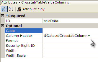
- Beneath the parent Crosstab Table element, add a Crosstab Table Value Columns element to the definition, as shown above.
- Set its Column Header attribute to @Data.rdCrosstabColumn~to use the Crosstab column data as column headers.
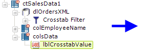
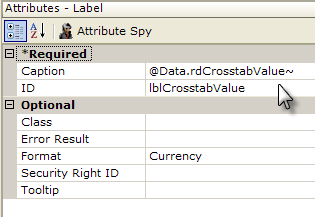
- Add a Label element beneath the Crosstab Table Value Columns element and set its Caption attribute to @Data.rdCrosstabValue~, as shown above, to retrieve the aggregated crosstab values.
Arrange and Size Columns
The developer can configure Crosstab Table columns so that they can be rearranged and/or resized at runtime by the user.
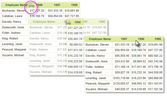
As shown above, when the Crosstab Table element's Draggable Columns attribute is set to True, a dotted icon appears in the column headers when the mouse is hovered over their left side and the cursor changes to left-right arrows. The entire column can then be dragged left or right and dropped into a new position. The new column arrangement will be "remembered" for the duration of the current user session. Draggable Columns cannot be used when there are custom header rows, with
columns that span multiple columns, in use. The default value for Draggable Columns is False.
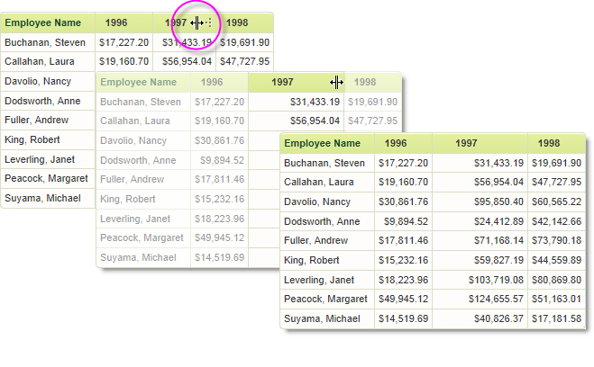
In v11.0.519, the Resizable Columns attribute was introduced. As shown above, when this attribue is set to True, a dotted icon appears in the column headers when the mouse is hovered over their right side and the cursor changes shape. The icon can then be dragged left or right, contracting or expanding the width of the column. The new column width will be "remembered" for the duration of the current user session. Resizable Columns cannot be used when there are custom header rows, with columns that span multiple columns, in use. The default value for Resizable Columns is False.
Compare, Sort, and Summarize Columns
It's not uncommon to need to include the difference, either as a value or as a percentage, between two or more value columns in a crosstab table. There are two approaches to creating this information and their availability depends on what product and version you have.
The Crosstab Comparison Element
Included in Logi Info only, beginning with v10.0.299, the Crosstab Comparison element makes it easy to visually understand the differences between values in crosstab columns:

Each column is compared with the previous column and an indicator arrow or colored background is shown if the value increased or decreased. The amount of increase or decrease can be displayed as a numeric and/or percentage difference.
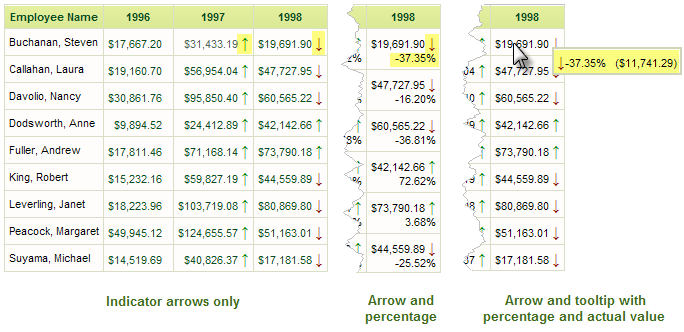
As shown above, comparisons between columns can be indicated by colored arrows and percentages or literal values, within each column cell or in tooltips that appear when the mouse is hovered on a value. Instead of the colored arrows, you can display a colored cell background, covering a spectrum, to indicate the differences.
The unique attributes of the Crosstab Comparison element are:
| Attribute | Description |
|---|---|
| Comparison Show Tooltips | Enables display of the numerical difference in a tooltip when the mouse is hovered over a crosstab value. Display options include Percent, Value, All, or the default, None. |
| Comparison Show Values | Enables display of the numerical difference in the crosstab cells. Display options include Percent, Value, All, or the default, None. The Format attribute can be used to format the displayed numbers. |
| Comparison Style | Specifies how differences will be indicated visually. Options include None, ColorSpectrum, and the default, Arrows. |
| Format | Formats the numbers displayed for values or percentages. For more information, see Format Data. |
| High Color Value | When ColorSpectrum has been selected as the Comparison Style, specifies the color to be used for the highest value in the numeric range. Default: Green |
| Low Color Value | When ColorSpectrum has been selected as the Comparison Style, specifies the color to be used for the lowest value in the numeric range. Default: Red |
| Medium Color Value | When ColorSpectrum has been selected as the Comparison Style, specifies the color to be used for the value in the middle of the numeric range. |
If the Crosstab Table element's Draggable Columns attribute has been set to True, and the Crosstab Comparison element is in use, when columns are dragged to change their order, their comparison values will be automatically updated.
Note that, because the calculations made by this element do not affect the table's datalayer, it's not possible to summarize or sort the results.
Calculate Comparisons Using Tokens
For developers using Logi Report, or older product versions, an alternate approach to value column comparison is available. This technique also provides for other calculations, such as comparisons to current dates or to external values, and is accomplished entirely within the Label element used to present the results.
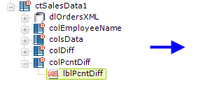
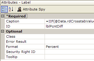
In the example above, a CrosstabTableLabelColumn element ("colPcntDiff") has been added with a Label element beneath it. The Label element's Caption attribute includes a formula that relies on the fact that crosstab table value columns can be individually addressed using the tokens @Data.rdCrosstabValue-0~, @Data.rdCrosstabValue-1~, ...@Data.rdCrosstabValue-n~.
To get the difference between two values, for example, the Label caption would use this formula:
=@Data.rdCrosstabValue-1~ - @Data.rdCrosstabValue-0~
To get the percentage difference between two values, for example, the Label caption, with a Percent format, would use this formula :
=IIF(@Data.rdCrosstabValue-1~ - @Data.rdCrosstabValue-0~ < 1, (@Data.rdCrosstabValue-1~ - @Data.rdCrosstabValue-0~)/@Data.rdCrosstabValue-0~, (@Data.rdCrosstabValue-1~/@Data.rdCrosstabValue-0~) - 1 )
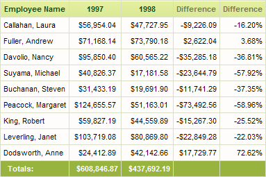
With both of these difference calculations included, the resulting crosstab table looks like the example shown above. Note that, because the calculations do not affect the table's datalayer, it's not possible to summarize or sort the results.
Sort and Summarize Columns
As mentioned earlier, you can apply a Sort Filter element beneath your datalayer, before or after
The sorting and summary features for crosstab table columns are functionally similar to those for data table columns: Sort Filter and Summary child elements are added beneath them. However, because of its special dynamic-column nature, the Crosstab Table Value Column has its own special sort element: the Crosstab Value Column Sort element is used to sort by value columns.
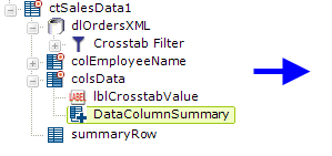
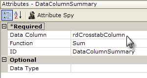
When using a standard Data Column Summary element to summarize crosstab Value columns, set its Data Column attribute to rdCrosstabColumn, as shown above.
A standard Summary Row element is added to create a row across the bottom of the crosstab table to display the summarized value for each column with a Data Column Summary element.
Display Column Detail
A crosstab table does a great job of aggregating data and displaying it in a manner that makes it easy to see its progression. There are times, however, when it's useful to be able to examine the detail data that the crosstab filter used to create the value in each column cell. The Group Drillthrough element was introduced for this purpose, in Logi Info, v10.0.385. Feature not available in Logi Report.
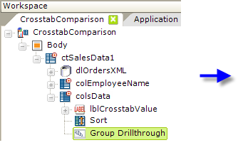
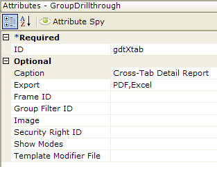
In the example above, a Group Drillthrough element has been added beneath a Crosstab Table Value Columns element. All of the element's attributes, other than ID, are optional but the example shows a custom caption and export button selections have been entered.
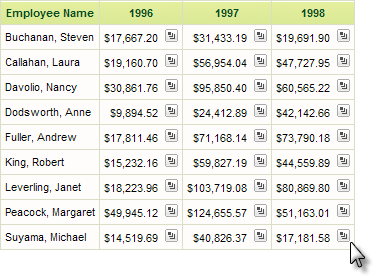
The resulting crosstab table is shown above. Note that each value column cell now contains a drill-through icon. Starting in v10.2.110+, you have to hover your mouse pointer over the area for the icon to become visible.
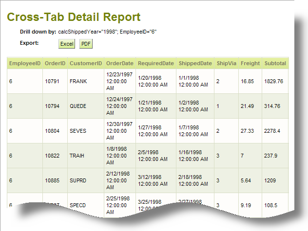
When the icon is clicked, a detail report, like the example shown above, is automatically generated, containing all of the relevant detail data.
The Group Drillthrough element's attributes allow you to customize the icon image that appears in the crosstab table and certain aspects of the detail report. You can also include Drillthrough Column elements beneath the Group Drillthrough element; they allow you to set the number columns that will appear in the report and to customize their appearance.
Work with the Crosstab Filter
A Crosstab Filter element is required to format, or "pivot", data retrieved into a datalayer for use in crosstab tables. As discussed in the first section of this topic, developers designate three columns in the datalayer to configure the Crosstab Filter: the Label column, the Crosstab column, and the Value column. Developers must also choose an aggregate function to apply to records from the specified Value column.
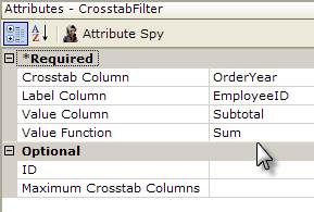
The filter groups the data based on the designated Crosstab column. If the Crosstab column contains numerous distinct records, many crosstab value columns may be generated and the table can become quite wide. This can be controlled using the optional Max Crosstab Columns attribute, which limits the number of crosstab value columns that appear in the table.
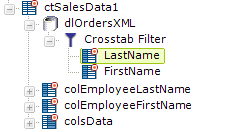
One Label column may not be sufficient to display all the necessary information in a crosstab table. As shown above, developers can add Extra Crosstab Label Column elements beneath a Crosstab Filter element in order to add additional columns from the datalayer as Label columns.
To display the data for these extra label columns, an @Data token is used but the token identifier matches the ID of the Extra Crosstab Label Column element, not the datalayer column it represents. For example, the datalayer may have a column named EmployeeLName and this column is identified in the attributes of the Extra Crosstab Label Column element whose ID is LastName. To display this data, use the token @Data.LastName~.
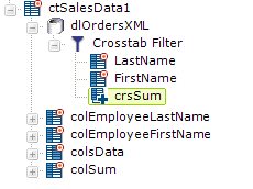
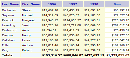
Developers can summarize crosstab row data (a horizontal summary) as well as crosstab column data (a vertical summary). As shown above, the Crosstab Row Summary Column element can be added beneath a Crosstab Filter element to generate new columns in the filtered datalayer that contain aggregations for each value in every crosstab row.
Developers can set the summary element's Function attribute to Count, Sum, Average, AverageOfAllRows, CountOfAllRows, or StdDev. For example, to count the number of value columns, set this attribute to Count; in the image above there are value columns for 1996, 1997, and 1998, so the value calculated will be 3. If this attribute is set to CountOfAllRows, it will calculate 809, the number of all of the order records for all three years.
Additional Crosstab Table Label Column elements, such as "colSum" above, can be added as needed to display the summarized results.
The @Data token used to retrieve the data uses the ID of the summary element. In the example above, using @Data.crsSum~ retrieves the aggregate values for the corresponding Crosstab Row Summary Column element named "crsSum".
![]() Crosstab Filters can also be used with the datalayers that provide data for charts and gauges, however, they're designed for use with Crosstab Table elements and may not provide full functionality with other elements.
Crosstab Filters can also be used with the datalayers that provide data for charts and gauges, however, they're designed for use with Crosstab Table elements and may not provide full functionality with other elements.
The Include Condition Attribute
Beginning in v10.0.319, the Crosstab Filter element has an Include Condition attribute. If the value of this attribute is left blank or contains a formula that evaluates to True, the Crosstab Filter element is applied to the datalayer. If the value evaluates to False, the filter is ignored and does not affect the datalayer. This powerful feature allows developers to dynamically determine if the datalayer will be manipulated or not.
Plan the Example Crosstab Table
Before adding elements to a definition, it's a good idea to first plan the table (or chart) that you're trying to produce. A simple sketch can often provide clarity and save you from having to re-work your definition later. Look the crosstab table shown below:
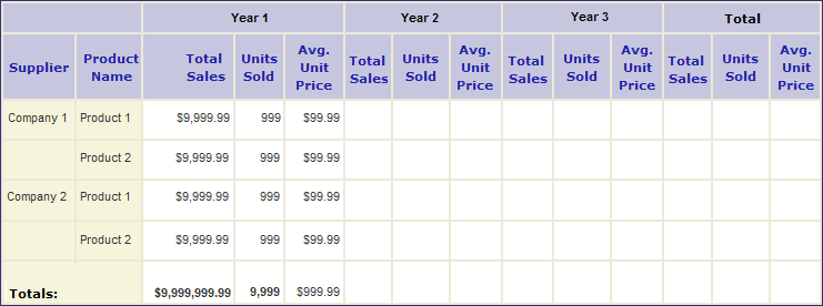
The table is limited to three years of data, groups products by company, provides summarized data for each year in several categories and for all products, and summarizes across all years as well. With this layout in hand, we can proceed to build the table.
The following examples demonstrate how to use a variety of elements to produce this table. The complete, downloadable definition for this crosstab table is available in the Crosstab Table Sample Application on DevNet.
Build the Basic Table Structure
As discussed on the previous page, the Crosstab Filter element determines the basic structure of the table:

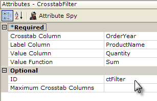
The definition starts with a Crosstab Table element, a datalayer to retrieve the data, and a Crosstab Filter element to format the data. In the filter attributes shown above, the table will have a label column for the Product Names, be grouped horizontally (crosstab) by Order Year, and the initial values will be the sum of the order Quantities.
A Crosstab Table Label Column element ("colProductName") and a Crosstab Table Value Columns element ("colQuantity") are added to the definition to display the data. Note that a special token is needed to access the Value column data: @Data.rdCrosstabValue~. The token identifier uses the reserved word "rdCrosstabValue" and the token is used in the Caption attribute of a Label element beneath the Crosstab Table Value Columns element.
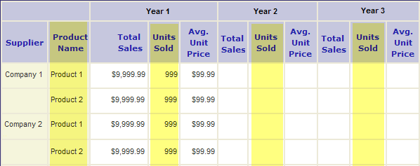
The five elements added so far provide the portions of the basic crosstab table which are highlighted in yellow above.
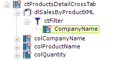
The Extra Crosstab Label Column element was discussed above. One of these elements is added to the definition to provide the data for the Supplier column ("Company Name"), along with a Crosstab Table Label Column element ("colCompanyName") which displays the data.
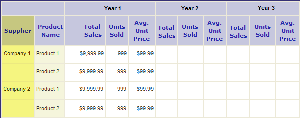
The result is the addition of the Supplier column, highlighted in yellow above, to the crosstab table.
Add Extra Crosstab Values
By default, the Crosstab Filter produces a single value for each column and row combination. In order to generate additional values for the Total Sales data for our crosstab table, an Extra Crosstab Value Column element is used.
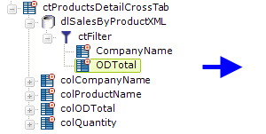
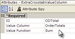
As shown above, this element simply identifies a column from the datalayer ("OrderTotals") and the aggregation to be applied to it.
A Crosstab Table Value Columns element ("colODTotal") is also added to display the values. Note that a special token is needed to access that data: @Data.rdCrosstabValue-ODTotal~. The token identifier combines the reserved word "rdCrosstabValue", then a dash "-", and then the ID of the element beneath the Crosstab Filter that represents the value column ("ODTotal"). This token is used in the Caption attribute of a Label element beneath the Crosstab Table Value Columns element.
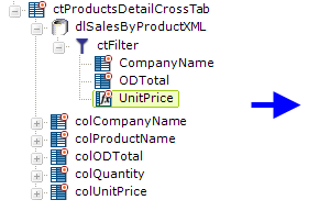
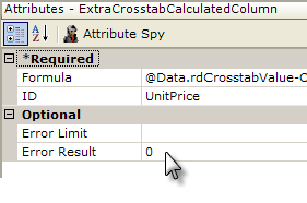
Additional values can also be added to the crosstab through calculations, by using an Extra Crosstab Calculation Column element. In the example shown above, the average unit price is calculated using this element. The complete formula in this example is:
@Data.rdCrosstabValue-ODTotal~/@Data.rdCrosstabValue~</span>
which divides the Order Total by the Quantity. The Order Total value is accessed using the same token discussed earlier and used to display the order total values; while the Quantity value is accessed using a similar token representing the original Value column defined in the Crosstab Filter.
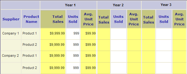
The elements added and configured in this step add the columns highlighted above.
Summarize Value Rows
Our plan calls for adding three columns in the table that summarize row (horizontal) values. This is done by adding Crosstab Row Summary Column elements to the Crosstab Filter:
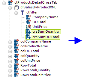
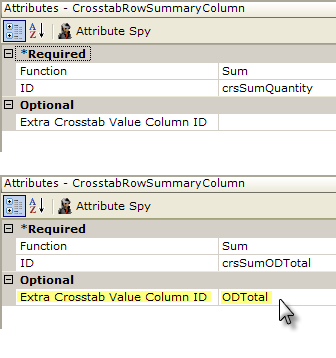
The first of these elements refers to the original Value column defined in the Crosstab Filter attributes, Quantity, so all that is required is that the element be added beneath the filter, be given an ID, and its summarizing function be set to Sum.
The second element of this type is summarizing an Extra Crosstab Value Column ("ODTotal") so it needs to include that elements's ID, as highlighted in yellow above, in the Extra Crosstab Value Column ID attribute.
Three Crosstab Table Label Columns are also added to display the summarized values. The first two reference their data using Label elements and standard tokens <i>@Data.crsSumQuantity~ and @Data.crsSumODTotal~. The third one divides the other two using the formula =@Data.crsSumODTotal~/@Data.crsSumQuantity~ to derive its value.

The addition of the Crosstab Row Summary Column elements adds the columns highlighted in yellow above to the table.
Add a Header Row
The header row ties the crosstab value columns together and provides data-driven identification for them as well. Before proceeding, look at the header on our plan: it consists of a blank area that spans two columns, three areas that will contain data (the year number) and span three value columns each, and an area labeled "Total" that spans three columns.
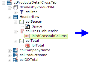
The Header Row element is added, as shown above, to the definition and is then "built-up" using a combination of Column Cell elements and a Crosstab Table Header Column element.
The first Column Cell element is just a "spacer" or placeholder; its attributes are set to span the two columns beneath it and it contains a single Space element. The second Column Cell element ("colTotal") is configured to span three columns and contains a Label element with the word "Total" as its Caption attribute value.
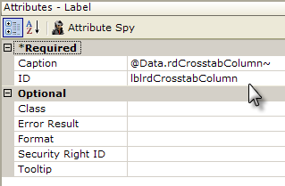
The Crosstab Table Header Column element is also configured to span three columns and contains a Label element. The Label element's Caption attribute value is set to the token @Data.rdCrosstabColumn~ and will display the actual data from the datalayer column identified as the Crosstab Column in the Crosstab Filter's attributes (in our example, this is "OrderYear").

The elements added in this step create the header row, highlighted in yellow above.
Summarize Value Columns
The creation of a Summary Row at the bottom of a table with summarizing column values is a bit like creating the header row, in that it's built-up column by column.
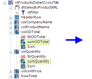
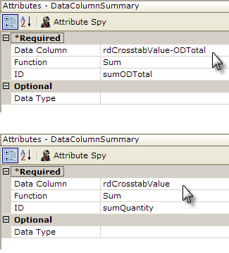
The first step in this process is to add Data Column Summary elements beneath the columns to be summarized. The columns that show the average Unit Price do not need these elements as their summarized value can be derived by dividing the summarized values of two other columns.
Note that the special column names, rdCrosstabValue-ODTotal and rdCrosstabValue, discussed earlier in the section on Extra Crosstab Value Columns, are used in the Data Column Summary elements' attributes for the two extra value columns, as shown above.
The IDs of the Data Column Summary elements ("sumODTotal", "sumQuantity", etc.) will be used in the next step with an @Data token to identify the summarized data.
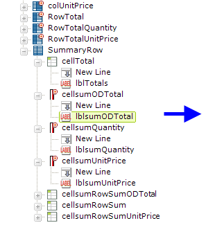
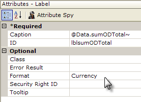
In the example above, a Summary Row element has been added to the end of the definition. Like the Header Row, it contains elements that "build up" the columns needed for the summaries. Column Cell elements are used for non-crosstab value columns and Crosstab Table Summary Column elements are used for the value columns.
The first Column Cell element is set to span two columns (it will be underneath the Supplier and Product columns) and contains a Label element with a Caption of "Totals:."
The Crosstab Table Summary Column and other Column Cell elements span just one column each and contain Label elements. The Label elements' Caption attributes, as shown above, use an @Data token to reference the Data Column Summary elements (by ID) that were inserted in the table columns in the previous step.
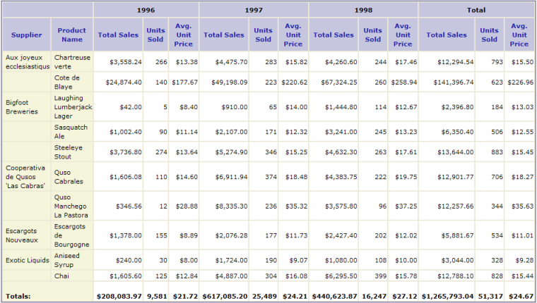
When you put it all together with live data, the first page of the resulting crosstab table looks like the image shown above.
Plan the Example Crosstab Table
Before adding elements to a definition, it's a good idea to first plan the table (or chart) that you're trying to produce. A simple sketch can often provide clarity and save you from having to re-work your definition later. Look the crosstab table shown below:

The table is limited to three years of data, groups products by company, provides summarized data for each year in several categories and for all products, and summarizes across all years as well. With this layout in hand, we can proceed to build the table.
The following examples demonstrate how to use a variety of elements to produce this table. The complete, downloadable definition for this crosstab table is available in the Crosstab Table Sample Application on DevNet.
Build the Basic Table Structure
As discussed on the previous page, the Crosstab Filter element determines the basic structure of the table:


The definition starts with a Crosstab Table element, a datalayer to retrieve the data, and a Crosstab Filter element to format the data. In the filter attributes shown above, the table will have a label column for the Product Names, be grouped horizontally (crosstab) by Order Year, and the initial values will be the sum of the order Quantities.
A Crosstab Table Label Column element ("colProductName") and a Crosstab Table Value Columns element ("colQuantity") are added to the definition to display the data. Note that a special token is needed to access the Value column data: @Data.rdCrosstabValue~. The token identifier uses the reserved word "rdCrosstabValue" and the token is used in the Caption attribute of a Label element beneath the Crosstab Table Value Columns element.

The five elements added so far provide the portions of the basic crosstab table which are highlighted in yellow above.

In the previous page, the Crosstab table was discussed. In the previous page, the Extra Crosstab Label Column element was discussed. As shown above, one of these elements is added to the definition to provide the data for the Supplier column ("CompanyName"), along with a Crosstab Table Label Column element ("colCompanyName") which displays the data.

The result is the addition of the Supplier column, highlighted in yellow above, to the crosstab table.
Add Extra Crosstab Values
By default, the Crosstab Filter produces a single value for each column and row combination. In order to generate additional values for the Total Sales data for our crosstab table, an Extra Crosstab Value Columnelement is used.


As shown above, this element simply identifies a column from the datalayer ("OrderTotals") and the aggregation to be applied to it.
A Crosstab Table Value Columns element ("colODTotal") is also added to display the values. Note that a special token is needed to access that data: @Data.rdCrosstabValue-ODTotal~. The token identifier combines the reserved word "rdCrosstabValue", then a dash "-", and then the ID of the element beneath the Crosstab Filter that represents the value column ("ODTotal"). This token is used in the Caption attribute of a Label element beneath the Crosstab Table Value Columns element.


Additional values can also be added to the crosstab through calculations, by using an Extra Crosstab Calculation Column element. In the example shown above, the average unit price is calculated using this element. The complete formula in this example is:
@Data.rdCrosstabValue-ODTotal~/@Data.rdCrosstabValue~
which divides the Order Total by the Quantity. The Order Total value is accessed using the same token discussed earlier and used to display the order total values; while the Quantity value is accessed using a similar token representing the original Value column defined in the Crosstab Filter.

The elements added and configured in this step add the columns highlighted above.
Summarize Value Rows
Our plan calls for adding three columns in the table that summarize row (horizontal) values. This is done by adding Crosstab Row Summary Column elements to the Crosstab Filter:


The first of these elements refers to the original Value column defined in the Crosstab Filter attributes, Quantity, so all that is required is that the element be added beneath the filter, be given an ID, and its summarizing function be set to Sum.
The second element of this type is summarizing an Extra Crosstab Value Column ("ODTotal") so it needs to include that elements's ID, as highlighted in yellow above, in the Extra Crosstab Value Column ID attribute.</p> <p>
Three Crosstab Table Label Columns are also added to display the summarized values. The first two reference their data using Label elements and standard tokens @Data.crsSumQuantity~ and @Data.crsSumODTotal~. The third one divides the other two using the formula =@Data.crsSumODTotal~/@Data.crsSumQuantity~ to derive its value.

The addition of the Crosstab Row Summary Column elements adds the columns highlighted in yellow above to the table.
Add a Header Row
The header row ties the crosstab value columns together and provides data-driven identification for them as well. Before proceeding, look at the header on our plan: it consists of a blank area that spans two columns, three areas that will contain data (the year number) and span three value columns each, and an area labeled "Total" that spans three columns.


The Header Row element is added, as shown above, to the definition and is then "built-up" using a combination of Column Cell elements and a Crosstab Table Header Column element.
The first Column Cell element is just a "spacer" or placeholder; its attributes are set to span the two columns beneath it and it contains a single Space element. The second Column Cell element ("colTotal") is configured to span three columns and contains a Label element with the word "Total" as its Caption attribute value.
The Crosstab Table Header Column element is also configured to span three columns and contains a Label element. The Label element's Caption attribute value is set to the token @Data.rdCrosstabColumn~ and will display the actual data from the datalayer column identified as the Crosstab Column in the Crosstab Filter's attributes (in our example, this is "OrderYear")."

The elements added in this step create the header row, highlighted in yellow above.
Summarize Value Columns
The creation of a Summary Row at the bottom of a table with summarizing column values is a bit like creating the header row, in that it's built-up column by column.


The first step in this process is to add Data Column Summary elements beneath the columns to be summarized. The columns that show the average Unit Price do not need these elements as their summarized value can be derived by dividing the summarized values of two other columns.
Note that the special column names, rdCrosstabValue-ODTotal and rdCrosstabValue, discussed earlier in the section on Extra Crosstab Value Columns, are used in the Data Column Summary elements' attributes for the two extra value columns, as shown above.
The IDs of the Data Column Summary elements ("sumODTotal", "sumQuantity", etc.) will be used in the next step with an @Data token to identify the summarized data.


In the example above, a Summary Row element has been added to the end of the definition. Like the Header Row, it contains elements that "build up" the columns needed for the summaries. Column Cell elements are used for non-crosstab value columns and Crosstab Table Summary Column elements are used for the value columns.
The first Column Cell element is set to span two columns (it will be underneath the Supplier and Product columns) and contains a Label element with a Caption of "Totals:".
The Crosstab Table Summary Column and other Column Cell elements span just one column each and contain Label elements. The Label elements' Caption attributes, as shown above, use an @Data token to reference the Data Column Summary elements (by ID) that were inserted in the table columns in the previous step.

When you put it all together with live data, the first page of the resulting crosstab table looks like the image shown above.