Data Table Column
This topic is to help developers customize column headers, add interactive sorting capabilities, and create various types of aggregations based on column data.
- Attributes
- Working with Column Headers
- Justifying Column Header Text
- Arranging and Sizing Columns at Runtime
- Sorting Displayed Column Data
- Showing/Hiding Columns
- Summarizing Column Data
- Using Event Handlers with Column Data
Attributes
The Data Table Column element has the following attributes:
| Attribute | Description |
|---|---|
| Class | Specifies a style class to be applied to the column. |
| Column Header | Specifies the text to be displayed in the column's heading. In special cases in which an Extra Header Row element is used to make grouped column headings, and one of its columns has a Row Span greater than 1, this attribute's value may be set to None. This prevents the header column from getting created and thus pushing other column headers into the wrong positions. An image file can be specified here instead of text, if Header Type is set to Image. |
Column Header Class | Specifies a class for the Column Header text or image. Use this attribute to set the alignment and other styling of the Column Header text or image. If left blank, the text or image will be centered. |
| Condition | Specifies an expression that evaluates to a value of True or False. If True, then the column is displayed, otherwise it's removed. Expressions should be in JavaScript or VBScript syntax. Typically, expressions compare values using a token, such as @Data.value~ < 0. Enclose both sides of the expression in quotes when working with strings: "@Data.myColumn~" == "SomeValue". |
| Header Type | Specifies if the header will be text (the default) or an image. |
| ID | Specifies a unique element ID. |
| Scope Row Header | Specifies if the HTML output for data cells will be modified to improve Section 508 accessibility. Set to True to output a column which includes header information for each row, changing the <TD> tags to <TH Scope="Row"> tags. Added in v11.2.040. |
| Security Right ID | When specified, access to this element can be controlled with Logi Security. Specify the ID of a Right defined in the application's _Settings Security element. Only users with matching rights will be able to see the element. |
| Show Modes | Specifies a text string that controls whether elements will be displayed or hidden. Leave this blank for the element to always be displayed or set it to None to hide it (it can be displayed again later with an Action.Show Element element). Set it to your own string value to have it appear only when the report's (root element's) Show Modes includes that value. Show Modes can contain multiple, comma-delimited values. |
| Tooltip | Specifies text that appears when the user hovers the mouse over the column header. |
| Width | Specifies the width of the element, in Width Scale units. |
| Width Scale | Specifies the units, pixels or percentage, to be used with the Width attribute. |
Working with Column Headers
A column header contains optional information at the top of a specific data table column. Generally, column headers consist of text but, in a Logi application, they can include images and even user input controls, like buttons and links. Text or images may be a link that, when clicked, sorts the table on the column in alternating ascending and descending order.

The Column Header row is the first row in the table, as shown above.
To configure a column header:
- Select one of the Data Table Column elements in the definition.
- Set the Header Type attribute to Image if an image is desired in the column header. If left blank, the default value is Text.
- In the Column Header attribute value, type the desired text or choose an image from the drop-down list of choices.
- The column header text is centered by default. However, you can apply a separate class to all of the column headers at once by setting the Column Header Class attribute of the parent Data Table element.
Column headers normally consist of a simple title, but Logi Studio makes it easy for developers to add additional content if necessary. Developers can create extra column headers with additional text, images, formatting and user-input controls.
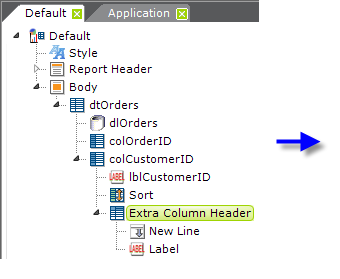
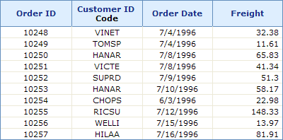
In the example above, an Extra Column Header element has been added as a child of a Data Table Column. It contains New Line and Label elements and the effect is to make a 2-line column header for the Customer ID column, as shown.
The Extra Column Header element gives developers more control over the layout and style of additional header material.
Justifying Column Header Text
The Data Table Column element has a Class attribute, which affects the data displayed in the column but not the column header text. By default, column header text is centered, which may not suit you.
![]() An attribute was added to the Data Table Column element, Column Header Class, which allows you to justify the header text.
An attribute was added to the Data Table Column element, Column Header Class, which allows you to justify the header text.
In earlier versions, to justify the header text, you must create a CSS class that targets the Data Table Column element based on its ID attribute, plus "-TH". This type of style class specification uses the # sign rather than a period before its name, as it affects elements with a matching ID, you don't have to assign it to the element's Class attribute.

Depending on browser versions, you may or may not need to use all three of the text-align descriptors in the class specification, and in the order, shown above to cover all of the major browsers. In the Data Table Column element's Class attribute, you'll still have to assign an appropriate class, your own or from a Theme, to justify the actual data.
You'll need to create one of these class specifications for each column header that you want to left- or right-justify.
Note that the effectiveness of other style descriptors in these style classes, such as font-size or -weight, may vary depending on any other style settings that have been made for the table, its rows, and cells, including those set by Themes.
Sorting Displayed Column Data
Developers often need to present data tables with their data sorted in a specific order and this can be done by sorting the datalayer data. You can also give users the ability to dynamically sort columns at runtime simply by adding a child Sort element beneath any Data Table Column element. This causes the column header text to become a link that users can click to sort the table based on that column.
Column data is sorted in the order specified in the First Sort Sequence attribute when the user clicks the link; clicking it again reverses the sort order. This defaults to Ascending first, then Descending.
To do this: | Set the following element attributes: |
|---|---|
| Create an initial sort order | Set the Sort element's First Sort Sequence attribute to Ascending or Descending. Default: Ascending |
| Specify a sort order for multiple columns | Set the Sort element's Data Column attribute to a comma-separated list of data column names, then set the Data Type attribute to a comma-separated list of data types that correspond with the respective column names. |
| Disable interactive sorting for large tables | In some cases, with a very large number of rows, column sorting should be disabled so the user is not left waiting to sort a very large result set. Set the Sort Row Limit attribute to a large number to disable sorting with large result sets. Set the Sort Row Limit Message attribute to the desired text if you want a message to be displayed when the Sort Row Limit is exceeded. |
| Remember the user's sort selections | Set the parent Data Table element's Remember Sort attribute to True. |
| Display arrows in the header that indicate the sort order | Set the parent Data Table element's Sort Arrows attribute to True. Default: False |
| Sort the data and update the table, without reloading the entire page | Set the parent Data Table element's AJAX Paging and Sorting attribute to True. AJAX is a technology that allows targeted portions of web pages to be updated, rather than the entire page. With this attribute enabled, when the user sorts a column by clicking its header, only the table portion of the web page will be updated, preventing the page from "flickering" or losing its scroll position. You should be aware that this alters the behavior of the browser's "Back" button because the page history is not updated when AJAX is used. Beginning in v11+, if AJAX Paging and Sorting is enabled and sorting is initiated and there is more than a very brief delay, a spinning "Wait" icon will automatically be displayed to let the user know that processing is occurring. |
In v10.0.299, a new sorting scheme featuring faster performance, called FlexSort, was introduced as an option. To use FlexSort in this version, add the constant rdFlexSort to the _Settings definition and set its value to True. In v10.0.319, the FlexSort sorting scheme became the default sorting method. In this and subsequent versions, to revert to the older sorting method, add the constant rdFlexSort
to the _Settings definition and set its value to False.
Arranging and Sizing Columns at Runtime
If a Data Table element's Draggable
Columns attribute is set to True, users can rearrange its columns at runtime:
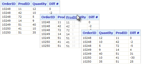
When this feature is enabled, as shown above, users can click in the column header and drag the column right or left to a new position.

Columns that can be dragged will include a special icon in their headers, as shown above; depending on the application version, this icon may not be visible until the mouse is hovered over it.

Similarly, in v11.0.519+, the Resizable Columns attribute allows users to drag an icon in the column header, shown above, at runtime to increase or decrease the column width.
The new column arrangement and/or width is "remembered" for the duration of the current session and these features can't be used when there are custom header rows with columns that span multiple columns. The default value for both of these attributes is False.
Showing/Hiding Columns
The Data Table Column element's Condition attribute can be used to dynamically show or hide the column at runtime, and developers frequently want to do this based on the table's data. However, there's an important restriction on this attribute: an expression used as its value cannot include @Data tokens. This is because any tokens used here must be available to be resolved when the table structure is being built but, because the table's datalayer doesn't run until later, there are no @Data tokens available at that time.
One solution is to use Local Data, then @Local tokens would be available when the table structure is being built and could be used in the Condition attribute.
Other types of tokens, of course, can be used in Condition attribute expressions.
Summarizing Column Data
Developers can perform typical aggregations of column data to create summary information for data tables. The following aggregations are available when summarizing column data:
|
|
Developers can display the summary information at the bottom of a data table in a dedicated row, on every page or just the last page (if the data spans multiple pages).
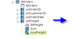
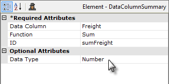
To summarize a data column:
- Add a Summary element as a child of a Data Table Column element, as shown above.
- Set the Data Column attribute value to the name of the column to be summarized.
- Choose one of the aggregate functions for the Function attribute value.
- Give the element an ID - this is important as the ID may be used later in order to reference the summarized value.
- Set the Data Type attribute value to the proper data type.
As mentioned above, the summarized value is available using an @Data token. So, the data in the example above would be available as @Data.sumFreight~. However, you do not need to use this token if you use a Summary Row element to display your summarized data.
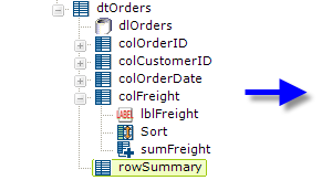
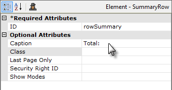
As shown above, the Summary Row element is added as a child of the Data Table (its position in the element tree does not matter) and its attributes are set as shown. This will cause a separate row to appear at the end of the report and its Caption will appear in the first column; the summarized values for each column that has a child Summary element will automatically appear in this row.
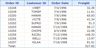
The example above shows the summary row and summarized Freight column value.
An alternative to using data column summaries is to use datalayer aggregate columns. An aggregate column behaves like any other column in the datalayer, and developers can perform additional calculations using more datalayer column elements.
Using Event Handlers with Column Data
It's possible to assign Event Handler elements as children of a Data Table Column. This allows the developer, for example, to capture mouse-related events associated with table columns and dynamically react to them. For instance, a More Info Row (see Data Table Rows) might be made visible or an image or popup panel or menu might be displayed when the mouse is hovering in a particular table column.