Paginate Data and Printing Reports
The volume of data retrieved into Logi reports often requires that tables be presented as a series of pages; in addition, developers often need to offer the ability to print hard copy versions of reports with suitable headers. The topic introduces developers to techniques for satisfying both of these requirements.
- Paginate Tables
- Create Printable Reports
Paginate Tables
Large data tables, with hundreds of rows of data, are cumbersome to interact with in a browser-based environment. The concept of navigating through a lot of data using "pages", each with a small number of rows, is familiar to anyone who's used an Internet search engine and looked through the search results. Logi reporting tools include the Interactive Paging element which provides this functionality for data tables in Logi applications.
![]() We do not recommend using Interactive Paging with tables that contain user input elements in each row.
We do not recommend using Interactive Paging with tables that contain user input elements in each row.
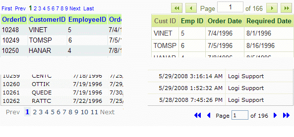
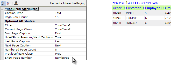
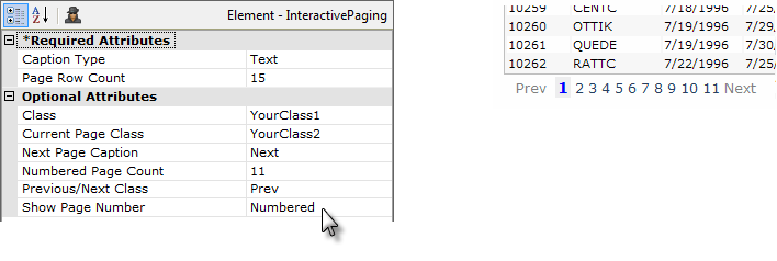
The examples above show four different styles and locations for page navigation links, all of which are created using the Interactive Paging element. The left two examples use Text-type links and the right two use Image-type links.
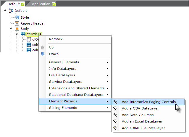
Studio includes a wizard that will add an Interactive Paging element to a report definition and configure it, using the Image-type links shown in the upper-right hand corner of the previous examples. To use it, select the desired data table element, then click the "Add interactive paging controls" wizard at the bottom of the Element Toolbox, as shown above. The Interactive Paging element can, of course, be added and configured manually as well.
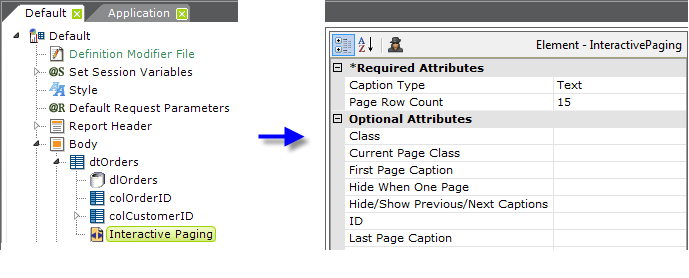
Interactive Paging Element Attributes
Once an Interactive Paging element has been added, it can be customized. The following table describes the element's attributes:
| Identifier | Description |
|---|---|
| Caption Type | (Required) Specifies whether the navigation links will be text or images. |
| Page Row Count | (Required) Specifies the number of data rows that will appear per "page". |
| Class | Specifies the general style class to be applied to the element. |
Current Page Class | Specifies the style class to be applied to the text that indicates the current page, overriding the previous Class. Use this, for example, to make the current page number appear in a larger font, with a colored background, etc. |
First Page Caption |
Specifies the text or the image file name that will appear as the "First Page" link. |
Hide When One Page | Specifies if the navigation controls will be hidden when the datalayer returns only one page of data. The default value is False. |
Hide/Show Previous/Next Captions | Specifies if the non-numeric navigation links will be dynamic based on the current page. When set to True, the links for First, Previous, Next, and Last are hidden when the current page is the first or last page. The default value is False. |
| ID | A unique element ID. |
Last Page Caption |
Specifies the text or the image file name that will appear as the "Last Page" link. |
Location |
Specifies where the navigation controls will appear: Top, Bottom, or Both. The default value is Both. To align the controls with the left or right side of the table, apply an appropriate style class to the data table's parent container (such as a Division or Column Cell element). |
Next Page Caption |
Specifies the text or the image file name that will appear as the "Next Page" link. |
Numbered Page Count |
Specifies how many separate numbers will be display, when using a Text-type caption, in a list of numbered page links. The default value is 10. For this to apply, the Show Page Number attribute must be set to Numbered. |
Page Number Caption |
Specifies a word to use instead of "Page" in the navigation control caption "Page X of Y". The default is Page. |
| Page of Caption | Specifies the word to use instead of the word "of" in the navigation control caption "Page X of Y". The default is of. |
| Previous Page Caption | Specifies the text or the image file name that will appear as the "Previous Page" link. |
| Previous/Next Class | Sets the style class to be applied to First, Last, Next, and Previous parts of the paging control. |
| Show Page Number | Specify True or False here to show or hide the "Page X of Y" part of the navigation controls. Specify Numbered to create a list of numbered page links (works with the Numbered Page Caption attribute). |
To prevent the entire page from being refreshed when a different table page is selected, set the parent Data Table element's AJAX Paging and Sorting attribute to True. AJAX is a technology that allows targeted portions of web pages to be updated, rather than the entire page. With this attribute enabled, when the user changes pages by clicking the table's navigation controls, only the table portion of the web page will be updated, preventing the page from "flickering". You should be aware that this alters the behavior of the browser's "Back" button because the page history is not updated when AJAX is used.
Beginning in v11+, if AJAX Paging and Sorting is enabled and a user changes table pages and there is more than a very brief delay, a spinning "Wait" icon will automatically be displayed to let the user know that processing is occurring.
The following images show the attribute settings for the examples shown earlier. To conserve space, blank attributes have been removed:

Data Table Page Navigation
If a data table has been paginated, there are scenarios in which you might want to navigate to a specific table page. For example, suppose your data table has drill-down links in it and you'd like to return to the same data table page after drilling-down to a detail report. Yes, the "Back" button on your browser will accomplish the same thing, but there may be circumstances in which you don't want to rely on it.
When you navigate away from the paginated data table, a special Request variable is included in the URL that calls the next report. You can use that variable in the link used to return to the data table report to ensure you return to the same data table page.
To do this, include these two Link Parameters in the return link:
| Parameter Name | Parameter Value |
|---|---|
<myTableID>-PageNr | @Request.<myTableID>-PageNr~ |
rdNewPageNr | True |
where <myTableID> is the element ID of the paginated data table.
Logi Info developers may want to run a process task and then return to the same data table page. This can be done by passing @Request.<myTableID>-PageNr~ to the task and then assigning its value to a Link Parameter named rdNewPageNr when calling the data table report.
Create Printable Reports
Report consumers often want to print hard copies of their web-based reports. To do this, the reports need to be paginated and formatted for printing. Logi reporting products make this easy to accomplish by providing the Printable Paging element.
The process causes the report to be formatted for printing and then loaded into a browser window, after which it can be printed. The process automatically hides any Interactive Paging element, which ensures that the navigation controls do not appear on the printout and increases the number of records in tables so they fill the page.
There are two things that must be done to make a report "printable": the addition of a Printable Paging element, which governs page margins, size, and headers, and the addition of a link that's clicked to begin the formatting/printing process. The formatting/printing process formats the report for printing and then, optionally, outputs it to a printer or other formats, such as Adobe PDF or Word.
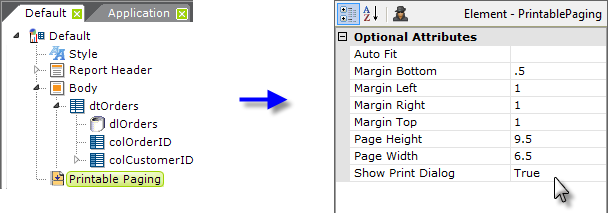
Begin, as shown above, by adding a Printable Paging element beneath the root Report element (its location in the element tree does not matter). Set its Margin attributes as desired, in inches. To calculate the proper Page Height and Page Width attribute values, start with the physical paper size in inches and subtract the related margin values. So, in the example, working with a standard U.S. Letter size page, subtract from the physical paper height (11") the bottom margin (- .5") and the top margin (- 1") to arrive at the Page Height value ( = 9.5").
The Show Print Dialog attribute controls whether the operating system's standard printer selection dialog box appears once the report has been loaded into the browser. For output to other formats, such as PDF or Word, this is set to False.
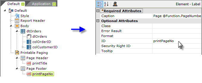
If desired, a page header and footer that will only appear in the printed output can be included by adding Page Header and Page Footer elements as child elements beneath the Printable Paging element, as shown above. They, in turn, can contain other elements including Labels and Images. In the example, the footer makes use of some Function tokens to present the current page number and total page number. The complete Caption attribute value for this is:
Page @Function.PageNumber~ of @Function.PageCount~
![]() Note that the @Function.PageNumber~ token is only valid when Interactive Paging or Printable Paging elements are in use and the @Function.PageCount~ token is only valid when Printable Paging is in use.
Note that the @Function.PageNumber~ token is only valid when Interactive Paging or Printable Paging elements are in use and the @Function.PageCount~ token is only valid when Printable Paging is in use.
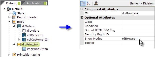
Next, add the element that users will click to print the report:
- Add a Division element beneath the Body of your report and set its Show Modes attribute to the system value rdBrowser, as shown above.
- Add an Image, Label, or Button element beneath the Division to use as the report's "print link".
The rdBrowser Show Modes value causes the Division element (and its child elements) to only be visible when the report is viewed in a browser; ensuring that it will not appear on the printed report.
Next, select the appropriate actions depending on the type of output required.
Format Report for HTML Display and Printing
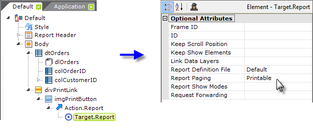
- As shown above, add Action.Report and Target.Report elements beneath the print link element. Set the Target.Report element's attributes as shown.
When the print link is clicked, the report will be reformatted and displayed in the browser window. If the Show Print Dialog attribute was set to True earlier, it will appear to allow printer selection and printing.
Or, To Format Report and Display as a PDF
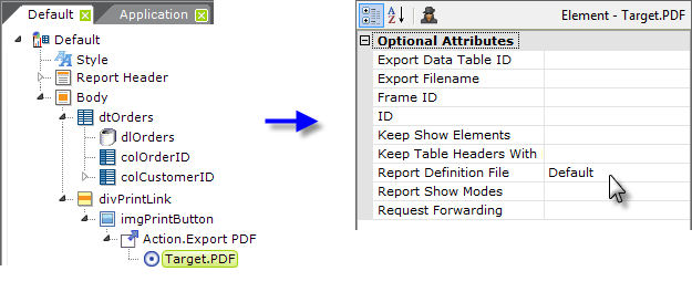
- As shown above, add Action.ExportPDF and Target.PDF elements beneath the print link element. Set the Target.PDF element's attributes as shown.
When the print link is clicked, the report will be reformatted, saved as a temporary .PDF file, and displayed using the Adobe Reader browser extension (which must be installed on the client machine). From there, the report can be saved as another PDF file or printed.
Page headers and footers are rendered separately when exporting to PDF format. Since space is limited on printable pages, it's advisable to keep the size of page headers and footers small to allow room for the body of the report.
Note that the web server's local ASPNET or NETWORK SERVICES account must have Full Control access permissions to the rdDownload folder in your Logi application folder in order to create temporary PDF files.
Or, To Format Report and Display as a Word Document
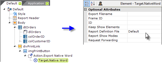
- As shown above, add Action.Export Native Word and Target.Native Word elements beneath the print link element. Set the Target.Native Word element's attributes as shown above.
When the print link is clicked, the report will be reformatted, saved as a temporary Word file, and opened using Word. From there, the report can be saved to another Word file or printed. Microsoft Office or the Word browser viewer must, of course, be installed on the client machine.
Note that the web server's local ASPNET or NETWORK SERVICES account must have Full Control access permissions to the rdDownload folder in your Logi application folder in order to create temporary Word files.
