Pie, Doughnut, Pyramid, and Funnel Charts
Pie
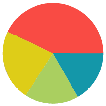
Pie charts are used to show the relationship of individual data fields in a series as portions of the total data in the series. They are shaped like a circle divided into colored “slices,” each representing a data value. The area of each slice of the pie is proportional to the quantity it represents. Pie charts are single-series.

Doughnut
Doughnut charts are a stylistic variation of a Pie chart. They are ring shaped with a circular “hole” in the center like a doughnut. The ring is divided into colored “slices,” each representing a data value. The area of each slice is proportional to the quantity it represents. Doughnut charts are created in the same manner as Pie charts.

Pyramid
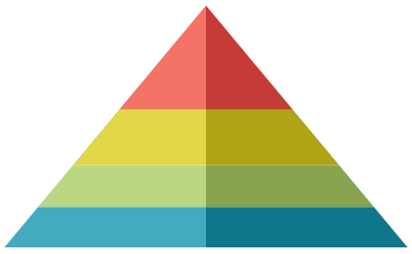
Pyramid charts are a variation of a Pie chart. They are often used when it is necessary to show a hierarchical order of data as well as its quantity.
Each data value is represented by a vertically stacked “slice” of a triangle, the height of each proportional to the quantity it represents. The slices are stacked in sort order. The width of each slice corresponds to its order, but has no relation to its quantity. Pyramid charts are created in the same manner as Pie charts.

Funnel
Funnel charts are a variation of a Pie chart. They are often used to show stages in a process as a falling value or percentage.
Each data value is represented by a vertically stacked “slice” of a triangle, the height of each proportional to the quantity it represents. The slices are stacked in sort order. The width of each slice corresponds to its order but has no relation to its quantity. Funnel charts are created in the same manner as Pie charts.
