Bar Charts
Bar
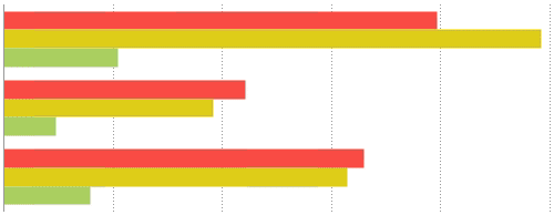
Bar charts use rectangular bars that extend horizontally to show comparisons between categories. Each data value is represented by a bar, the length of which represents its quantity. Bar charts can be single-series (one bar per category) or multi-series (multiple bars per category, each series differentiated by color).
Stacked Bar
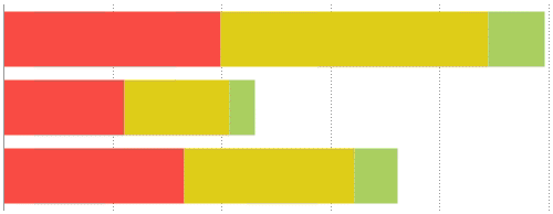
Stack bar charts are a variation of a multi-series Bar chart. Each bar is a category of data values stacked additively. The length of the bar represents the total quantity of the category, and each segment represents the data value in proportion to the total. Each series is differentiated by color. Stack bar charts can be created in the same manner as multi-seriesBar charts.
100% Stacked Bar
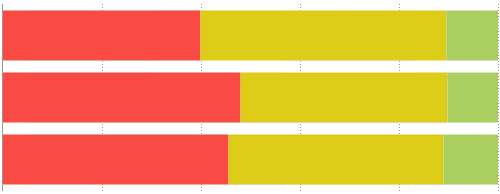
Stack bar 100% charts are a variation of a multi-series Bar chart. Each bar is a category of data values stacked additively. The length of the bar is fixed to 100%, and each segment represents the data value as a percentage of the total. Each series is differentiated by color. Stack bar 100% charts can be created in the same manner as multi-seriesBar charts.
Column
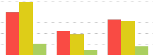
Column charts are a stylistic variation of a Bar chart. They use rectangular columns which extend vertically to show comparisons between categories. Each data value is represented by a column, the height of which represents its quantity. Column charts can be single-series (one column per category), or multi-series (multiple columns per category, each series differentiated by color). Column charts are created in the same manner as Bar charts.
Stacked Column
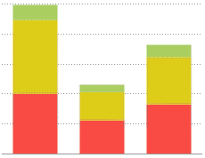
Stack column charts are a variation of a multi-series Column chart. Each column is a category of data values stacked additively. The length of the column represents the total quantity of the category, and each segment represents the data value in proportion to the total. Each series is differentiated by color. Stack column charts can be created in the same manner as multi-seriesBar charts.
100% Stacked Column
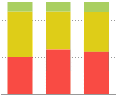
Stack column 100% charts are a variation of a multi- series Column chart. Each column is a category of data values stacked additively. The length of the column is fixed to 100%, and each segment represents the data value as a percentage of the total. Each series is differentiated by color. Stack column 100% charts can be created in the same manner as multi-seriesBar charts.
