Gauges
A Gauge gives a visual representation of the scale of a value. Refer to the Examples at the end of this topic.
Gauge Wizard
To add a gauge to an Advanced Report:
- Select a cell on the design grid where the gauge will reside. Gauges can be placed in any section of the report except for the Page Header and Page Footer sections.
- Open the Gauge Wizard:
- (v2021.1+) Click the Insert

 icon on the toolbar, then click
  Gauge
Gauge - (pre-v2021.1) Click the Gauge
 icon in the toolbar.
- (v2021.1+) Click the Insert
The Gauge Wizard will appear. The Gauge Wizard has two tabs: Appearance and Data, detailed below.
Appearance
In the Appearance tab, choose the style and size of the gauge.
Type
Select the Type of gauge that will appear:
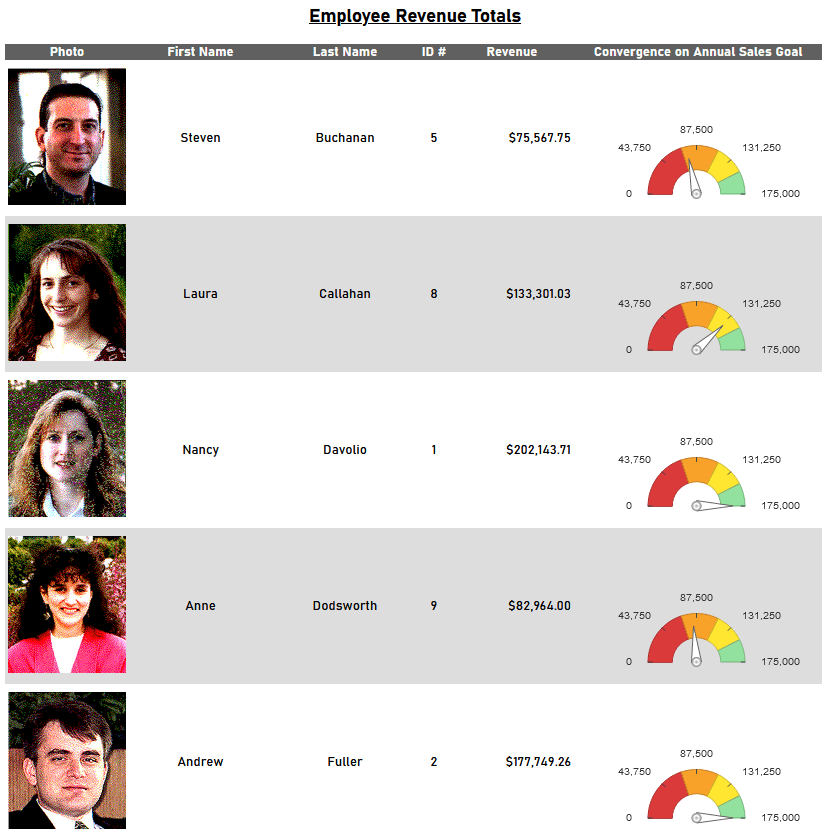
 Angular — the indicating needle sweeps from left (minimum) to right (maximum) along a curved dial
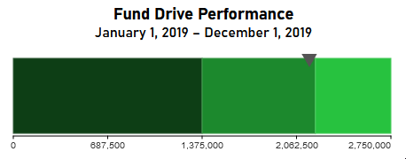
 Linear — the indicating needle sweeps from left (minimum) to right (maximum) along a horizontal line
 Bulb — value is indicated by the presence of a single color, similar to a flag or semaphore. The value is shown below the bulb.
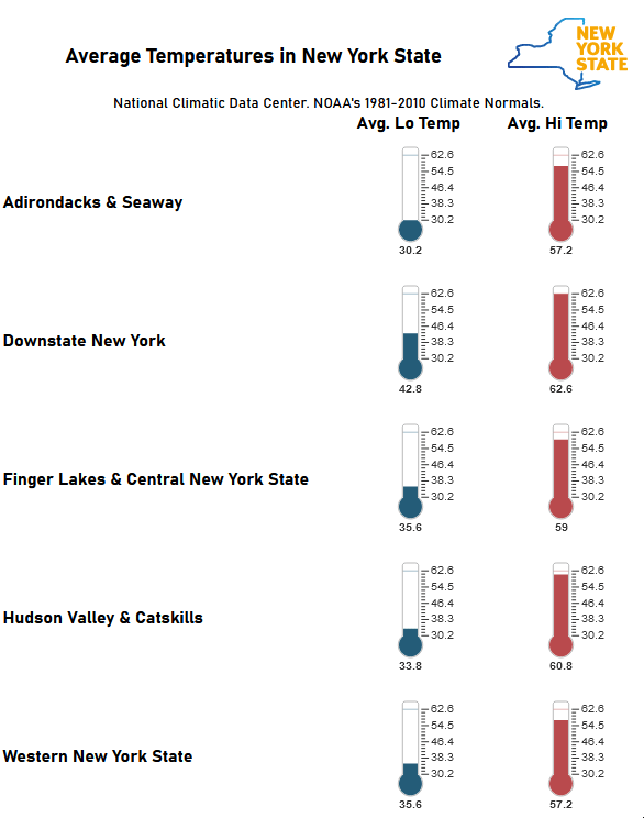
 Thermometer — value is indicated by the thermometer tube filling from the bottom (minimum) to the top (maximum)
Dimensions
Select the size (Dimensions) of the gauge by either:
- Drag-and-drop the resizing handle
 at the bottom-right corner.
 - Check the Fit to Cell checkbox and resize the chart cell on the Design Grid.
- Enter a custom Height and Width in pixels directly into the corresponding inputs
Angular gauges have a minimum width of 120 pixels.
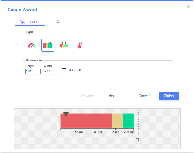
Click Next to advance to the Data tab.
Data
Use the Data tab to choose the value presented in the gauge, the range of values and the coloring of those values.
Value and Range

- From the top dropdown, choose a cell with a numeric value that determines the gauge’s indicator position. In the example above, a cell with the formula
=aggsum({OrderDetails.Revenue})that computes the sum of all order revenues is selected. - Specify the range (minimum and maximum) values by choosing one of the Provide range asoptions. The Min and Max values must be numeric.
- Static value — specify explicit numeric Min and Max values

- Cell value — choose cells on the report that represent the Min and Max values


To create a “semi-static” gauge, include a cell on the report with the desired static value preceded with an equals sign. In the example above, the gauge’s minimum value will be 0 and the maximum value will be whatever the value of the
@SalesGoal@parameter is at the time of report execution.
- Static value — specify explicit numeric Min and Max values
Color Ranges
- Choose a Color by method to determine how the color breakpoints will be applied to the gauge’s dial:
- Percentage — breakpoints are calculated as a percentage of the data values with the smallest value at 0% and the largest value at 100%
- Static Value — breakpoints in color happen at explicitly defined values of the data
- Cell Value — breakpoints in color happen at value changes that occur in cells on the report
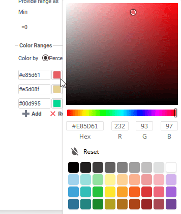
- Add or Remove color breakpoints, and select the locations of the breakpoints. Breakpoints values must be in ascending numeric order. There are three breakpoints by default.

Thermometers only have one color.
- Click Add
 to add additional breakpoints to the end of the list. Click
  Remove to remove the break point at the end of the list.
 - Enter a hexadecimal color code into the text field, or click the Color Chooser icon to select a color for each break point.
- Click Add
- Click Finish to close the Gauge Wizard and add the visualization to the report.
Examples
