Line Charts
All of the sample charts in this topic have been generated using the same sample data set.
Line
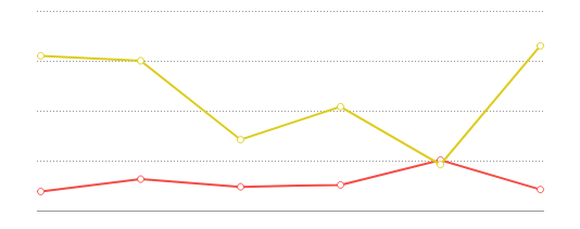
Line Charts display a series of data points on a grid, connected by straight lines. They are often used to display a trend in data over intervals of time. Lines are not necessarily representative of any data between connected points. Line charts can be single-series (one line), or multi-series (multiple lines). On a multi-series chart, lines are differentiated by color.
Spline
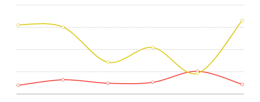
Spline charts are a stylistic variation of a Line chart. Data points are connected by an interpolated curve. They are often used to display a trend in data over time, with estimated data between points. Spline charts are created in the same manner as Line charts.
Area
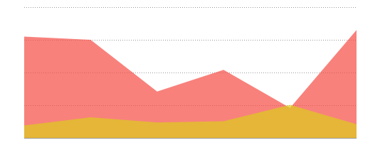
Area charts are a variation of a Line chart. The area below each line is colored to represent cumulative data. They are often used to compare cumulative totals over time. On a multi-series chart, each series is given a distinct color, and the colors blend where series areas overlap. Area charts are created in the same manner as Line charts.
Spline Area
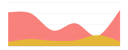
Spline Area charts are a stylistic variation of an Area chart. Data points are connected by an interpolated curve, and the area below each curve is colored to represent cumulative data. They are often used to compare cumulative totals over time, with estimated data between points. On a multi-series chart, each series is given a distinct color, and the colors blend where series areas overlap. Spline area charts are created in the same manner as Line charts.
Stacked Area v2021.1+
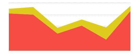
Stacked Area Charts are a variation of a multi-series Line chart. Each area is a category of data values stacked additively. The height of the area represents the total quantity of the category, and each segment represents the data value in proportion to the total. Each series is differentiated by color. Stacked Area Charts can be created in the same manner as multi-series line charts.
Zoom Line
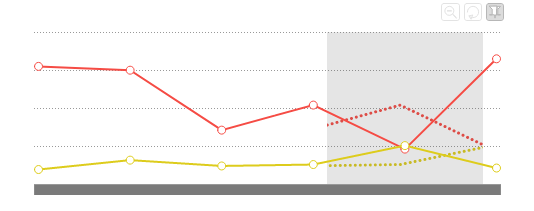
Zoom Line charts are variations of a standard line chart. Zoom line charts have the same basic construction and components of a line chart, but add in the ability to zoom in and out to see more or less data points in the user interface.
Statistical Process Control (SPC)
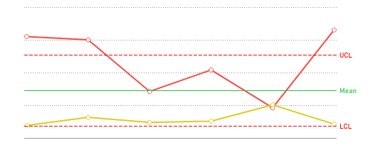
A Statistical Process Control (SPC) Chart is a graph used to study how a process changes (usually over time). Data is plotted in time order. SPC charts always have a central line for the average, an upper line for the upper control limit and a lower line for the lower control limit. Control limits are located 3 standard deviations above and below the centerline (mean). Data points outside of the limits are indicative of an out-of-control process.
Radar v2021.1+
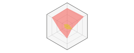
Radar Charts also known as Spider Charts can be used to compare dimensions along a single radial grid. The name Spider Chart derives from the resemblance to a spider’s web. Each dimension or label is located at the outer vertices of the grid, and the magnitude of that dimension’s value is displayed by the distance of the data point from the center of the chart.
