 New for 14.1 InfoGo - Editing Chart Labels and Captions
Every SSRM chart has the ability to format captions and labels for your Label Column, Data Column, and Additional Column(s) in some capacity. This topic discusses how to customize the label format and edit captions for the X- and Y-axis in your SSRM charts.
Editing Captions
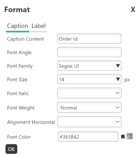
Axis caption formatting includes the ability to change the following:
Caption Content: Enter the axis caption. To remove the caption, enter "".
Font Angle: Enter a value between 1-360 to angle your caption.
Font Family: Changes the font of your caption.
Font Size: Changes the font size of your caption between 6-72 px.
Font Italic: Select True or False to make your caption italicized.
Font Weight: Changes the thickness of the caption font between Normal, Bold, Bolder, or Lighter. Note that the Font Family you choose may affect how the font weight displays.
Alignment Horizontal: Select Left, Center, or Right to set your caption alignment.
Font Color: Changes the font color and hue using a 'color picker'.
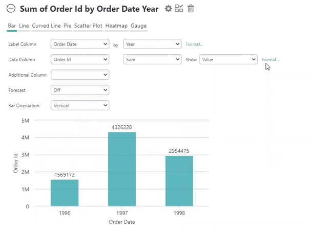
For this example, we're going to change the 'Order Id' caption's size, weight, and color.
To access this feature, select Format... in your chart:
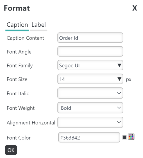
A Format dialog window appears, shown below:
To change the size, select the Font Size drop-down menu:
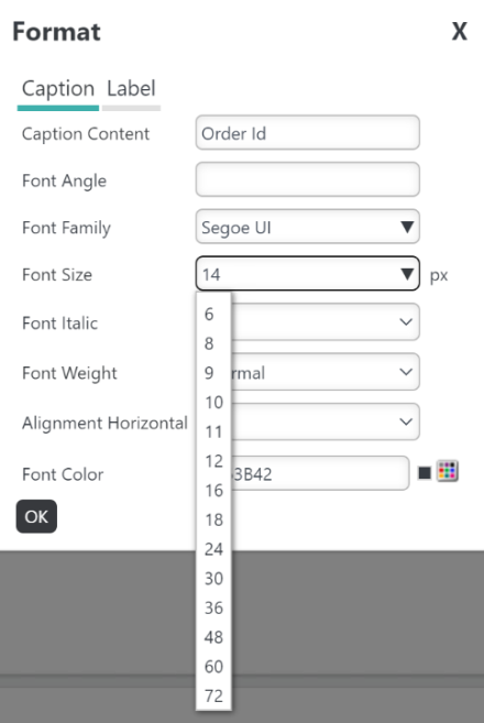
Choose the desired size. For this example, we're going to select size 14 font.
Then, select the Font Weight drop-down menu:
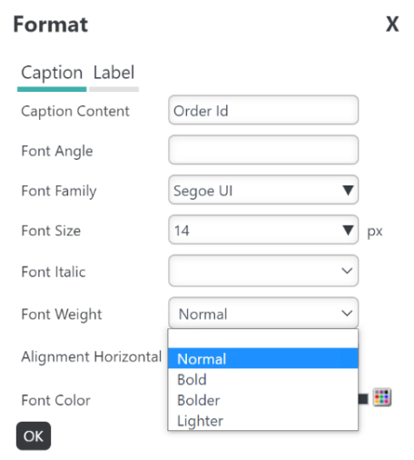
Choose the desired weight. We want our caption to be Bold.
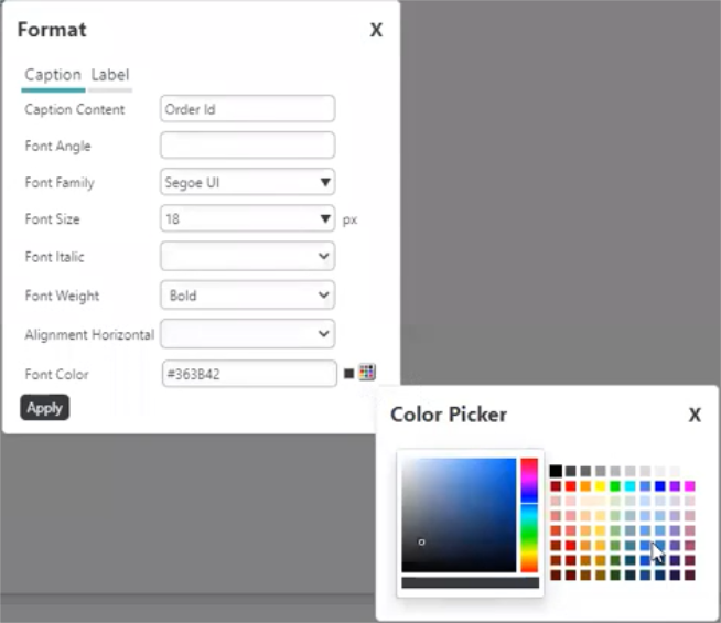
To change the color, enter a Hex #, or choose a color by selecting the Color Picker:
The Color Picker dialog displays.
Choose the desired caption color from the list of available colors. Change the shade of the color by moving the cursor to the left of the color panel, shown below:
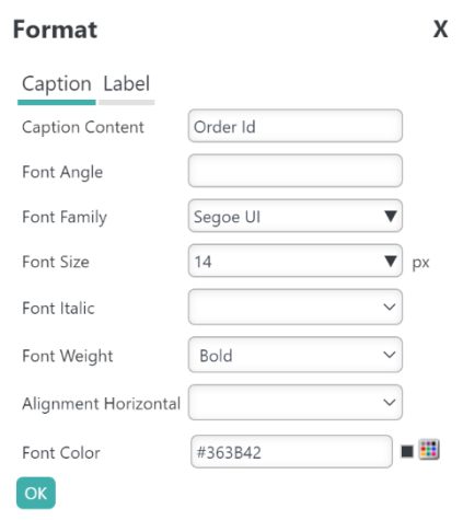
When you're done making changes, select OK:
You chart automatically reflects the changes, shown below:
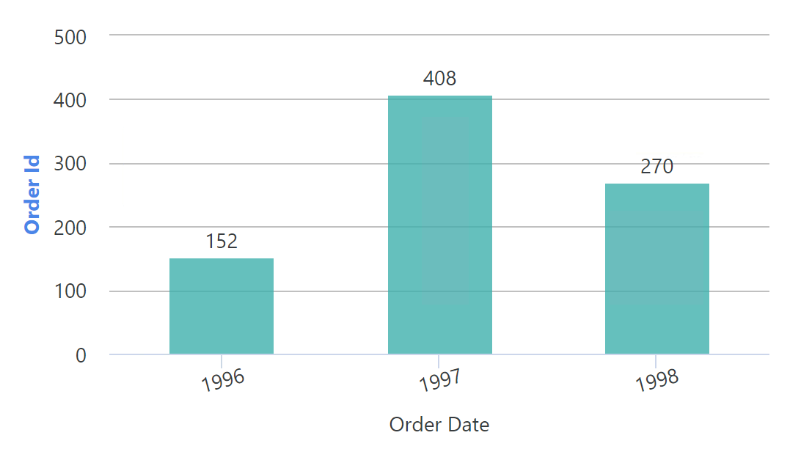
Since we edited the 'caption' our changes only applied to the words 'Order Id' (for this example). To change the format of the values represented in the Y axis (5M, 4M, 3M in this example), follow the steps in the section below.
![]() Changing the chart type resets all formatting; however, changing the value in the Label, Data, or Additional Column does not reset formatting.
Changing the chart type resets all formatting; however, changing the value in the Label, Data, or Additional Column does not reset formatting.
Editing Labels
Axis label formatting includes the ability to change the following:
Format: Changes the data format.
Font Family: Changes the font of your label.
Font Size: Changes the font size of your label between 6-72 px.
Font Italic: Select True or False to make your label italicized.
Font Weight: Changes the thickness of the font between Normal, Bold, Bolder, or Lighter. Note that the Font Family you choose may affect how the font weight displays.
Font Angle: Enter a value between 1-360 to angle your label.
Font Color: Changes the font color and hue using a 'color picker'.
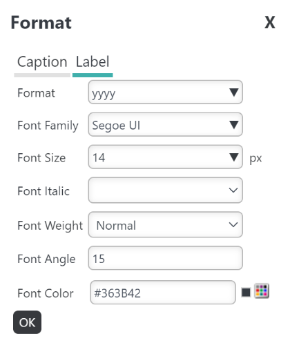
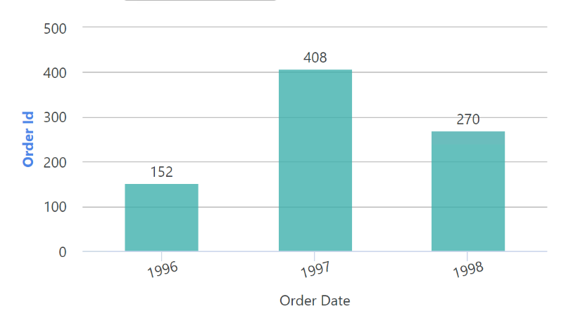
For this example, we're going to change the 'Order Id' label's format and font angle.
To access this feature, select Format... in your chart:
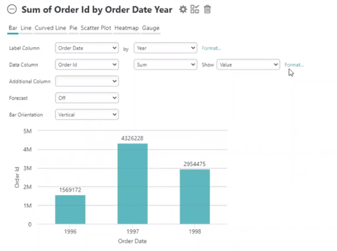
A Format dialog window appears, shown below:
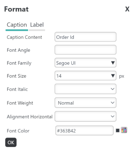
Select the Label tab to edit the Data Column's label:
To change the format, select the Format drop-down menu:
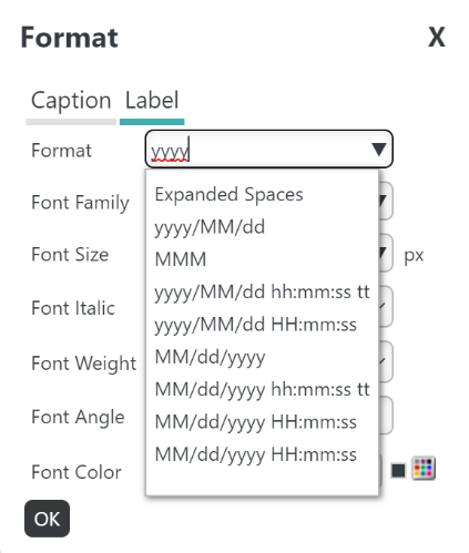
Choose the desired format, or enter your own format in the field. For this example, we're going to enter 'yyyy'.
Next, we'll edit the angle of the label by entering a value (1-100) in the Font Angle field:
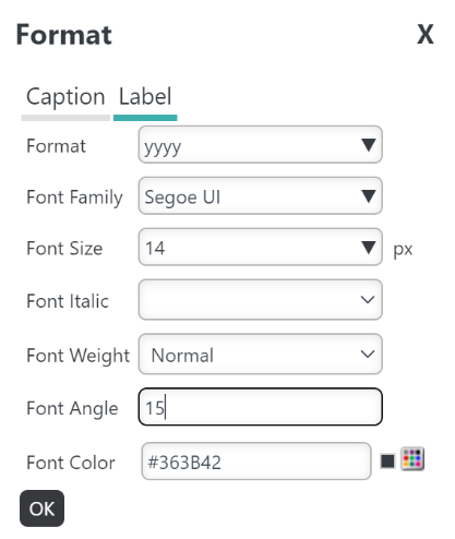
When you're done making changes, select OK:
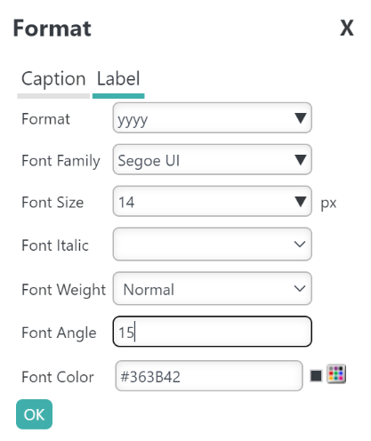
You chart automatically reflects the changes, shown below:
![]() Changing the chart type resets all formatting; however, changing the value in the Label, Data, or Additional Column does not reset formatting.
Changing the chart type resets all formatting; however, changing the value in the Label, Data, or Additional Column does not reset formatting.