Arranging and Sizing Columns
The developer can configure Crosstab Table columns so that they can be rearranged and/or resized at runtime by the user.

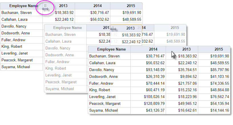
As shown above, when the Crosstab Table element's Draggable Columns attribute is set to True, a dotted icon appears in the column headers when the mouse is hovered over their left side and the cursor changes to left-right arrows. The entire column can then be dragged left or right and dropped into a new position. The new column arrangement will be "remembered" for the duration of the current user session. Draggable Columns cannot be used when there are custom header rows, with
columns that span multiple columns, in use. The default value for Draggable Columns is False.

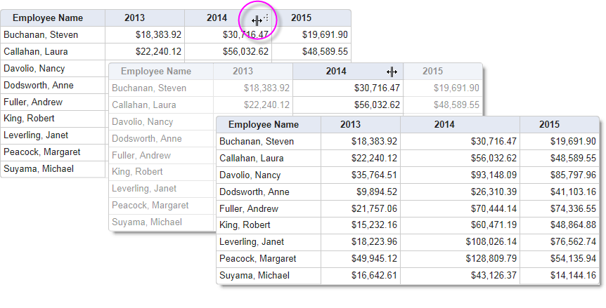
When the Resizable Columns attribute is set to True, a dotted icon appears in the column headers when the mouse is hovered over their right side and the cursor changes shape. The icon can then be dragged left or right, contracting or expanding the width of the column. The new column width will be "remembered" for the duration of the current user session. The default value for Resizable Columns is False.
![]() Resizable Columns cannot be used when there are custom header
rows with columns that span multiple columns in use.
Resizable Columns cannot be used when there are custom header
rows with columns that span multiple columns in use.