Data Retrieval and Appearance
Data is provided for charts by adding a datalayer element as a child of the chart or gauge element. The datalayer retrieves the data to be visualized and supplies it, record by record, to the chart for plotting. The datalayer can make use of grouping, filtering, and all the other modifier elements generally available to datalayers in order to shape the data it retrieves. The Formatted Column element can be particularly useful in getting data in the datalayer formatted correctly for use in charts.
![]() Animated Gauges can get their data from a datalayer or from tokens, including Local Data, Session, and Request tokens. However, they're not designed to be used in a report page where there are multiple gauges, each with its own child datalayer. In this case, all of the gauges will draw data only from the first child datalayer. If you have a multi-gauge page such as this
in mind, design
your report to use Local Data to retrieve all of the data needed for all
of the gauges, then use tokens to provide the data to the gauges.
Animated Gauges can get their data from a datalayer or from tokens, including Local Data, Session, and Request tokens. However, they're not designed to be used in a report page where there are multiple gauges, each with its own child datalayer. In this case, all of the gauges will draw data only from the first child datalayer. If you have a multi-gauge page such as this
in mind, design
your report to use Local Data to retrieve all of the data needed for all
of the gauges, then use tokens to provide the data to the gauges.
For Static charts, a Show Wait Icon attribute controls whether an animated "loading" image is displayed if there's a delay in retrieving data for a chart. It defaults to True, so set it to False if you don't want the animated icon to appear.
Chart processing is multi-threaded and asynchronous so, for example, charts in multiple dashboard panels will be generated simultaneously. On web servers with multiple cores or multiple processors, chart generation tasks will be spread across them for even better performance.
What if no data is returned to the datalayer? Instead of displaying the chart, Animated charts will automatically generate a "No data to display message". When using Static charts, you can choose to add a Zero Rows Message element to display a message.
Values from the datalayer can be used to set the boundaries of graphics in the chart (the height of a bar, the size of a pie slice, etc.) and to supply text that appears in tooltips, legends, and chart labels.

The name of the datalayer column that provides a chart's Y-axis ("Data") values is specified in the element's Data Column Y-axis attribute, as shown above. This adds the initial data series to the chart.
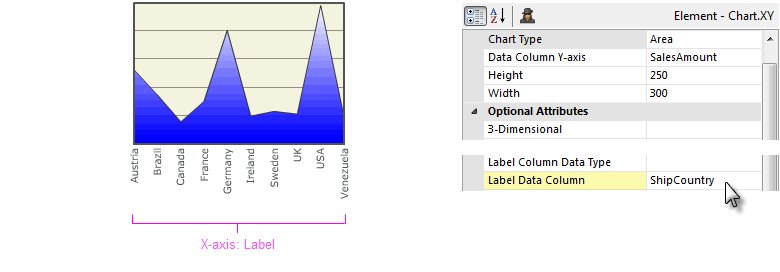
The name of the datalayer column that provides a chart's X-axis ("Label") values is specified in the element's Label Data Column attribute, as shown above.

For Chart.Pie, Chart.Polar, and Chart.XY, the chart's Data values can be formatted for presentation, using the Data Scale and Format Data elements. For Label values, the Label Scale element provides similar functionality, as shown above.
Adding Multiple Series
Multiple data series can be plotted on the same canvas, as shown in the following examples.

In the example above, three data series are shown in a Line chart. The basic chart will display one data series; to add additional series, Extra Data Column elements are added below the chart element. Each of these elements has an attribute that's set to the name of another column in the datalayer.
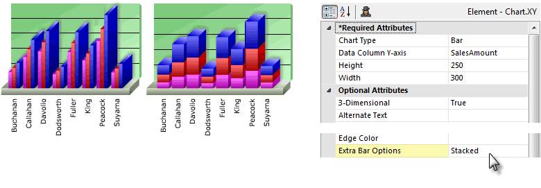
In the example above, the chart type has been changed to a Bar chart. On the left, the three data series appear as Side-by-Side bars, and in the middle, as Stacked bars. This behavior is controlled by the chart's Extra Bar Options attribute, shown above right.
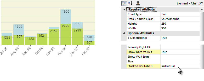
You can show the data values inside stacked bars in a Static Bar chart by setting the chart's Stacked Bar Labels attribute to Individual, as shown above. The default option, Aggregate, displays a single, combined value above the top of each stack.

Static Chart.XY charts can have two Y-axes. The Secondary Data Axis element controls a secondary axis, normally appearing on the right side of a grid. In the example shown above, this is the "Orders" axis. This other axis represents data for an Extra Grid Layer, and has its own independent scale. Child elements can be used to format the data and secondary axis appearance.
Controlling Data Appearance
The appearance of the data visualization, including colors, widths, and style, can be configured.
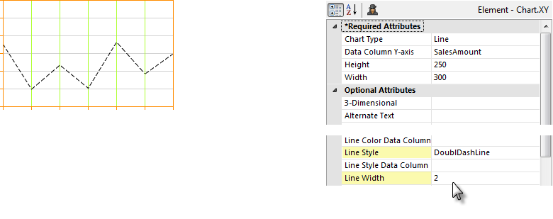
The style and width of the lines representing data in Line charts can be formatted using the Line Style and Line Width attributes, as shown above. Solid, and a variety of dotted and dashed, line styles are available.
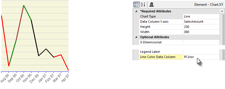
The appearance of static line charts can also be data-driven by setting the Line Color Data Column and Line Style Data Column attributes. This allows you to have different colors for different line segments, as shown above.
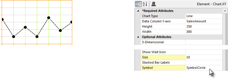
In Line and Scatter charts, the data points can be emphasized with symbols, as shown above. The size of the symbol, in pixels, can be set and symbols choices include Circle, Cross, Diamond, Glass Sphere, Solid Sphere, Square, Triangle, X and others. You can enter a comma-separated list of symbols as the Symbol attribute value for Line and Spline-types of Chart.XY. This allows a different symbol to be used for each data series

Line chart lines can be made discontinuous by replacing null data values with the value 1.7E+308, producing "broken" lines.

A "trend" line can be added to static reports to give a general impression of the trend of the data. The blue trend line in the example above was included by adding a Trend Line element as a child of the chart element. The calculation involved in determining the trend line angle occurs automatically; line width and color can be set through attributes.

The Lowess Curve Line element, available with release 9.5.78, creates a trend line (in blue, above) that fits a curve through a static Chart.XY's data points using the Lowess Curve Fitting algorithm.

Static and Animated Pie charts can be configured so that one or more of their pie wedges are displayed as "exploded", as shown above. This is done using the Exploded Wedges Column attribute, which specifies a datalayer column whose values determine wedge state. Non-zero values in that column will cause the wedge for the corresponding X-axis value to be exploded. Typically, the developer will add a Calculated Column to the datalayer, with a formula that evaluates to 1 or 0, and specify that column in the Exploded Wedges Column attribute.

Tooltips can be also added to charts, as shown above, by setting the Tooltip Column (Animated charts) or Tooltip (Static charts) attribute. This causes identifying data from the datalayer to be displayed as a tooltip, as shown above, when the mouse hovers over a portion of the chart. The Tooltip Column requires only the name of a column from the datalayer, while the Tooltip attribute requires the use of an @Chart token to display data. For animated charts, a Tooltip Font element is available for formatting the tooltip.
Certain charts can include a feature called Quicktips:
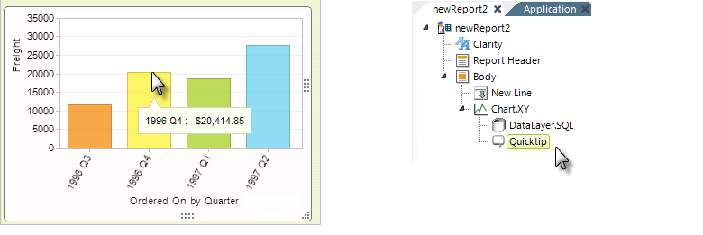
When the Quicktip element is added as a child of the chart element, it provides a small, popup "balloon" at the cursor location. The Quicktip allows the balloon to have a title and one or more rows of text. Data values can be shown by configuring the Quicktip element with the @Chart token.
In summary, data is retrieved for use in a chart by a datalayer. Typically, a chart on its own will display one data series but, with the addition of other helper elements, it can be made to show additional data series.
Refreshing Animated Chart.XY in Realtime
The Realtime Update element was introduced. It transforms an Animated Chart.XY into a chart that updates itself periodically, by adding new data values at its right side and scrolling the X-axis horizontally.
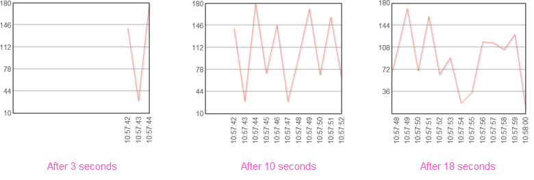
The example above shows a Line chart displaying a value as it changes, once per second. The Realtime Update element uses AJAX technology to automatically refresh its Animated Chart parent element, based on an interval set in seconds. It works by re-running just that portion of the report that retrieves the chart data and passing it back to the browser to update the chart. The data is accumulated internally and re-processed each time the chart is displayed.
If Extra Data Column elements are used, they're displayed as additional lines in Line charts, and as stacked values in Area and Bar charts.
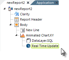
As shown above, the Realtime Update element is used by adding it beneath the Animated Chart.XY element. Its only attribute is the required Refresh Interval attribute, which is specifies, in seconds, how frequently to refresh the chart.
![]() The Realtime Update element cannot be used with a chart whose datalayer has a Crosstab Filter applied to it.
The Realtime Update element cannot be used with a chart whose datalayer has a Crosstab Filter applied to it.