Using a Color Spectrum Legend
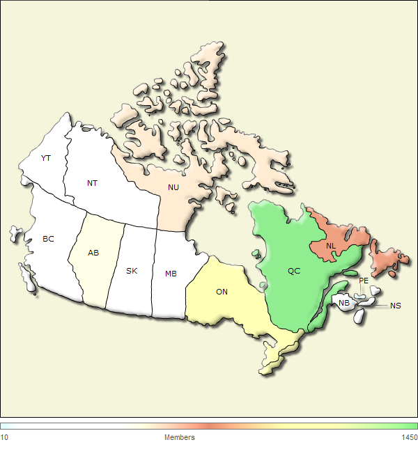
Instead of using Map Color Range elements, you can add a "color spectrum" legend to your animated map; this legend uses colors to illustrate the distribution of the data values used to generate the map and assigns those colors to the appropriate map regions.

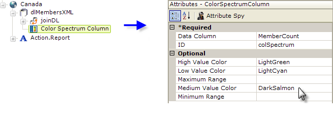
The first step, as shown above, is to add a Color Spectrum Column element beneath the datalayer. Configure its attributes to identify the data column used as the Animated Map element's Region Value Column, and the desired colors for the low, medium, and high values.

The next step is to add an Animated Map Color Spectrum Legend element, as shown above, beneath the Animated Map and to set its caption. The legend appears by default below the map, but its Location attribute can be set to make it appear to the right of the map.

And the resulting map and legend are shown above.