Series.Area Spline
The Chart Canvas element's Series child elements cause a data visualization (the chart) to be rendered in the canvas.
The following topics discuss the Series.Area Spline child element:
- Using Multiple Series
- Series.Area Spline Attributes
- Using the Data Labels Element
- Using the Marker Points Element
- Using the Quicktips Element
- Using the Trend Line Element
- Using Action Elements
- Using Input Selection
- Using the Refresh Series Timer
About Series.Area Spline
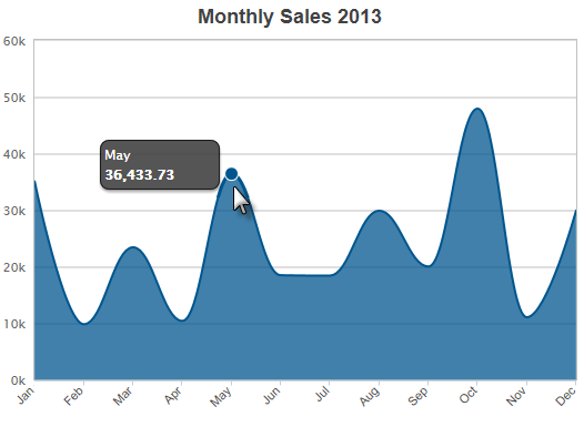
The Series.Area Spline element generates an Area chart with the characteristic curves of a Spline chart, which is commonly used to represent aggregated totals, as numbers or
percentages, over time.

The example above shows a simple Area Spline chart, representing sales per month for a year. Notice that, unlike a regular Area chart, the data region border is smoothly curved.

As shown above, the chart is created by adding Series.Area Spline to the canvas, along with a datalayer and, typically, some child elements that may include Time Period Column elements, a Group Filter, and a Group Aggregate Column element. Very few attributes need to be set for the Series element in order to produce a basic chart.
![]() A datalayer element can be used either beneath Series.Area Spline, as shown above, or beneath Chart Canvas. If used as a child of Chart Canvas, its data is available to all child Series elements. This can improve performance if you have several series, all using the same data, beneath the same Chart Canvas element.
A datalayer element can be used either beneath Series.Area Spline, as shown above, or beneath Chart Canvas. If used as a child of Chart Canvas, its data is available to all child Series elements. This can improve performance if you have several series, all using the same data, beneath the same Chart Canvas element.

The properties of the X- and Y-axis, including captions, are set using the X-Axis and Y-Axis elements. For example, in order to angle the X-axis labels, add an X-Axis element beneath Chart Canvas (none of its attributes need to be set) and add its child Label Style element. Set the Label Style element's attribute as shown above.