Creating Reports
This topic introduces how to create page and web reports. Before you can create reports in Logi Report Designer, you need to first create a catalog to connect with your database or open an exiting catalog.
In Logi Report Designer, the data resources that can be used to create different report types vary. Web reports and library components can only be created using business views. For page reports, the following data resources are supported: business views, queries, stored procedures, imported SQLs, imported APEs, user defined data sources and hierarchical data sources. In Logi Report Server, end users can create ad hoc web reports and page reports using business views via Web/Page Report Studio, and web reports and page reports created in Web/Page Report Studio can also be downloaded to Logi Report Designer for editing.
This topic includes the following sections:
Creating Page Reports
Creating a page report will automatically create a report tab in the page report.
- Select Home> New > Page Report or File > New > Page Report. The Select Component for Page Report dialog appears.
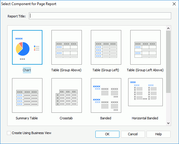
- In the Report Title text box, specify the title of the first report tab in the page report.
- Decide the data resource type for the page report. A page report can be created from either query resources or business views. To use business view as the data resource for the page report, select the Create Using Business View checkbox.
- Select the component that is to be created in the first report tab in the page report.
Creating Page Report Tabs
Before you can create report tabs, you first need to create a page report or open an existing page report. Then,
- Do either of the following:
- Select Home > New > Page Report Tab.
- Select File > New > Page Report Tab.
- On the report tab bar, right-click an existing report tab in the report and select Insert on the shortcut menu.
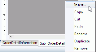
The Select Component for Page Report Tab dialog appears.
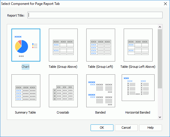
- In the Report Title text box, specify the title of the report tab. If you do not want a title, remove the text in the text box. The title is not used as the report tab name. For how to name a report tab, go here.
- Select the component to add in the report tab.
Logi Report provides you with the following component types to start a page report tab. The component types available for a report tab vary with the data resource type specified for the page report to which the report tab is to be added, which is determined at the time when the page report is created via the Create Using Business View option. Once defined, all the data components in the page report can only be created on the specified data resource type.
- Chart
Creates a report tab containing a chart. - Table (Group Above)
Creates a report tab containing a table with group information above the detail row. - Table (Group Left)
Creates a report tab containing a table with group information left to the detail row. - Table (Group Left Above)
Creates a report tab containing a table with group information left above the detail row. - Summary Table
Creates a report tab containing a table with only group and summary information. - Crosstab
Creates a report tab containing a crosstab. - Banded
Creates a report tab containing a vertical banded object. - Horizontal Banded
Creates a report tab containing a horizontal banded object. Not available when creating a report tab in a page report that is based on business views. - Mailing Label
Creates a report tab containing a banded object, which is in the form of a mailing label layout. Not available when creating a report tab in a page report that is based on business views. - Tabular
Creates a report tab with a tabular which partitions the report page into several parts. Not available when creating a report tab in a page report that is based on business views. - Blank
Creates a report tab with nothing in it.
- Chart
- Select OK.
- If the chart, table, crosstab or banded component type is selected, the corresponding wizard is displayed for you to create the data component. You can select the Page Setup button in the wizard to set the page settings for the report tab in the Page Setup dialog. For details about how to define the data component, see the following topics:
- Inserting Charts in a Report
- Inserting Tables in a Report
- Inserting Crosstabs in a Report
- Inserting Banded Objects in a Report
A banded object in a page report that is based on query resources can be a standard banded object, a horizontal banded object or a mailing label banded object. The steps for creating a banded object in any of the three layouts are mostly the same, just that the banded object is positioned differently in each layout: one in a vertical way, one horizontally and one in the form of mailing labels.
When you create a report tab with a table, crosstab or banded object in it into a page report that is based on query resources, the Chart screen is available in the report wizard, using which you can create a chart together with the data component. The chart can only be defined based on the data fields that have been added to the data component.
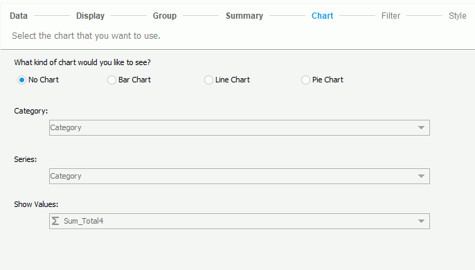
To define the chart:
- Select a radio button to select the chart type you like.
- From the Category drop-down list, select the field to display on the category (X) axis of the chart. To define the chart based on a table or banded object, you can choose from the group-by fields of the table or banded object on which some summaries are added; to define on a crosstab, you can choose from all the fields added to the column and row headers of the crosstab.
- Choose the field to display on the series (Z) axis of the chart from the Series drop-down list. To define the chart based on a table or banded object, you can choose from all the group-by fields of the table or banded object; to define on a crosstab, you can choose from all the fields added to the column and row headers of the crosstab.
- From the Show Values drop-down list, select the field to display on the value (Y) axis of the chart. To define the chart based on a table or banded object, you can choose from the summaries which are calculated based on the field you specify to display on the category axis of the chart; to define on a crosstab, you can choose from the aggregate fields in the crosstab.
When the report tab is created, the chart will be put in the report body together with the table or crosstab, or in the banded header panel of the banded object.
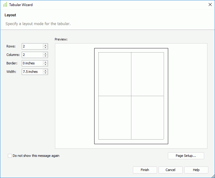
- If Tabular is selected, the Tabular Wizard is displayed. Specify the number of rows and columns, and the border width and tabular width respectively. You can also select the Page Setup button to set the page settings for the report tab in the Page Setup dialog. After the tabular is created, you can insert components and texts into the tabular cells and their layout will be controlled by the cells. A tabular helps you better design the report page. For details about how to work with tabulars, refer to Tabulars.
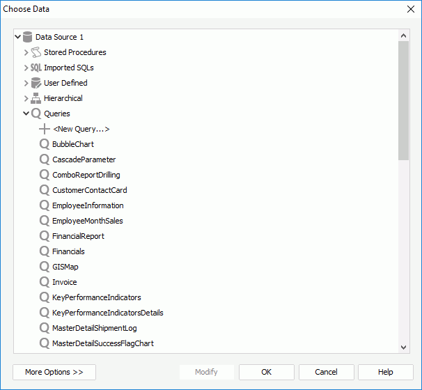
- If Blank is selected, the Choose Data dialog is displayed, prompting you to select the data resource on which to create the report tab. Depending on the data resource type the page report to which the report tab is to be added is specified, you can choose either from query resources or business views in the current catalog. After the blank report tab is created, you can then insert the required objects into the report tab as described in Components.
When selecting from query resources, if the given data resources are not what you want, you can select the first item in the corresponding resource node to create one. When a query is selected, you can select the Edit button to modify the query. Then a new dataset based on the selected data resource is created in the page report. If you want to use an existing dataset in the current page report for the page report tab, select the More Options button, then select the Existing Dataset radio button and select a dataset. You can select the Edit button to modify the selected dataset in the Dataset Editor, or select the <New Dataset...> item to create a new dataset in the page report to use. It is always better to use an existing dataset rather than create a new one. Even when the two datasets are based on the same query, Logi Report will still run the query separately for each dataset.
- If the chart, table, crosstab or banded component type is selected, the corresponding wizard is displayed for you to create the data component. You can select the Page Setup button in the wizard to set the page settings for the report tab in the Page Setup dialog. For details about how to define the data component, see the following topics:
Creating Web Reports
- Select Home > New > Web Report or File > New > Web Report.
- A blank web report with a tabular of one cell is displayed. You can then split the tabular and insert components to the tabular cells. For details, see the corresponding topic about the specific component in Components.
Creating Library Components
- SelectHome > New > Library Component or File > New > Library Component. The Select Component for Library Component dialog appears.
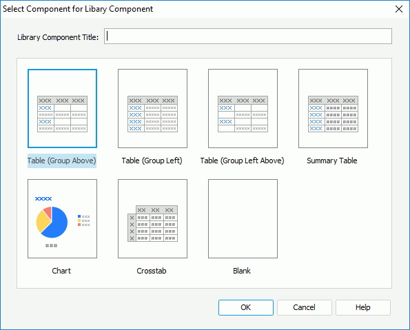
- Type a title for the library component in the Library Component Title text box.
- Select the type for the first data component in the library component.
- If Blank is selected, a blank library component is created; if a specific component type is selected, follow the wizard to create the data component in the library component. For details about how to define the data component, see the following topics:
- You can insert more components, such as charts, crosstabs, tables, KPIs, web controls, and so on into the library component. For details, see the corresponding topic about the specific component in Components.
A library component in Logi Report Designer contains three parts:
- Wrapper defines some basic properties of the library component, such as the author, title and description of the library component. The title bar of a library component is included in the wrapper. You can edit these properties in the Report Inspector.
- Configuration Panel can be used at runtime to set parameter values for the library component, filter or sort the library component, or change properties of the components in the contents.
- Contents contains three objects: Body, Data Source and Page Panel. Body is the container that can hold a number of components such as charts, crosstabs, tables, geographic maps, labels, images, web controls, and so on. Data Source contains the datasets the data components in the body use and the Refresh Object of each business view on which the datasets are based. Page Panel controls the page settings for printing and exporting the library component.
Saving the Data Components in a Web Report as Library Components
Logi Report also supports saving the data components: tables, charts (including the KPI charts in KPIs), crosstabs, and geographic maps in a web report as library components, provided that all the objects in the data components can be supported by library components.
- Open the web report which contains the data components you want to save as library components.
- Right-click a data component and select Save as Library Component from the shortcut menu.
- In the Save As dialog, specify the name for the library component in the File Name text box.
- The library component file type (*.lc) is the only default value in the Files of Type drop-down list.
- Select Save. The Library Component Setting dialog appears.
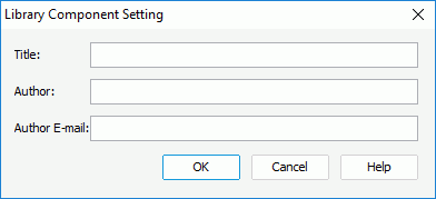
- Specify the title, author and the author's e-mail address in the Title text box, Author text box and Author Email text box respectively.
- Select OK to save the selected data component as a library component with the specified name and title.
- Repeat the above steps to save another data components in the web report as library components.
Defining the Configuration Panel for Library Components
If you want the dashboard users to make use of the configuration panel at runtime, you need to configure the panel for each library component in Logi Report Designer.
To display the configuration panel of a library component, select the Display Configuration Panel checkbox on the top-right corner of the design area. The height of the configuration panel can be adjusted to the size of the contents, but its width is equal to the width of the library component and cannot be adjusted. You can resize its width only by resizing the width of the library component.
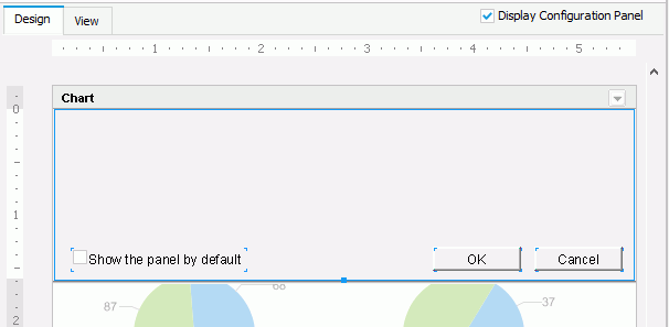
The initial configuration panel contains a checkbox and two buttons.
- The checkbox in the configuration panel is used to specify whether to show the panel by default when the library component is inserted into a dashboard in JDashboard. You can select the checkbox by setting the Default Show property of the configuration panel to true in the Report Inspector as well.
- All actions in the configuration panel are bound with the OK and Cancel buttons in it. You can select OK to apply the actions to the library component. The button Cancel is used to make this panel invisible and initialize the value of the web controls to the last values.The two buttons are built-in buttons so they cannot be deleted, cut, copied, or pasted, but their properties can be edited in the Report Inspector and they can be moved by dragging and dropping.
You can insert labels and use web controls such as Text Field, Checkbox, List, nd Drop-down List in the configuration panel to filter or sort a library component, or change properties of objects in a library component.
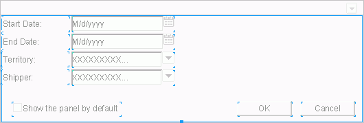
When a library component contains parameters, the configuration panel will be automatically populated with all the parameters needed to run the library component, and web controls for the parameters will be created automatically in the panel. Therefore, the configuration panel can also be used to specify parameter values for a library component at runtime. The values of the parameters saved in the library component will be used as the default values.
 Previous Topic