Inserting a Chart
With the chart wizard, it is easy to create charts in a report, however, the wizard varies with the data resource type used to create the chart: business view or query resource. The 3-D chart types are only supported in page reports that are created on query resources.
A web report and library component can only use business views as the data resource. For a page report it can be created either based on query resources or business views, which is determined at the time when the page report is created by the Create Using Business View option. Once defined, all the data components in the page report can only be created on the specified data resource type.
A chart can be inserted in the report areas listed in Component placement.
Below is a list of the sections covered in this topic:
Inserting a Chart Based on a Business View
- Position the mouse pointer at the destination where you want to insert the chart. For a web report or library component, the destination cannot be inside any other component such as a table. For a web report it is usually best to create a unique tabular cell for each component that you add. For a page report, the destination can be in an empty area of the page report or inside a banded object.
- Do either of the following:
- Drag the desired chart type button from the Visual category of the Components panel to the destination.
- Select Insert > Chart or Home > Insert > Chart.
The Create Chart wizard appears.
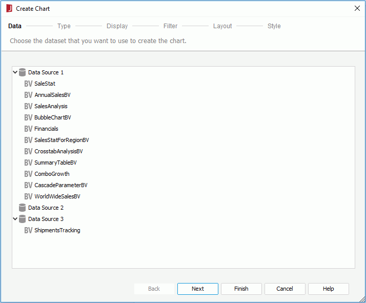
- In the Data screen, select a business view on which to create the chart.
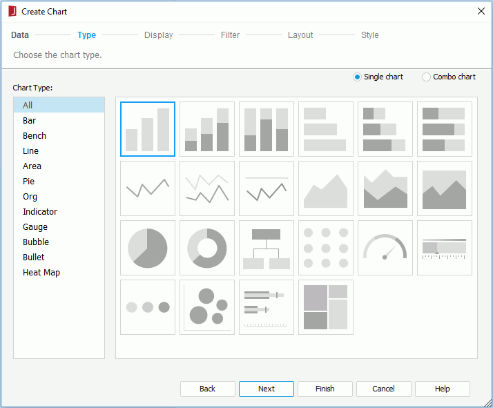
- In the Type screen, specify the type of the chart. Logi JReport automatically filters out the chart types that cannot be supported in the report where the chart is to be inserted and lists only the
supported types.
- To create a single chart, check the Single Chart radio button, and then select the required type from the Chart Type box and its subtype accordingly.
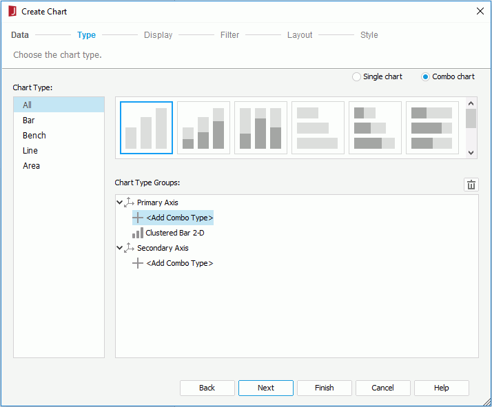
- To create a combo chart, check the Combo Chart radio button. You can see that the Chart Type Groups box lists the two value axes: the primary axis (Y1) and the secondary axis (Y2), and an <Add Combo Type> item is displayed for each axis. A default chart subtype has been added to the primary axis. To add an additional subtype to an axis, select the corresponding <Add Combo Type>, and you will find that a subtype has been added. To change any subtype listed in the box, select it then choose your required chart type from the Chart Type box, and select the thumbnail for the subtype you want in the Sub Type box. To delete a subtype, select it and select
 . Most often combo charts will use a bar chart on the primary axis and a line chart on the secondary axis to make a readable chart.
- To create a single chart, check the Single Chart radio button, and then select the required type from the Chart Type box and its subtype accordingly.
- The Display screen varies with chart types: common chart, organization chart, heat map.
- For common chart types
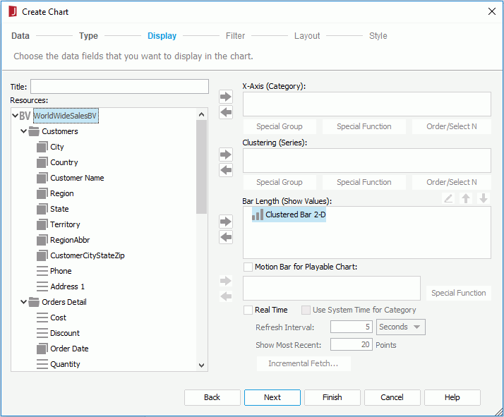
Specify a title for the chart in the Title text field. In the Resources box, all the view elements in the specified business view as well as the dynamic resources of the business view are listed. Select a field in the Resources box and select
 beside the corresponding axis box or drag and drop it from the Resources box to the axis box to add it to the category axis, series axis or value axis of the chart. To remove a field from an axis, select it in the corresponding axis box and select
  or drag and drop it to the Resources box. You can add multiple fields as long as they are of Numeric type and use additional values on the value axis, while only one field is allowed on the category or series axis. For the category and series fields, you can define special group and Order/Select N condition on them if required.
However, the value axis for the bubble chart type is slightly different from other common chart types. You need to specify the fields to be shown on the bubble X axis, Y axis and the value you want to show as the bubble radius respectively in the Show Values box. When a value is added for the bubble X axis, this value will be displayed on the category axis instead of the one specified in the Category box, while, the value defined in the Category box will still be included in data calculation. See Creating a Motion Chart for a bubble chart example.
You can also choose to make the chart a real time chart or a motion chart.
To add an additional value to the value axis:
- From the Resources box, select Constant Value/AverageValue in the Additional Value node and select
 beside the Show Values box. The Edit Additional Value dialog appears.
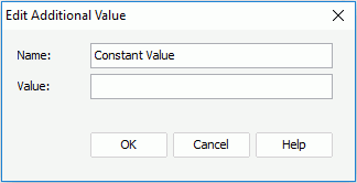
- In the Name text box, specify the display name for the constant/average value.
- Input the constant value with numeric type in the Value text box, or select a field based on which the average value will be calculated from the Based On drop-down list.
- Select OK, and the defined constant/average value will be added into the Show Values box.
If you want to further modify a constant/average value, select the value in the Show Values box, then select
 . In the Edit Additional Value dialog, edit the value as required.
- From the Resources box, select Constant Value/AverageValue in the Additional Value node and select
- For organization chart
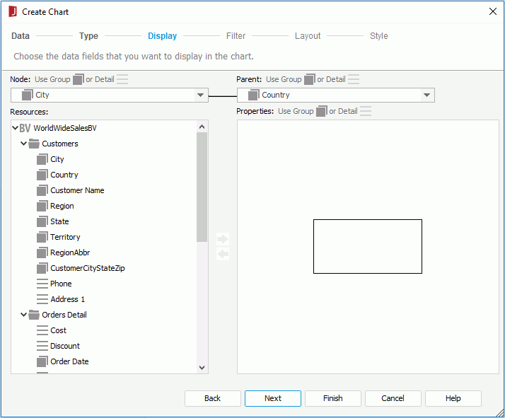
- The Node drop-down list displays all the the group and detail objects in the specified business view. Select one field from the drop-down list to define the entities the org chart nodes are mapped to.
- Select a group or detail object from the Parent drop-down list to define the ownership or reporting to relations among the entity members. For example, if the child node field is Employee ID, the parent field can be the one about IDs showing which employee ID reports to which employee ID. Note that the parent field should use different one from the child node field.
- The Properties box displays a node model in the org chart. You can add objects, including group objects, detail objects, dynamic formulas that are used as group or detail objects, labels and images, from the Resources box into the node and then adjust their positions and sizes in the node and the size of the node. Those added objects will be displayed in each node as the information about the entity members.
To add an object, drag it from the Resources box and drop to the specific position in the node area in the Properties box, or select it from the Resources box and then select
 .
.To remove an object from the node, select it and then select
 or press Delete on the keyboard.
- For heat map
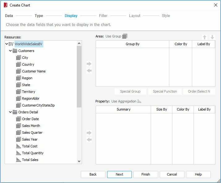
- Add the group objects in the specified business view or dynamic formulas of the business view that are used as group objects into the Area box to group the data in different areas. To add a group object, select it in the Resources box and select
 beside the Area box, or drag and drop it from the Resources box to the Area box. If a group object is not required, select it and select
  or drag and drop it to the Resources box. You can add or remove only one group object at a time. Select
 and
and  to adjust the group levels.
 - Define special group, special function and Order/Select N condition on each group if required.
- Add proper aggregations in the specified business view into the Property box using either
 or by dragging and dropping. You can also use dynamic formulas used as aggregation objects or dynamic aggregations in the Property box.
 - From both Area and Property boxes, specify the fields to do color by and size by, and select the fields to display in the innermost rectangle in the heat map.
- Add the group objects in the specified business view or dynamic formulas of the business view that are used as group objects into the Area box to group the data in different areas. To add a group object, select it in the Resources box and select
- For common chart types
- To apply filters to the chart so as to reduce the data displayed in the chart, go to the Filter screen. Select a predefined filter of the specified business view if there are any from the Filter drop-down list to apply, or select User Defined in the list to define a new filter. For how to define a filter, refer to Filtering the Data.
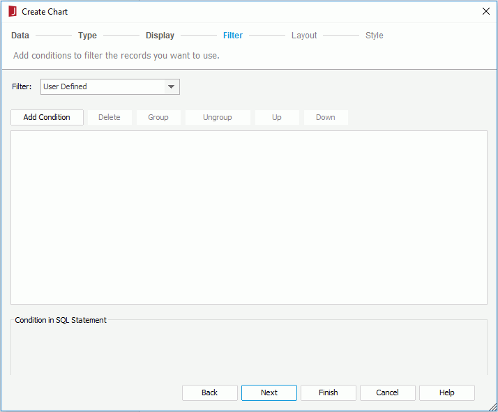
- In the Layout screen, specify the layout of the chart.
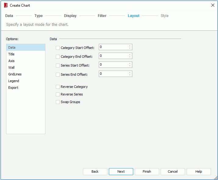
- For common chart types, specify the category/series start and end offset, whether or not to reverse the category/series field value sequence, and whether or not to swap groups. Specify the titles for the chart, the category axis and value axis respectively. Check whether or not to show the axes, walls, gridlines, and legend. If you choose not to display a certain axis, the labels and tick marks along the axis will be hidden as well.
- For organization chart, choose a way of expanding the org chart tree and specify the title for the chart.
- For heat map, specify the chart title and whether to show the chart legend.
- In the Style screen, select a style for the chart.
- Select Finish to insert the chart.
If the chart is to be inserted into a position other than the report body or tabular cell, after selecting Finish in the wizard, you need to select the mouse button in the destination once again in order to insert the chart there.
You can now further format elements of the chart according to your requirements.
Inserting a Chart Based on a Query Resource
- Position the mouse pointer at the destination where you want to insert the chart. It can be in an empty area of the page report or inside a banded object or table.
- Do either of the following:
- Drag the desired chart type button from the Visual category of the Components panel to the destination.
- Select Insert > Chart or Home > Insert > Chart.
The Create Chart wizard appears.
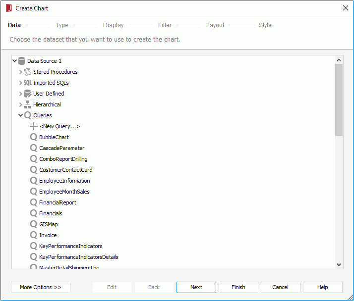
- In the Data screen, select the data resource on which to create the chart. If the given data resources are not what you want, select the first item in the corresponding resource node to create one. When a query is selected, select the Edit button to modify the query if required. Then a new dataset based on the selected data resource is created in the page report.
- Check the Existing Dataset radio button and select a dataset. You can select the Edit button to modify the selected dataset in the Dataset Editor if necessary, or select the <New Dataset...> item to create a new dataset in the page report to use. It is always better to use an existing dataset rather than create a new one. Even when the two datasets are based on the same query, Logi JReport will still run the query separately for each dataset.
- Check the Current Dataset radio button to make the chart inherit the dataset from its parent.
- In the Type screen, specify the type of the chart. You can choose to create either a single chart or a combo chart.Logi JReport automatically filters out the chart types that cannot be supported in the report where the chart is to be inserted and lists only the
supported types.
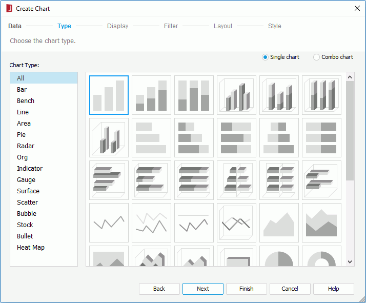
- The Display screen varies with chart types: common chart, organization chart, heat map.
- For common chart types
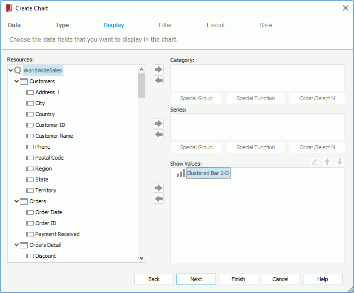
In the Resources box, all the DBFields in the specified data resource as well as the valid formulas and summaries of the data resource are listed. Select a field in the Resources box and select
 beside the corresponding axis box or drag and drop it from the Resources box to the axis box to add it to the category axis, series axis or value axis of the chart. To remove a field from an axis, select it in the corresponding axis box and select
  or drag and drop it to the Resources box. When the predefined formulas or summaries cannot meet your requirements, you can select <New Formula...> in the Formulas node to create formulas, or <New Summary...> in the Summaries node to create summaries to use in the chart, which will be saved into the same catalog data source as the data resource used to create the chart. You can add multiple fields as long as they are of Numeric type and use additional values on the value axis, while only one field is allowed on the category or series axis. For the category and series fields, you can further define special group, special function and Order/Select N condition on them if required.
However, the value axis for the back-to-back and bubble chart types is slightly different from other common chart types.
- For a back-to-back bench chart, two comparison types are provided to define the values on the origin left and origin right of the chart (additional values cannot be used for comparison). See Creating a Back-to-back Bench Chart for more information about this chart type.
- For a bubble chart, you need to specify the fields to be shown on the bubble X axis, Y axis and the value you want to show as the bubble radius respectively in the Show Values box. When a value is added for the bubble X axis, this value will be displayed on the category axis instead of the one specified in the Category box, however, the value defined in the Category box will still be included in data calculation.
Note: If you have defined a subtype of the Stock type, you should add fields for the subtype in the order indicated by the subtype name, for example, if you define the Open-High-Low-Close 2-D subtype, then you should add four fields to the Show Values box for this subtype, and arrange them to the order of Open-High-Low-Close by selecting the buttons
 and
and  .
. - For organization chart
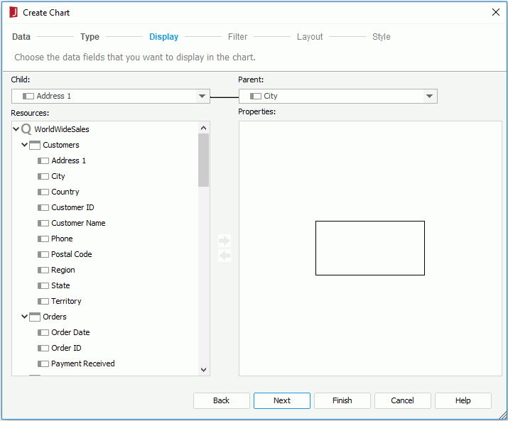
- Select a field from the Child drop-down list which defines the entities the org chart nodes are mapped to.
- Select a field from the Parent drop-down list which defines the ownership or reporting to relations among the entities. For example, if the child field is Employee ID, the parent field can be the one about IDs showing which employ ID reports to which employ ID. Note that the parent field should use different one from the child field.
- The Properties box displays a node model in the org chart. You can add objects, including DBFields, formulas, labels and images, from the Resources box into the node, and then adjust their positions and sizes in the node and the size of the node. Those added objects will be displayed in each node as the information about the entity members. You can also select <New Formula...> in the Formulas node to create formulas to use in the chart, which will be saved into the same catalog data source as the specified data resource used to create the chart.
To add an object, drag it from the Resources box and drop to the specific position in the node area in the Properties box, or select it from the Resources box and then select
 .
.To remove an object from the node, select it and then select
 or press Delete on the keyboard.
- For heat map
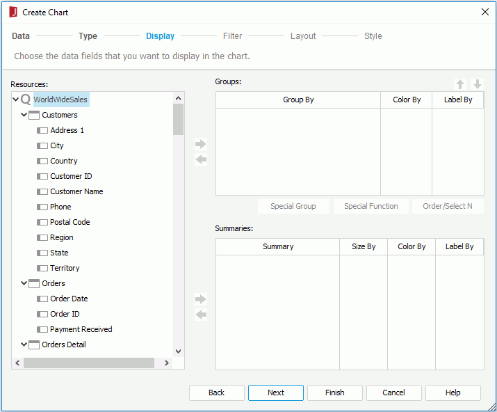
- Add the DBFields or formulas used as group fields to group the data into the Groups box.
You can also select <New Formula...> in the Formulas node to create formulas to use in the heat map, which will be saved into the same catalog data source as the specified data resource used to create chart. To add a field, select it in the Resources box and select
 beside the Groups box, or drag and drop it from the Resources box to the Groups box. If a field is not required, select it and select
  or drag and drop it to the Resources box. You can add or remove only one field at a time. Select
 and
and  to adjust the group levels.
 - Define special group, special function and Order/Select N condition on each group field if required.
- Add proper summaries into the Summaries box using either
 or by dragging and dropping.
When no group is specified in the Groups box, you can insert any static summary, and its group-by field will be inserted into the Groups box automatically. When there are multiple groups, static summaries should match the lowest-level group. For example, if the groups level is A > B > C, the static summaries grouped by C can be inserted into the Summaries box, but the static summaries grouped by A, B or other fields cannot. You can also select <New Summary...> in the Summaries node to create summaries to use in the heat map, which will be saved into the same catalog data source as the specified data resource used to create chart.
- From both Groups and Summaries boxes, specify the fields to do color-by and size-by, and select the fields to display in the innermost rectangle in the heat map.
- Add the DBFields or formulas used as group fields to group the data into the Groups box.
You can also select <New Formula...> in the Formulas node to create formulas to use in the heat map, which will be saved into the same catalog data source as the specified data resource used to create chart. To add a field, select it in the Resources box and select
- For common chart types
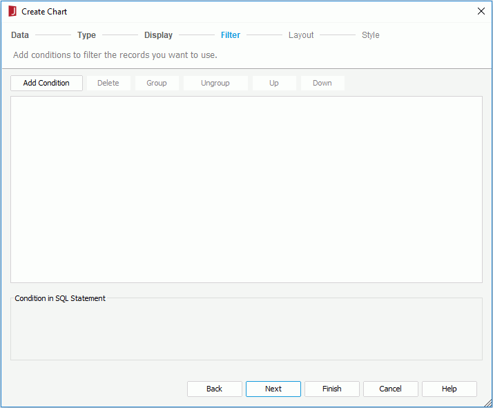
- To apply filters to the chart so as to reduce the data displayed in the chart, go to the Filter screen and define the filter conditions. For how to define a filter, refer to Filtering the Data.
- In the Layout screen, specify the layout of the chart.

- For common chart types, you can specify the category/series start and end offset, whether or not to reverse the category/series field value sequence, and whether or not to swap groups. Specify the titles for the chart, the category axis and value axis respectively. Check whether or not to show the axes, walls, gridlines, and legend. If you choose not to display a certain axis, the labels and tick marks along the axis will be hidden as well.
- For organization chart, choose a way of expanding the org chart tree and specify the title for the chart.
- For heat map, specify the chart title and whether to show the chart legend.
- In the Style screen, select a style for the chart.
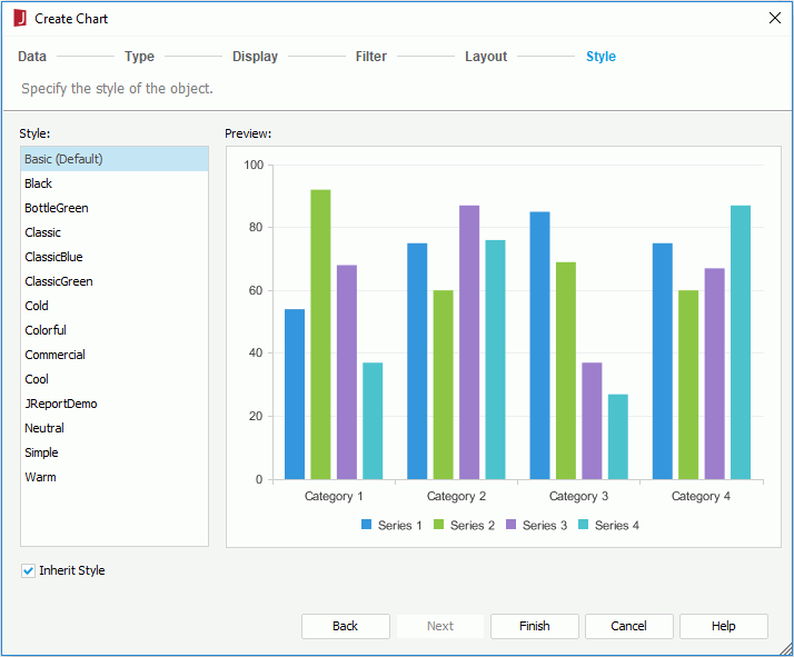
When you have specified to insert the chart into a banded object or table, by default the chart will inherit its parent's style. If you want to apply another style to the chart, uncheck the Inherit Style option and then select the required style from the Style box. For more information, see Inheriting Styles.
- Select Finish to insert the chart.
If you have specified to insert the chart to a position other than the report body or tabular cell, after selecting Finish in the wizard, you need to select the mouse button in the destination once again in order to insert the chart there.
If you want to use an existing dataset in the current page report to create the chart, select the More Options button and then:
You can now further format elements of the chart according to your requirements. When the chart is inserted into a banded object or table, you can set up a data container link between the chart and its parent.
- For a 2-D chart of bar, bench, line, area or stock type, you can select the values you are interested in to have them zoomed in at Designer preview and at runtime (not available for page report charts running in Page Report Studio). To do this:
- Drag the mouse from the start value to the end value you want to select, then release the mouse. The selected values will be zoomed in. If the chart is equipped with a scrollbar, the bar will be adjusted automatically at the same time.
- If you want to return to the initial status, just select the return button
 on the upper right corner of the chart paper.
- For an organization chart, you can edit the node model in the design area in the following ways:
- Resize the node model.
- Adjust the sizes and positions of the objects in the node model.
- For a heat map, you can edit it in the design area too. Only the first rectangle which represents the innermost rectangle is editable and can contain objects. You can insert labels and images into it, and can also input text in the rectangle directly. For the objects in the rectangle, you can edit or delete them just like they are in a text box.
 Previous Topic