Creating a Back-to-back Bench Chart
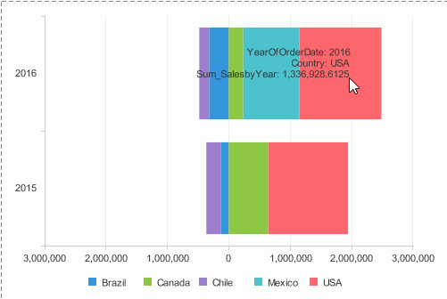
Back-to-back bench chart is used for comparing values on the value axis. It displays and compares the contribution of each data value on the origin left and origin right across categories. For example, you may want to do a chart comparing the sales of each country in Latin America and North America, you can use a back-to-back chart to display category Year and series Country, and define a condition on the series to make the Latin American countries display on the origin left of the category axis and North American countries on the origin right. Then you get to easily see not only the individual countries but can compare both regions.
Currenly the back-to-back bench chart type is only supported in page reports that are created using query resources.
To create a back-to-back bench chart:
- In the Data screen of the chart wizard, specify a query resource on which to create the chart.
- In the Type screen, select the Bench chart type, then from the Sub Type box, select a back-to-back type: Back to Back Bench 2-D, 100% Back to Back Bench 2-D, Back to Back Bench 3-D or 100% Back to Back Bench 3-D.
- In the Display screen, select the field from the Resources box and select
 beside the Category box or drag and drop it from the Resources box to the Category box to have it display on the category axis of the chart. Repeat this to specify the field on the series axis. To remove the field added on either axis, select it and select
  or drag and drop it to the Resources box. You can define special group, special function and Order/Select N condition on the category and series fields if required.
 - Define how the comparison on the value axis of the chart is created. You can either add two values on the origin left and origin right of the value axis to compare or
make the comparison based on the series field values if the chart contains a series field.
When the comparison is based on series values, you need to further define the series values display
on the origin left and origin right of the value axis: either manually or use a condition.
- To make the comparison based on fields displayed on the value axis, check Show Values. Select a Numeric type field in the Resources box, specify where you want the field to display on the value axis, the origin left or right, by selecting the chart type node in the Left or Right box, then select
 or drag and drop it to the Left or Right box. Select the chart type node in the opposite box and add the field to display on the opposite origin of the value axis. Only one field is allowed for one origin. To remove the field added on either origin, select it and select
  or drag and drop it to the Resources box.
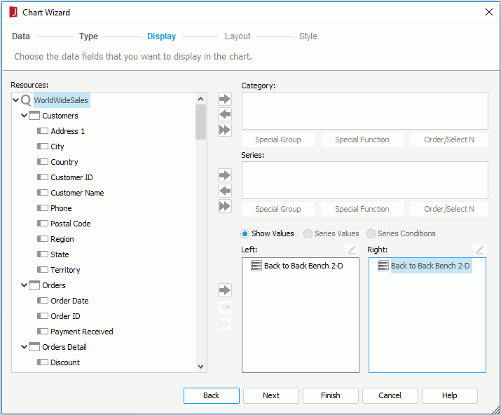
- To compare based on the series field and define the series values manually, check Series Values. Select
 above the Left/Right box to add a value line, double-click in the line and enter the required value of the series field. Repeat this to add more value lines. You can adjust the display order of the value lines in the box by selecting
  or
or  . To remove a value line, select it and select
  . Add the field to the Show Values box to have it display on the value axis of the chart. Then when you run the chart, the specified series values will be shown on the origin left/right of the value axis on the chart and the undefined values of the series field will be shown on the opposite origin.
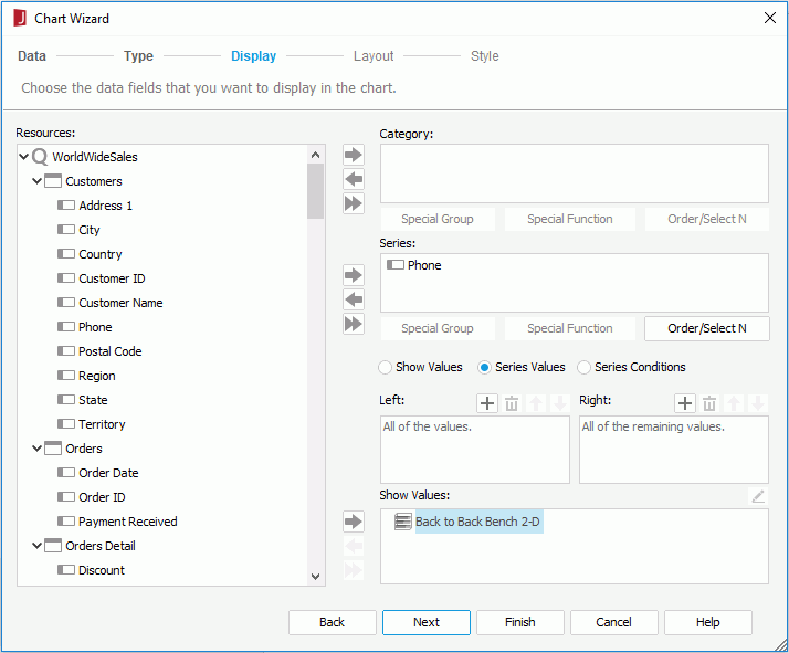
- To compare based on the series field and use a condition to define the series values, check Series Conditions. Select
 above the Left/Right box. In the Edit Condition dialog, define the conditional expression on the series field and select OK (for how to define a condition, refer to Filtering the Data). The conditional expression is then displayed in the Left/Right box. Add the field to the Show Values box to have it display on the value axis of the chart. Then when you run the chart, the series values that meet the specified condition will be shown on the origin left/right of the chart, and the remaining values of the series field will be shown on the opposite origin.
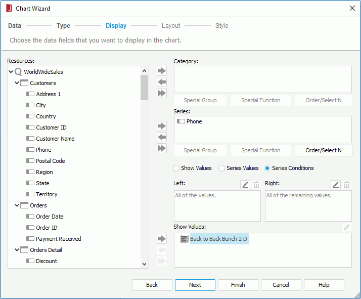
- To make the comparison based on fields displayed on the value axis, check Show Values. Select a Numeric type field in the Resources box, specify where you want the field to display on the value axis, the origin left or right, by selecting the chart type node in the Left or Right box, then select
- In the Filter, Layout and Style screens, specify the filter conditions to narrow down data displayed on the chart and the layout and style for the chart. Select here for more information.
- Select Finish to create the chart.
Example of creating a back-to-back bench chart
Suppose you want to have a chart to compare the sales for individual countries in Latin America and North America, you can create it as follows:
- Open the catalog file SampleReports.cat in
<install_root>\Demo\Reports\SampleReports. - Select File > New > Page Report.
- In the Select Component for Page Report dialog, select Chart and select OK. The Chart Wizard is displayed.
- In the Data screen, select More Options to expand the dataset selection panel.
- Check the ExistingDataset radio button, and select <New Dataset...>.
- In the New Dataset dialog, select WorldWideSales from the Queries node, then select OK to create the dataset and close the dialog. A new dataset WorldWideSales is added to the dataset list and selected by default in the Data screen of the Chart Wizard.
Next we will filter the dataset to use data in the Latin America and North America regions only. By using dataset filter, the reports that use the same query will not be affected.
- Select the Edit button. In the Dataset Editor, switch to the Filter tab, then specify the filter condition as Region = Latin America Or Region = North America and select OK.
- Select Next in the Chart Wizard.
- In the Type screen, select the Bench chart type, then select Back to Back Bench 2-D from the Sub Type box. Select Next.
- In the Display screen, add Country in the Customers table to the Series box.
- Check Series Conditions and select
 above the Right box.
 - In the Edit Condition dialog, specify the filter condition as Country in Canada,Mexico,USA. Select OK to return to the Chart Wizard. The condition is displayed in the Right box.
- Add the summary Sum_SalesbyYear to the Show Values box. The summary is grouped by the formula YearOfOrderDate, so the formula is added to the Category box automatically.
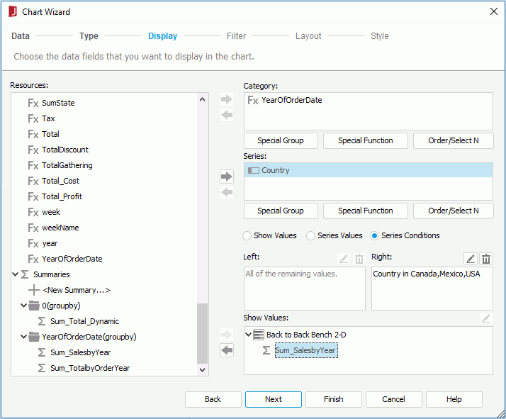
- Select Finish to create the chart.
- Save the report and view it. You can see sales for countries in Latin America are shown on the origin left of the category axis and sales of North American countries on the origin right.
 Previous Topic