Tabbed Panels
The ability to visually group charts, reports, and other elements using panels that can be selected by tabs is an interesting and useful capability. Tabs and Tab Panel elements in Logi Info provide developers with this capability and are discussed in this topic.
- About Tabbed Panels Attribute
- The Basic Tab Elements
- Work with the Tabs Element
- Work with the Tab Panel Element
About Tabbed Panels
Tabbed panels provide a neat method of grouping things together and are a commonly-understood mechanism in user interfaces.
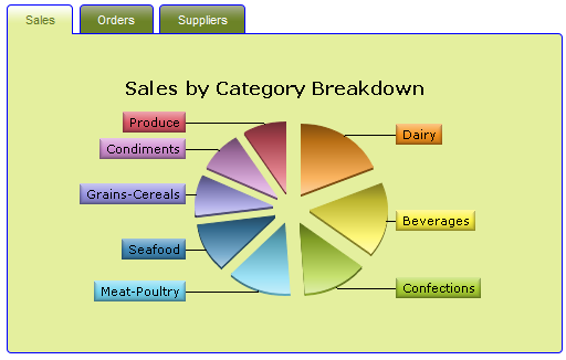
As shown above, each panel has a "tab" that extends beyond the panel, either at the top or bottom or the sides. The selected panel is presented as being "in front" of the unselected panels. The tabs themselves can have a different appearance depending on whether they're the selected tab or not.
Tab panels may contain just about any other element, although the use of super-elements, such as the Analysis Grid, within a tab panel is not recommended. In addition, do not use tab panels within an Embedded-type subreport (within an IncludeFrame-type subreport is OK). All of these elements use AJAX, and nesting them in these ways causes unpredictable AJAX behavior.

The appearance of the tabs and tab panels can be controlled both with style classes and through the use of themes. As shown above, the theme can be used to round all the square corners (this only works in Firefox- and Chrome-type browsers, not in IE).
You may use multiple Tabs and Tabbed Panel sets in a single report definition, however, they will all have the same style-related appearance.
The Basic Tab Elements
Two elements, Tabs and Tab Panel, are used to implement tabbed panels in Logi reports:
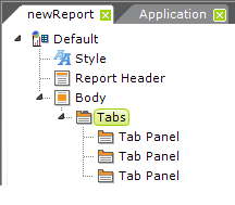
As shown above, the Tabs element is the parent of one or more Tab Panel child elements.
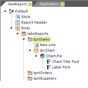
As mentioned earlier, Tab Panel elements can contain a wide variety of other elements, including those for tables, charts, user input, images, labels, and more. In the example above, a Chart.Pie has been placed in the first tab panel.
Notice that the example shown above uses a Division element ("divChart") in the Tab Panel, and it contains the pie chart. This is the proper way to align content in the panel. The division's Class attribute can be set to a style class that will, for example, center its contents, and you must also set its Output HTML Div Tag attribute to True to make it work.
You can specify an exact size for Tab Panels but, if you do not, they will automatically size themselves to their contents.
Work with the Tabs Element
The Tabs element is the parent element for one of more Tab Panels elements. The attributes of the Tabs element are:
| Attribute | Description |
|---|---|
ID |
(Required) The unique element identifier. |
Active Tab Background Color | Specifies the background color for the active tab panel. Enter a color by name, decimal RGB value, or hex RGB value. Prefix hex values with the pound sign, such as #112233. |
Border Color | Sets the color of the border lines for all tab panels. If border lines are not desired, you may select "Transparent". Enter a color by name, decimal RGB value, or hex RGB value. Prefix hex values with the pound sign, such as #112233. |
Default Tab | The ID of the Tab Panel that will be initially selected when the report is displayed. See the paragraph below concerning how to maintain the tab selection between page refreshes. |
Height | Specifies the fixed height of the tab panels. Leaving this value blank will cause the panels to dynamically resize themselves based on their content. The adjacent Height Scale attribute specifies whether this value is in to be applied in pixels or as a percentage. |
Inactive Tab Background Color | Specifies the background color for inactive tab panels. Enter a color by name, decimal RGB value, or hex RGB value. Prefix hex values with the pound sign, such as #112233. |
| Security Right ID | Controls access to this element using Logi Security. Provide the ID of a Right defined in the application's _settings definition and only users that have a Role referenced in the Right will be able to see the element. Multiple Right IDs, separated by commas, may be entered. |
Tab Location | Specifies location of the tabs that the user clicks to switch between tab panels. Options include: Top, Bottom, Left, and Right. The default is "Top". |
| Tabbing Style | Controls when tab panel content is refreshed and rendered. If the default value, Static, is selected, the content of all tabs is retrieved and rendered when Tabs element is displayed. When the user selects a hidden tab, the tab panel's content is already at the browser and the selected tab and content are displayed immediately If the value Ajax is selected, the contents of tabs other than the first one are not retrieved and rendered until each tab is selected. When the user selects a tab, an AJAX request is sent to the server to get its panel's contents. This can help reduce rendering time when there are many tabs, especially if those panels contain datalayers. If a tab is re-selected after other tabs have been selected, the panel is simply redisplayed without going back again to the server for content. If the value RefreshPage is selected, tab panel contents that are initially unselected are not processed by the server until the user selects their tab. When selected, the panel page is always re-submitted and therefore displayed with refreshed content. As with the previous mode, this can help reduce rendering time when there are many tabs, especially if their panels contain datalayers. |
Width | Specifies the fixed width of the tab panels. Leaving this value blank will cause the panels to dynamically resize themselves based on their content. The adjacent Width Scale attribute specifies whether this value is in to be applied in pixels or as a percentage. |
Maintain the Tab Selection Between Page Refreshes
It may be desirable to maintain the current tab selection when the page is refreshed. For example, if a data table is displayed in a tab panel and its records can be sorted by clicking column headers, the current tab should remain selected after a column header is clicked, the table is resorted, and the page is refreshed.
When a page with tabs is submitted using Action elements, the ID of the currently selected Tab Panel is automatically sent out as the value of a request variable. The request variable name is set to the ID of the Tabs element. Referring to the example definition shown earlier in this topic and assuming that the Sales tab was selected, this request variable would be sent when the page is submitted: tabsReports = tpnlSales.
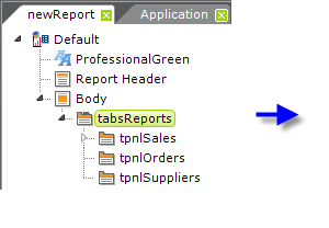
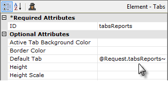
So, by setting the Default Tab attribute of the Tabs element to the request variable token, as shown above, the current tab will be maintained when the page is refreshed.
Work with the Tab Panel Element
The Tab Panel elements are the visible component of tabbed panels and include the little tab that users click to change panels and the area that's displayed when they do so. The attributes of the Tab Panel element are:
| Attribute | Description |
|---|---|
ID |
(Required) The unique element identifier. |
Caption | (Required) Specifies the text that will appear on the little tab that a user clicks (the selection tab) to change panels. This text appears as a link and, like all links, its appearance can be controlled using style sheet classes. If your caption seems too long, consider using an abbreviation and putting longer text into a Tooltip. |
Class | Specifies the style sheet class to apply to the tab panel. Note: Classes are applied to the text in the selection tab link and to elements that appear within the Tab Panel, such as labels. For example, padding applied using classes will affect both the Caption text and elements in the Tab Panel. To isolate elements in the panel from the Caption text, consider adding a Division element within the panel, moving the panel contents within it, and then applying a class to it. |
| Security Right ID | Controls access to this element using Logi Security. Provide the ID of a Right defined in the application's _settings definition and only users that have a Role referenced in the Right will be able to see the element. Multiple Right IDs, separated by commas, may be entered. |
Show Modes | Specifies whether the tab panel is visible or hidden. This attribute can be used to dynamically increase or reduce the number of tabs available for selection, based on runtime criteria. |
Tooltip | Specifies text that appears when the mouse is hovered over a tab. Note that if this attribute is left blank, the word "active" will appear as a default tooltip. |
Change Tab Panel Content Dynamically
This next example illustrates two more important ideas about working with Tabs. The first is that embedded subreports can be placed into tab panels, allowing you to develop panel contents as independent reports first, before integrating them into your tab panel. This can make debugging and report polishing much easier.
The second is that tab panel contents, through the use of Division elements, can be dynamic. By showing and hiding divisions, based on request variables, one tab panel can have multiple uses.
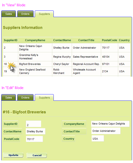
Suppose we want a tab panel to show a data table and then be able to edit the data for a single row in that table, using a data entry form, in the same tab panel, as shown above.
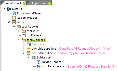
To achieve this, we'll begin by placing two Division elements in the Tab Panel "tabSuppliers", as shown above. The first division contains the elements that display the data table of supplier information. A column in this table, such as a SupplierID, is a link that refreshes the report, passing both the Supplier ID value and a variable indicating whether we're in "View" or "Edit" mode. This "mode" request variable is used in the divisions' Condition attribute to determine which division will be displayed.
The second division, as shown above, uses a SubReport element, in Embedded mode, to include a separate definition which contains the data entry form. The Link Parameters element is used to pass the request variable containing the Supplier ID to the subreport, so it knows which supplier record to look up and present in the data entry form.
Did you follow all that? It depends entirely on the fact that reports can call themselves ("refresh" themselves) and also pass request variables to the refreshed report in the process.
In summary, tabbed panels provide a useful, well-recognized, and convenient mechanism for arranging and displaying data without using separate report pages, and Logi Info provides an easy way to implement them.