Popup Panels
Logi Info includes the Popup Panel element, which extends popup functionality beyond the Popup Menu. This element provides a fully-functional, configurable window that can include data tables, charts, sub-reports, images, and other standard visualizations. The Tooltip Panel, a variation of the Popup Panel, is available in both Logi Info and Logi Report and is also discussed here.
- About the Popup Panel
- Popup Panel Attributes
- Use a Popup Panel with a Link
- Use a Popup Panel with the onMouseOver Event
- Pass Parameters to a Popup Panel
- The Tooltip Panel
About the Popup Panel
The Popup Panel, available in Logi Info only, is a separate window that you can open "on top" of your existing report page. You can control its size, initial location, modal state, style, and, of course, its contents. It can contain almost every other element you would use in a regular report, with the exception of the super-elements (Dashboard, Analysis Grid, IDV, etc.). and a few others.
The visibility of a Popup Panel is controlled using the Action.Show Element element and therefore it can be shown or hidden when a user clicks a link, button, image, or data, or when a DHTML event occurs.
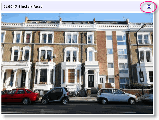
As you can see in the example above, Popup Panels include a Title Bar, where the element's Caption attribute value appears, and a "close button" appears at the right end of the title bar for closing the panel.
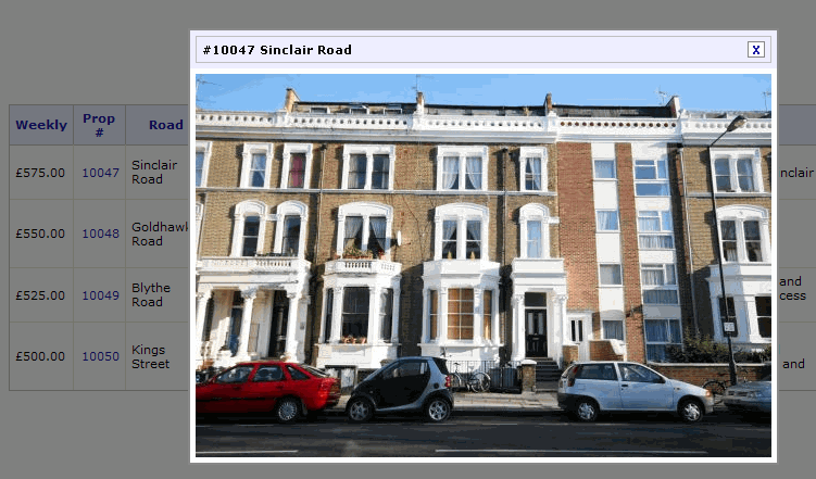
Panels can either be displayed as Modal or non-Modal. As shown above, when a modal panel is displayed, the underlying page is disabled and shaded in transparent gray until the panel is closed.
The Popup Panel uses its own style classes to set colors, font sizes, spacing and other presentation values. These can be overridden by adding classes with the same names to your own stylesheet. The panel's stylesheet is:
<application folder>/rdTemplate/rdPopup/rdPopupPanel.css
In order for the style class override effect to work, your style sheet must be named in a Style Sheet element that is lower in your report definition's element tree than the Popup Panel element.
Popup Panel Attributes
The non-standard attributes for the Popup Panel element are described below:
| Identifiers | Description |
|---|---|
Caption | The text that will appear in the panel's Title Bar. |
| Close Button Caption | Popup panels can include a "close" button in the title bar, which by default is an "X". This attribute allows you to specify different text instead, such as "Done". |
| Close Button Class | Specifies an alternate class for the Close Button. |
| Height | Height of panel. If left blank, panel will automatically size to its contents. |
| Height Scale | Measurement units applied to previous attribute: Percent or Pixels. |
| Hide Close Button | When True, the Close Button will not be displayed. Default: False |
| Popup Modal | When True, the panel is shown in a Modal state, disabling the rest of the report page and shading it with a transparent gray overlay. Default: False |
| Popup Movable | When True, allows the panel to be dragged and repositioned. |
| Popup Panel Location | The location at which the panel will be shown. Choices include: |
| Show On Page Load | Causes the Popup Panel to be automatically displayed when the report page is loaded. Default: False |
| Width | Width of panel. If left blank, panel will automatically size to its contents. |
| Width Scale | Measurement units applied to previous attribute: Percent or Pixels. |
Use a Popup Panel with a Link
Adding a Popup Panel to your report definition is simple and straightforward.
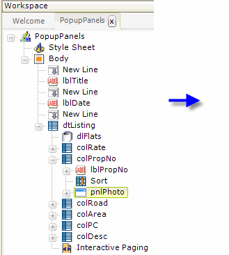
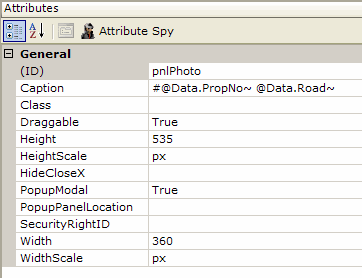
In the example above, a Popup Panel element (named "pnlPhoto") has been added to the definition in a table column. Its attributes have been set to size it and control its behavior. Note that the panel's caption will display data from the datalayer, through the use of @Data tokens, which is why this element has been placed as a child-element beneath a Data Table Column element ("colPropNo"). Otherwise it could be placed anywhere in the definition.
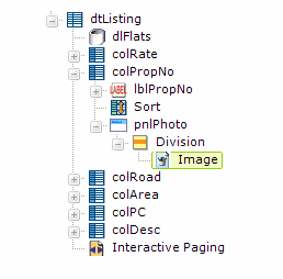
Below the Popup Panel element, Division and Image elements have been added and the Image's Caption attribute set to data returned from the datalayer (in this case, an image filename).
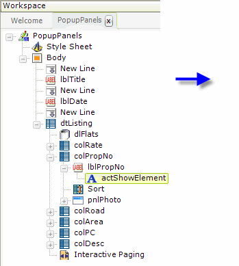
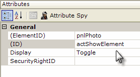
Next, above, a link has been created, which shows or hides the Popup Panel, by adding an Action.Show Element element to the Label element that displays the data in the report's Property Number column. Its attributes are set to make it act upon the Popup Panel ("pnlPhoto") and to cause the panel's visibility to toggle, or alternate, between shown and hidden.
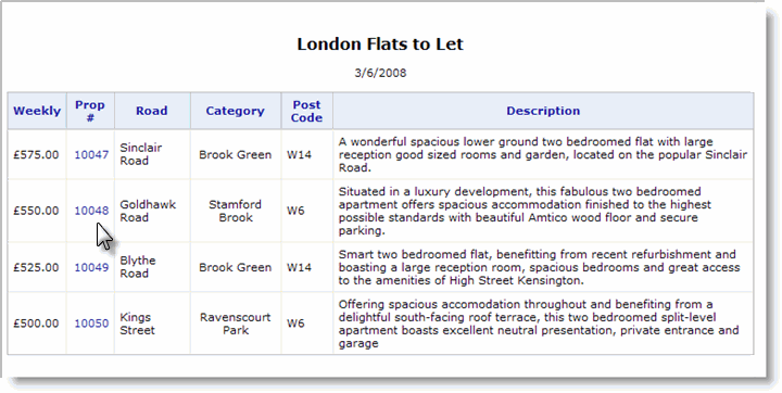
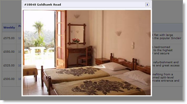
The examples above show the report and the results of clicking one of the Property Number links. The report is disabled when the panel is display and the background "grayed" because the Popup Panel is set to Modal.
![]() Note that, when you place a popup panel in a data table column, an instance of the panel will be generated for every row in the data table. This could have performance implications when using large data sets. Another technique, placing the Popup Panel element outside of the data table, is discussed in the section Passing Parameters to a Popup Panel, below.
Note that, when you place a popup panel in a data table column, an instance of the panel will be generated for every row in the data table. This could have performance implications when using large data sets. Another technique, placing the Popup Panel element outside of the data table, is discussed in the section Passing Parameters to a Popup Panel, below.
Use a Popup Panel with the onMouseOver Event
This example changes the elements slightly so that the Popup Panel will appear when the mouse hovers over an icon.
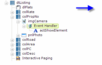
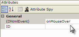
The actual Property Number data has been replaced with an image, a camera icon, with an Event Handler element below it. The Event Handler has been set, as shown above, to fire when the onMouseOver event occurs. The Action.Show Element element from the previous example has been placed below the Event Handler.
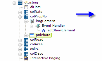
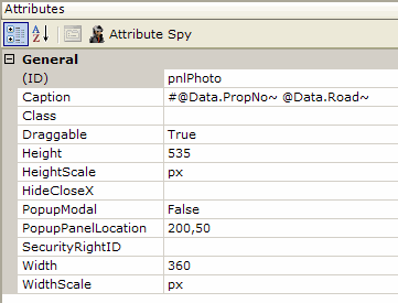
For a little variety, a few changes have also been made to the Popup Panel's attributes. The panel is no longer Modal and its pop up location has been set to absolute coordinates: x-axis = 200 pixels and y-axis = 50 pixels.
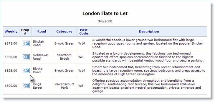
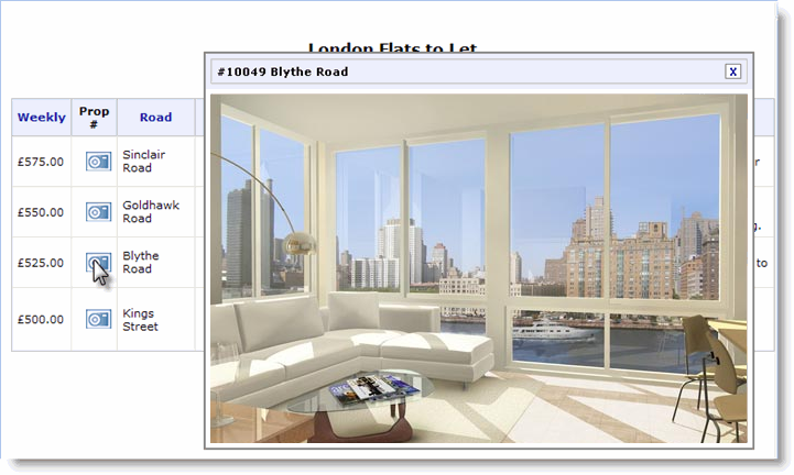
As shown above, when the cursor passes over the camera icon, the Popup Panel with its image appears. Because the panel isn't Modal, the cursor can continue to be moved over the other icons in turn.
Pass Parameters to a Popup Panel
As shown in an earlier section, a common use of the Popup Panel is to provide drill-down into the details of data that's presented in a data table. Placing a Popup Panel element in a data table column will result in a popup being generated for every table row, which could have a negative performance impact.
An alternate approach is to place the Popup Panel outside of the data table and pass parameters to it, so that it can do its own lookup and then present detail data. This is done using a "dual Event Handler" technique. It's based on the fact that, even though the popup panel has been generated once when the report is shown, we can use AJAX to "redraw" the popup when data is clicked. The fact the panel isn't visible at the time doesn't matter and, right after it's
redrawn, we'll show it.
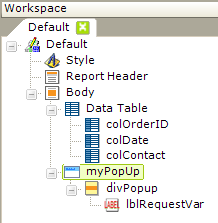
Consider the example above. A Popup Panel has been added to a report, but not under a data table column. The first element in the panel is a Division, and below it a Label. In this example, the label is just a way to verify that the parameter we'll pass has been received; the parameter will be available as a normal @Request token. The Division has no attributes set other than its unique element ID (which is important).
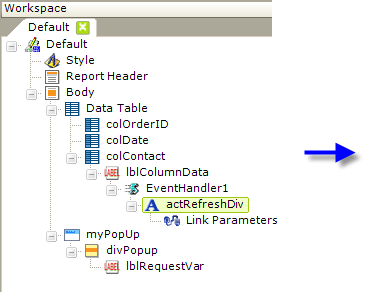
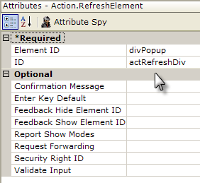
Now, as shown above, an Event Handler element has been added beneath the Label used to display data in a data table column. Its DHTML Event attribute value is set to onMouseDown.
Beneath it, an Action.Refresh Element element has been added, and its attributes have been set as shown. The Action.Refresh Element element can have a Link Parameters child element, and here's where we've placed the parameter to be passed to the popup panel.
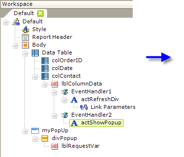
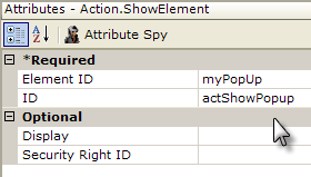
Finally, we've added a second Event Handler element, as shown above, beneath the Label in the data table column. Its DHTML Event attribute value is set to onClick.
Beneath it, an Action.Show Element element has been added, and its attributes have been set as shown. This element will cause the popup panel to be shown.
So, to review: the Label element that users will click has two Event Handlers beneath it. The first one will pass a request variable to the popup panel and refresh it; the second one will cause the refreshed popup panel to be shown.
Add a "Loading..." Message
We can add one more refinement: suppose the lookup that occurs when the popup panel is refreshed takes a while? We can introduce a message that says "Loading..." until the panel refresh is finished.
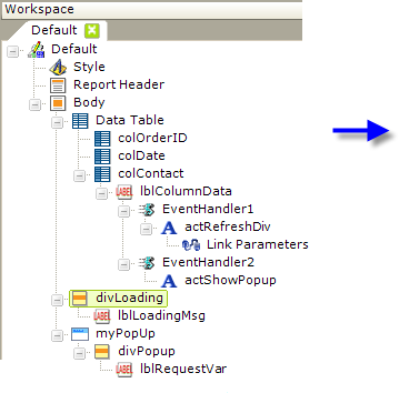
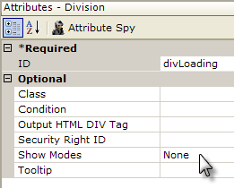
Another Division element has been added now, outside the data table. Its ID attribute has been set to a unique value and its Show Modes attribute has been set to None, so that it's initially hidden.
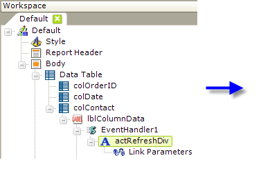
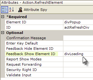
Finally, the Action.Refresh Element element's Feedback Show Element ID attribute has been given the value of our new division. This makes the division and its "Loading..." message visible while the refresh request is executing. When it ends, the division will be hidden again.
The Tooltip Panel
Beginning in v10.0.299, another variety of popup panel became available in both Logi Info and Logi Report: the Tooltip Panel. Like its namesake, the traditional "tooltip", the Tooltip Panel element is used to supply additional information to the user, and it appears when a user hovers their mouse over its parent element.
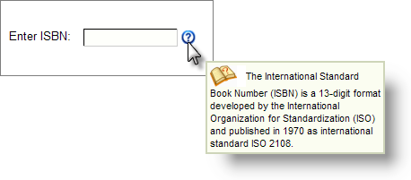
However, as shown above, this element is much more versatile than a regular tooltip, allowing you to control its size and include a range of other elements within it, including Labels, Images, and even Charts. The panel will be displayed just below and to the right of the mouse position.
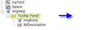
The definition snippet above shows how the Tooltip Panel element is used; it can be the child of a variety of other elements. No Event Handler element is required; the panel will appear and disappear automatically, based on mouse movements.
You can use an Event Handler in addition to a Tooltip Panel, but if you assign the onMouseOver event to the Event Handler, the Tooltip Panel will not work. Assigning other events, such as onClick, to the handler will not interfere with the Tooltip Panel.
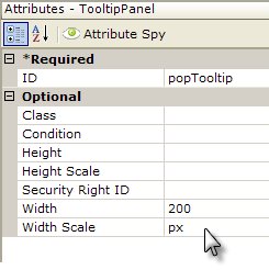
Note that the Tooltip Panel element has a Condition attribute, allowing you to control if, and when, it will appear.