The Data Calendar
The Data Calendar element allows Logi Info developers to create data-driven calendars within reports. These can be weekly or monthly calendars, with a variety of customizable days and appearances. This topic discusses the use of this element.
- About the Data Calendar Element
- Attributes
- Work with the Data Calendar
- Globalization and Localization
- Override the Default Style Classes
About the Data Calendar Element
The Data Calendar element, like a data table or a chart, works with datalayer element to retrieve data from a data source. Date-type data in the datalayer is used to generate the calendar days, which can then be populated with labels, links, tables, charts, etc. based on the rest of the data. Calendars can be weekly or monthly, with a variable number of days displayed; for example, a weekly calendar can be configured to show only the weekdays.

A calendar is rendered by the Logi Server engine as an HTML table; it's not an image. Two child elements, Data Calendar Day and Data Calendar Rows, are used to contain the data presented within each day in a calendar. A third, Data Calendar Paging, provides automatic next and previous calendar period paging.
The general appearance of a calendar is controlled by stylesheet classes, which can be overridden in a custom stylesheet.
Attributes
The Data Calendar element has the following major attributes:
| Attribute | Description |
|---|---|
| Data Column | (Required) The name of a column in the datalayer that contains date-type information. The dates in this column will each correspond to a single day in the calendar. This data should be in YYYY-MM-DD format. (As long as the data source thinks the data is date-type date, it will be retrieved into the datalayer in this format. Otherwise, a Calculated Column element should be used to reformat the data into the required format.) |
| ID | (Required) A unique element ID |
| Border | The thickness of the border, in pixels, around the calendar and between each day on the calendar. Default (and minimum) value: 1 |
| Calendar Caption Format | By default, a caption will appear centered above the calendar consisting of a date range (weekly calendar) or the month and year (monthly calendar). This attribute is used to format that caption, using system formats such as Short Date (weekly) or these combinations (monthly): None - the caption is suppressed Note: Only date-related formats should be selected here; use of other formats results in the format option itself appearing in the calendar caption. Default: Short Date (weekly calendar); yyyy MMMM (monthly calendar) |
| Cell Spacing | Space, in pixels, between cells (boxes) in the calendar. |
| Data Calendar Date | A date value that sets the current date for the calendar. The calendar will display the week or month, based on the Time Period attribute, containing the current date. |
| Day Caption Format | Controls the appearance of the day number in each box of the calendar. Set to "None" to suppress the numbering. Default: %d which provides the day number. |
| Layout | Determines whether the columns of days within the calendar size their widths automatically based on the widest data they contain or are set to a fixed width (based on required width of first row). Default: Auto |
| Time Period | Specifies whether the calendar rendered will display a week or a month of days. Default: Month |
| Weekday Caption Format | This attribute is used to format the Monday, Tuesday, Wednesday, etc. headings that appear at the top of the calendar above each columns of days. These formats are available: ddd - three-letter day abbreviation (Mon, Tues, Weds, etc.) Default - dddd |
| Weekday Filter | Specifies which days of the week will appear in the calendar; useful for suppressing display of weekend days. Enter values 0-6, separated by commas. Typically, a value of 1,2,3,4,5 will produce a calendar without Sunday (0) or Saturday (6) in it. The relationship of numbers 0-6 to days of the week can be set differently when using the Globalization element in your _settings definition by configuring its FirstDayOfWeek attribute. Default: 0,1,2,3,4,5,6 - showing all days of the week |
Work with the Data Calendar
The following provides a step-by-step example of how to use the Data Calendar element to create a calendar:
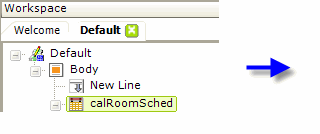
- Add a Data Calendar element to the body of your report definition, as shown above.
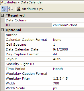
- Set its attributes as shown above. This will produce a calendar that looks like the image in the first section of this topic.
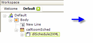

- Add a datalayer element beneath the Data Calendar to retrieve the calendar data, as shown above (this is also a perfect opportunity to use Time Period Column elements to parse the date data, if needed for later display).
- Set the Data Calendar element's Data Column attribute to the name of a column in the datalayer containing date-type data.
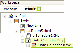
- Next, as shown above, add a Data Calendar Day element as a child of the Data Calendar element. This element has no attributes to be set.
- Beneath it, add a Data Calendar Rows element. This also has no attributes to be set.
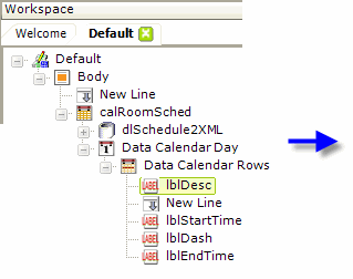
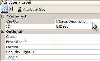
- Finally, add Label elements beneath the Data Calendar Rows element to display the data for each day on the calendar, using standard @Data tokes. A variety of elements, including images and charts, can also be used here to display data and Action elements can be used with them to create links, if desired.
The overall appearance of the calendar can be controlled by including a stylesheet in this report and using the techniques described in the next section.
Globalization and Localization
The format and presentation of calendars and dates varies widely depending on country and/or language. Some aspects of the date-related input elements are controlled by the "preferred language" settings of the browser being used and others may be affected by the default date and time format settings of the operating system.
At the application level, date-related aspects of your Logi application can also be changed by adding and configuring a Globalization element in the application's _Settings definition.
For example, setting the Globalization element's First Day of Week attribute will change the display of the calendars. If the attribute value is set to 1, then Monday will be the first day in the calendar; the default is Sunday. See Studio's Information Panel for the available values for this and other Globalization element attributes.
In addition, the browser's preferred language setting will affect the
display of the month and day-of-week names:
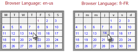
In the examples shown above, a Globalization element has been used to change the first day of the week to Monday. Notice that the day-of-week abbreviations in the calendar also change based on the browser's preferred language setting.
In addition, the actual value returned after the user clicks on a date also reflects the language preference in any text it contains - "Jan" vs. "janv", for example.
Override the Default Style Classes
The Data Calendar element is normally rendered at runtime using a default stylesheet, which is:
<your application folder>\rdTemplate\rdCalendar\rdDataCalendarStyle.css
However, you can override the classes in this stylesheet by copying them to your application's stylesheet and modifying them. Do not modify the original stylesheet named above, as it will be overwritten and your changes lost if you upgrade to a new Logi Info version.
|
For example, adding the style class shown above to your application stylesheet will allow you to control the appearance of the calendar caption that's generated at the top of calendar,
|
while the one shown above controls the appearance of the boxes on the calendar that represent each day. There are classes that allow you to control all aspects of the calendar, including background colors and images, border colors, and captions.