InfoGo - About Analyses
The general purpose of this application is to let you easily visualize your data, so that you can understand it.
InfoGo lets you see your data in tables and charts, in a variety of arrangements. It allows you to perform a wide range of activities with your data, including sorting, grouping, and filtering.
![]() The standard tool for creating analyses is the Analysis Grid, which is discussed in detail in this topic. Your application may be configured to use another tool, the Discovery Thinkspace, to create visual analyses, in addition to, or instead of, the Analysis Grid.
The standard tool for creating analyses is the Analysis Grid, which is discussed in detail in this topic. Your application may be configured to use another tool, the Discovery Thinkspace, to create visual analyses, in addition to, or instead of, the Analysis Grid.
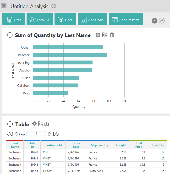
In the example analysis shown above, both a table and a chart are displayed in an Analysis Grid.
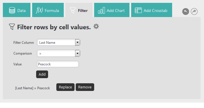
The Analysis Grid displays a set of tabs, or buttons, at the top that allow you to manipulate its data and visualizations. The visibility of specific controls is configured by the application developer and so you may or may not see the full set shown here.
When a tab is clicked, a configuration panel for that
feature appears, as shown above. Clicking it again hides the panel.
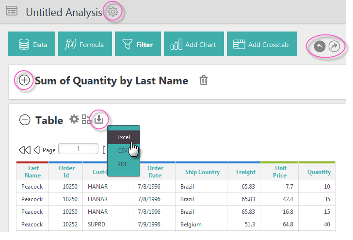
The gear icon, circled at the top of the image above, is used to access configuration details throughout the Analysis Grid. It can be used in the example above to rename of the analysis, or duplicate it. Duplicated items will appear in the My Items folder.
Duplicated items will be saved in the folder that contains the original item, rather than in the My Items folder.
Undo/Redo icons at the top near the tabs allow you to easily revert or reapply changes made.
Visualization Panels, shown above, contain either a table, a Crosstab Table, or a chart. Panels can be collapsed or expanded using the "+" and "-" icons. You can also rearrange their order by clicking your mouse near the top of a panel, and dragging it up or down.
Panels containing tables can display an Export icon for exporting the table data to
Excel, CSV, or PDF. The visibility of the export icon and the export formats are under
developer control, so you may or may not see the full set.
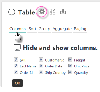
Clicking a panel's gear icon, circled above, will display or hide a configuration area for the
specific visualization. The Table configuration area, for example, let's
you control a variety of table features, which can be selected using the horizontal menu options.
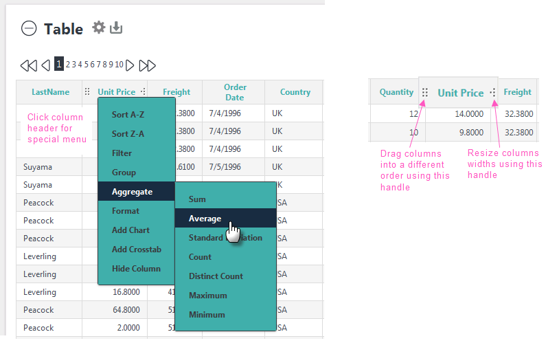
Table column headers contain a variety of features. When column header text is clicked, drop-down menus provide sorting, filter, formatting, grouping, and other options, as shown above. Options may differ depending on the type of data in the column. The availability of each option is configured by the application developer, so you may not see them all.
Table columns can also be dragged to rearrange the column order or to adjust their widths.
The analyses you create can be saved, viewed, combined, and even exported. They can be scheduled for regular production and shared with others. InfoGo makes all of this easy to do, so let's get started.

From the Home page, click the Analysis menu option. If you only have the Visual Analysis option, refer to Use Discovery v3.2 with InfoGo.