Data Table Basics
Data Tables are dynamic, data-driven reporting components. Unlike basic HTML tables built using the Rows, Row, and Column Cell elements, Data Tables are designed column-by-column rather than row-by-row.

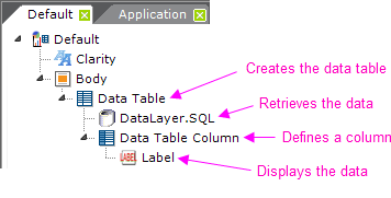
As shown above, every Data Table must have the following components:
- A Data Table element
- One or more DataLayer elements to retrieve and cache the data, possibly with child Filter elements
- One or more Data Table Column elements to display each column
- One or more report content elements, such as a Label, to present the data
This column-wise approach can be confusing. Just remember that, at runtime, every record in the datalayer will be iterated and rows for all of the data will be displayed in the table. Developers create and configure each column, while the number of rows is entirely dependent on the data.
The Data Table Column element, for example, is configured to provide the column header text, column width (if not automatically determined), and so forth.
The actual data values in the datalayer are accessed using tokens, such as @Data.CategoryID~, where the second part of the token is the column name in the datalayer. This case-sensitive token can be used in Label element Captions, for example, to display the data. For more information about tokens, see Token Reference.

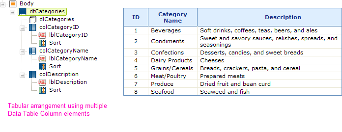
The most common way to design Data Tables is to have a Data Table Column element for each column in the datalayer, as shown above. This works well when you have many records that you want to show in a table.
The order of the columns in the displayed Data Table is governed by the order of the Data Table Column elements in the definition. The top-most of these elements in the definition will be the left-most column in the displayed Data Table. Developers are free to rearrange the order of columns by selecting a Data Table Column element in Logi Studio and dragging it, or by using the Up/Down Arrow buttons in the toolbar. This is particularly useful if a wizard has been used to create the Data Table and a different column arrangement is desired.
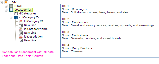
The one-to-one correspondence of data columns to Data Table Columns elements discussed above is not required and developers have complete freedom over the way data is presented in a report. Suppose, for example, that you don't want the typical tabular format.

Suppose instead you want to stack the data in a kind of form when you display it. This is easy to do, as shown above. The data is presented in a form-like manner by using just one Data Table Column element and placing multiple Label elements within it. Each Label element displays the data from a different data column in the datalayer. There's no limit on the number of elements you can place beneath a single Data Table Column element and you can, in fact, even place HTML tables and charts there!
 New for 14.1 Adding HTML Attribute Params to your Data Table enables you to apply your application to work with other frameworks or libraries easier. Depending on the type of HTML Attribute Params you add, there will be different parameters available to use, or you can define your own parameters. If an attribute was set in both Element and HTML Attribute Params, the one set in the HTML Attribute Params will be ignored.
Important Scope Limitation The scope of the data in a datalayer is limited to the Data Table element that contains it and its child elements. So, looking at the example above, the token @Data.CategoryID~ is valid in all elements beneath the Data Table dtCategories, but will be empty if you attempt to use it elsewhere, such as in the Report Header element.
![]() The only exception to this scope limitation is the Local Data element. This element works with a datalayer which retrieves just one result row but its data is available, using the @Local.<columnName>~ token, anywhere in the report definition.
The only exception to this scope limitation is the Local Data element. This element works with a datalayer which retrieves just one result row but its data is available, using the @Local.<columnName>~ token, anywhere in the report definition.