Logi Mobile Reports
Smart phones and tablets are creating a big demand for access to business intelligence on hand-held devices. Logi Info developers can leverage their experience with Logi reporting, using special Logi Mobile Report definitions, to satisfy this demand.
The following topics introduce the concepts, Studio features, and special elements available for developing mobile reports:
- Mobile Reporting Features in Logi Studio
- Elements: Additions and Restrictions
- Performance Considerations
About Logi Mobile Reports
Logi Mobile Reports bring business intelligence reporting to mobile devices. This is achieved by generating web pages that have been optimized for the mobile device environment.
Logi Mobile Reports are not compiled native device apps; they're pages displayed within the device's browser. Developers design and code Mobile Report apps in Logi Studio, using many of the same techniques used to develop standard Logi reports. An experienced Logi developer already has most of the skills needed to develop a Mobile Report application.
Mobile Reports can include most standard Logi application features, such as charts, tables, tabs, dynamic pages, drill-downs, scrolling, etc. A subset of the standard collection of elements can be used, along with some specialized elements created just for this type of report. Studio automatically provides the mobile-ready elements when you're working in a Mobile Report definition.
Animated Charts, based on JavaScript, are available in Mobile Reports. Mobile Reports can be displayed on devices that include full-featured browsers, such as:
- iPhone and iPod Touch
- Android devices
- Blackberry devices
- Windows Phone 7+ devices
- iPad and Android tablets (these however may be better candidates for regular Logi reports)
Obviously, the mobile device environment and technology differs from that of a regular browser on a PC. Therefore, developers should be aware of the following considerations.
Regular or Mobile?
Developers may want to create mobile versions of existing regular reports, and give them both the same name. How will the Logi Server Engine know which report to provide when the request is received? It's likely in the future that the product will include some form of "browser detection" that would allow this to happen automatically, but in the near term there are several things you can do:
- Use a Query string flag - If the query string of the Logi report request includes the argument "rdMobile=True" then the engine will respond with the mobile report rather than the regular report.
- Use separate reports, apps, or domains - Use different URLs for regular and mobile reporting. For example, give mobile reports slightly different names, such as prefixing them with "m", or create different Logi applications for each type of reporting, or use sub-domains, such as a mobile.mySite.com instead of www.mySite.com.
- Give your users a choice - It's a common practice to place a "Show Full Version" link in the mobile version of a report. This provides an option to break-out of the mobile view into a more standard view of the same content. This can also be done in reverse.
- Use script-based detection or other methods - You could insert some JavaScript in your reports to manage browser detection and redirection to mobile versions of reports. This can be tricky and may be somewhat unreliable due to a lack of consistency in the information reported by different devices, and some mobile browsers even disable JavaScript, but it might work for your situation. In addition, there are third-party tools available on the Internet: search for "mobile browser detection".
Screen Real Estate
The size of a mobile device screen is obviously smaller and has a different aspect ratio than that of a traditional computer monitor. Therefore, there are a number of report design considerations related to the amount of screen real estate available, such as the readability of the material being displayed, font and image sizes, etc.
In addition, different mobile devices have different screen sizes and developers may need to design for all device possibilities. Logi Studio provides a very useful feature for previewing Mobile Reports in a variety of device screen sizes (discussed in the next section).
Most devices also change their display size and orientation when the device is rotated from "portrait" to "landscape", and developers may want to provide application behavior that can take advantage of this.
Logi Info provides Responsive Design Elements that can be used to dynamically alter report layout and component visibility, depending on the device screen size.
User Interface
Mobile device browsers support HTML5, the latest extension of the HTML standard most web developers are familiar with, and CSS3. In addition, many mobile devices bind user input controls displayed in their browser into controls in their operating system. This causes the "standard" HTML controls, such as a select list, to be displayed in a different manner and perhaps differently in different devices.
In many cases, Logi developers don't need to do anything: standard Logi user input elements will be automatically converted into a device's specialized input representation.

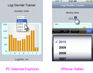
The examples above show the Logi Input Select List element in use. When clicked in a PC browser, it appears as a drop-down list of choices, but when tapped in an iPhone, it's automatically presented as a "Picker" control.
Logi Studio also provides some special user input elements for Mobile Reports, including Input Email and Input Telephone, which are described in Elements: Additions and Restrictions.
Developers can refer to a number of interface design guides available from the manufacturers of mobile device operating systems for guidance and best practices:
Apple: iOS Human Interface Guidelines
Google: Android User Interface Guidelines
Microsoft: Guidelines for UWP Apps
General Navigation
Mobile device browsers enable user interaction with touch gestures, such as tap, double-tap, flick, wipe, touch 'n' drag, and pinch. In Logi Mobile Reports, objects such as links are tapped instead of clicked. Action elements and drill-down links that redirect to other Mobile Report definitions will behave as usual. Developers should take care that objects such as links are in a large enough font, and positioned in such a way, that recognizing them and tapping them is easy. Crowding links together, for example, might make it difficult to tap them without tapping their neighbors, too.
Scrolling and Paging
Due to the relatively limited amount of screen space on a mobile device, developers need to design Data Tables and charts so that they're easily viewed. Displaying thousands of rows in a Data Table, for example, is potentially going to require a lot of scrolling by the user, which is not desirable.

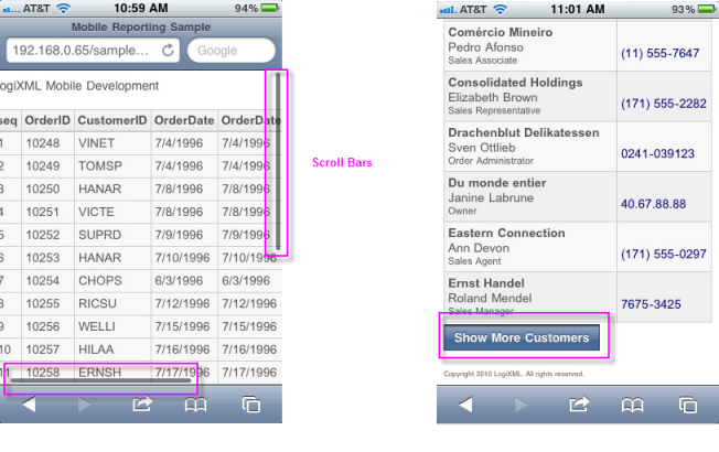
Data Tables, for example, can be scrolled vertically and horizontally on mobile devices by flicking or wiping the screen and by dragging the scroll bars, as shown above left, that appear when the table is tapped. A special element, Append Paging, is available for use with Data Tables; it provides vertical paging and the "show more" button, as shown above right. This replaces the functionality of the Interactive Paging element, whose links are deemed to be too small for mobile device use.
Chart Sizing
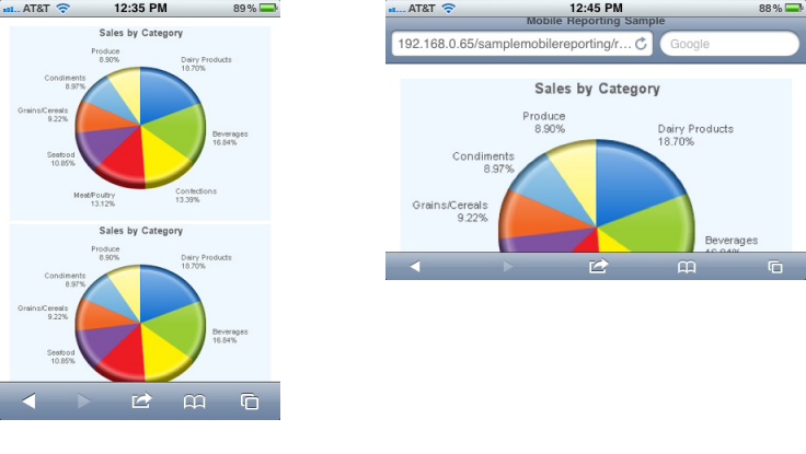
Sizing charts for mobile devices presents a challenge, especially if a Mobile Report will be viewed on different devices. A special element, the Auto Sizer, is available to assist with this: it automatically expands or shrinks a chart to fit the available space.

As shown in the examples above, the Auto Sizer also resizes the chart automatically when the device orientation changes.
Themes
The standard Themes provided in Studio for use with Logi applications have been extended for use in Mobile Reports. As usual, developers can also create their own custom themes. Themes include a special style sheet file called MobileTheme.css, which is active only for Mobile Reports and which makes fonts a little larger, increases padding so that to it's easier to tap on links, etc., to generally improve the user experience.
Security
All of the regular Logi security models are supported in Mobile Reports.