Series.Area - Using Multiple Series
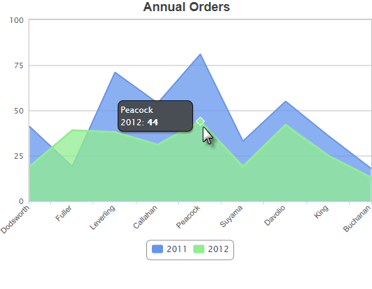
You can add additional series to the chart by adding additional Series elements:

The example above shows two Series, one for each year. A legend can also be added very easily.

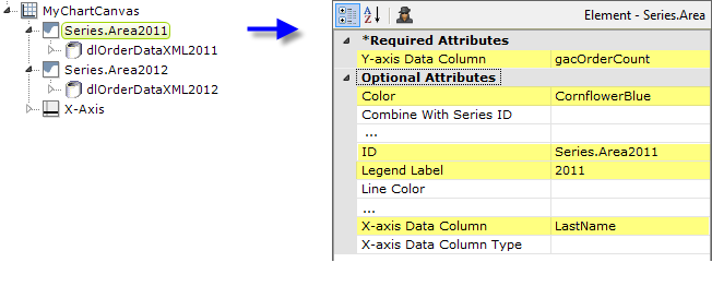
The example above shows the two Series elements, their datalayers, and an X-Axis element used to produce the previous chart. You can adjust which seriesappears "in front" of the other in the chart by changing the order of the Series elements in the definition. Setting the Series elements' Legend Label attribute will automatically cause the legend to be displayed.
![]() When using multiple series, you may be able to reduce the number of data queries and improve performance by using local data to read all of the data once, see Datalayers. Then, link its datalayer to share it to the series, see Link Datalayers. At each Series element,
link its datalayer to the shared Local Data datalayer and filter the datato meet the needs of each individual series.
When using multiple series, you may be able to reduce the number of data queries and improve performance by using local data to read all of the data once, see Datalayers. Then, link its datalayer to share it to the series, see Link Datalayers. At each Series element,
link its datalayer to the shared Local Data datalayer and filter the datato meet the needs of each individual series.
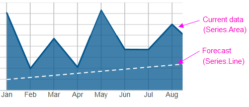
You can combine different types of Series elements, for example, Series.Area and Series.Line, to produce combinations of visualizations. A good example of this is when you wish to use forecasting.
Forecasting
Forecasting elements use a variety of techniques to produce projected
values by analyzing existing values. The future values they "predict"
are, in most cases, added as rows or columns to a datalayer so the data
can be displayed along with the existing data. When using Chart Canvas charts, the forecast data is typically displayed using a Series.Line element, in conjunction with other series elements.

Forecasting elements add a "forecast value" column to the datalayer, and this column is used as the series' Y-axis data column. For more information about using forecasting elements, see The Forecasting Elements.