Library Component Properties
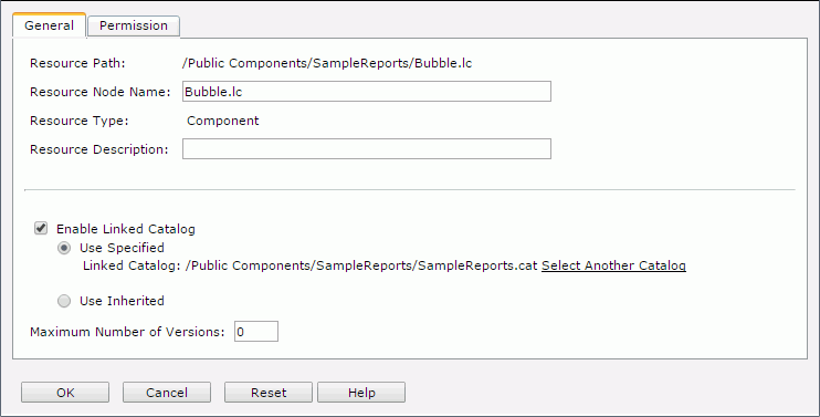
The Library Component Properties dialog helps you to set the properties of a library component and contains the following two tabs:
OK
Closes this dialog and applies the properties to the library component.
Cancel
Cancels any settings and closes the dialog.
Reset
Discards your modifications and restores the dialog to its default status.
Help
Displays the help document about this feature.
General
Specifies the general properties of the library component. See the tab.
Resource Path
Shows the resource path.
Resource Node Name
Specifies the name for the library component.
Resource Type
Shows the type of the resource.
Resource Description
Specifies description of the library component.
[Custom Field Name]
Specifies value of the custom field for the library component. A custom field can be regarded as a resource property and is available when it is enabled.
Enable Linked Catalog
Enables to link the library component with a catalog. Once a library component is linked with a catalog, even if the library component and the catalog are not in the same directory, it can still be run with the catalog.
- Use Specified
Links the library component with a catalog in the server resource tree.- Select Another Catalog
Specifies another catalog in the Select Another Catalog dialog.
- Select Another Catalog
- Use Inherited
Links the library component with the linked catalog inherited from its parent folder. Note that if the parent level does not enable linked catalog, you are not allowed to check this option.
Maximum Number of Versions
Specifies the maximum version amount that will be listed in the version table. By default the version amount is unlimited.
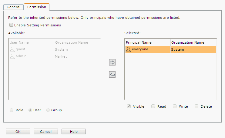
Permission Tab
Specifies permissions of roles/users/groups on the library component. This tab is available when the library component is in the Public Components folder. See the tab.
Enable Setting Permissions
Enables the setting of permissions.
Available
Lists the roles/users/groups to which you can assign permissions.
- Role
If checked, all roles will be displayed in the Available box for you to assign permissions. - User
If checked, all users will be displayed in the Available box for you to assign permissions. - Group
If checked, all groups will be displayed in the Available box for you to assign permissions.

Adds the selected role, user or group to the Selected box.

Removes the selected role, user or group from the Selected box.
Selected
Select a role/user/group in the Selected box and then select the permissions you would like the role/user/group to have on the library component.
 Previous Topic
 Back to top
