Build the Default Definition
In the Workspace panel editor, select the tab for your new Mobile Report definition.

-
Select the Style element that was added by default to your
definition, and set its Style Sheet and Theme attributes
as shown above.

-
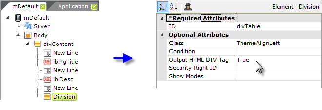
Beneath the Body element add a Division element, and set its
attributes as shown above. This will ensure that everything displayed on
the mobile device is neatly centered. Note that the
Output HTML DIV Tag attribute has been set to True.
Without this, the centering will not work.

-
Add as many Label and New Line elements as necessary to
put a title and description in the report. As shown above, use the
classes from your Theme, available in the pull-down list, to provide
consistent font styles for your labels.
-
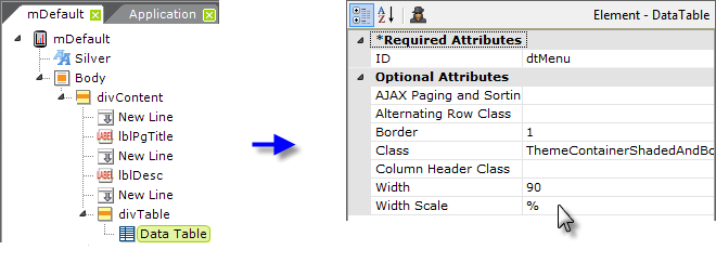
We're about to build our main menu, but first we need to add another
Division element. Without it, our menu items will also be
centered because the style of the first Div will be inherited by the
Data Table we'll use for our menu. So add another Div and set its
attributes as shown above.
-
Add a Data Table element beneath the last Div, and set its
attributes as shown above (some blank attributes have been removed from
the image to save space). Its complete Class attribute value,
which combines a theme class and a supplemental style sheet class, is:
ThemeContainerShadedAndBordered,mobileTable .

-
Add a DataLayer.Static element beneath the table and several
Static Data Row elements beneath it, as shown above. Of course,
any type of datalayer could be used here. Our static data rows will
include a column for the menu item text to be displayed and the name of
the Mobile Report definition to be called when the menu item is
tapped.
-
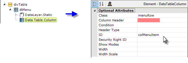
Add a Data Table Column element beneath the Data Table and set
its attributes as shown above. Notice that you're leaving the
Column Header attribute blank. This will result in no column
header being shown at all, which helps our Data Table look more like a
list of menu options than a Data Table.

-
Add a Label element beneath the Data Table column and set its
attributes as shown above. The text for the menu item is drawn from the
data in the datalayer.

-
Add an Action.Report and a Target.Report element beneath
the Data Table Column element (not the Label element) and
set its attributes as shown above. This is one of those mobile device
usability issues: it's easier for the user to tap a large space
(anywhere in the Data Table row) rather than a comparatively small text
link in the row.
-
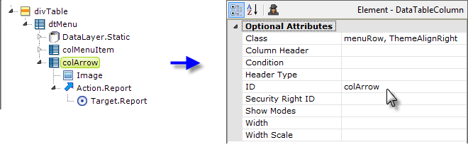
Now copy the existing Data Table Column element and
paste it beneath the Data Table, as shown above. Change its
element ID and modify its Class attribute. Replace the
Label element beneath it with an Image element. Set the Image
element's Caption to the file name of an image of an arrow that
points horizontally to the right.

-
Finish off the definition by adding a New Line and Label element, under
the first Division element, to center it, as shown above. Put
some footer text in the Label element's Caption attribute.
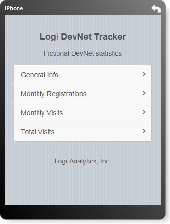
When you preview your definition, it should look something like the example shown above (although the text itself will vary, depending on what you chose to enter).
You can easily test your definition right on your own mobile device, assuming that you can connect it to your network. Many companies, for example, have Wi-Fi available internally and you may be able to connect your device to it. If so, then you should be able to browse your development web server.
![]() The "localhost" designation used inside Studio will
not work for this; you'll need to get the IP address of your
development machine and use it instead. The URL you use in your mobile
device browser will look something like:
http://192.168.0.12/yourLogiAppName
The "localhost" designation used inside Studio will
not work for this; you'll need to get the IP address of your
development machine and use it instead. The URL you use in your mobile
device browser will look something like:
http://192.168.0.12/yourLogiAppName
You will need to set your Mobile Report definition to be the Default
Report for your application:
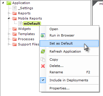
This can be done in Studio in several ways and one of the easiest is to select and right-click your definition in the Application Panel, and then select Set As Default in the popup menu, as shown above. This topic continues on the next page.