The Schedule Element
The Schedule element makes it easy to create and edit Scheduler Tasks. Because it's a super-element, adding it to a report definition automatically creates a user interface for a Scheduler task.

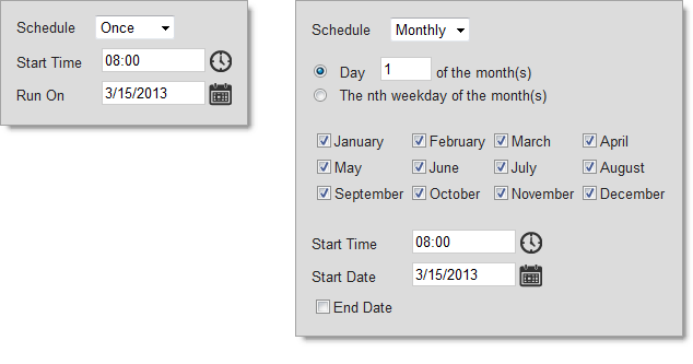
As shown above, the user interface presented by the Schedule element allows the user to select criteria for the Scheduler task. It's dynamic and will present more or fewer controls as required. For example, in the image above right, when a Monthly schedule is selected, the element expands vertically to display the months (a horizontal expansion, to the right, instead is also an option).
The Schedule element is built as an HTML table and has typical table attributes, such as Layout, Width, and Width Scale, used to control its size. The Schedule element also uses the following other attributes:
The element's UI does not display the ProcessXML value, a string of XML data that includes the task name, application URL, process definition file name, and process task ID, nor does it display the Task Name and Run As values. These values are available, however, from the Scheduler database as columns for retrieval using DataLayer.Scheduler and, if desired, the developer can create a UI to display and update them outside of the Schedule element interface.
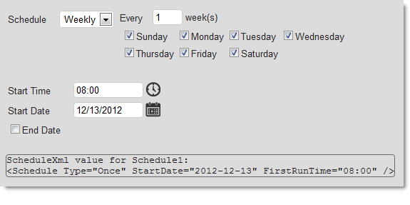
As mentioned above, the Schedule element has a Show Schedule XML attribute which can be turned on during development to assist in understanding scheduling intervals:

The image above shows what the display looks like when the Show Schedule XML attribute is set to True. If you change the interval selections, the ScheduleXML display will be immediately updated with new values.
Parameters that are to be passed to the process task at runtime can also be stored in the Scheduler task. For more information, see Working with Process Parameters.
Using CSS with the Schedule Element
Many presentation aspects of the Schedule element can be customized through the use of CSS classes. The default style sheet used by the element is <application folder>\rdTemplate\rdSchedule\rdScheduleStyle.css
Classes in this default style sheet can be overridden by copying them into, and altering them in, your own application style sheet. Do not modify the default style sheet.
For example, this class adds additional space between the UI's labels and input controls:
.rdScheduleColumnGap {
width: 15px; /* add more space between labels and controls */
}
and this one adds a background color to the element:
.rdSchedule TABLE {
border-collapse: collapse;
border-width: 0px;
background-color: AliceBlue; /* add BG color so element is obvious */
}
![]() HTML tables are used within the Scheduler super-element, and so you can count on working with table-related HMTL tags to make some CSS changes.
HTML tables are used within the Scheduler super-element, and so you can count on working with table-related HMTL tags to make some CSS changes.
