Series.Pie
The Chart Canvas element's Series child elements cause a data visualization (the chart) to be rendered in the canvas.
The following topics discuss the Series.Pie child element:
- Shaping the Pie
- Using Multiple Series
- Series.Pie Attributes
- Adding Data Labels
- Using the Quicktips Element
- Using the Chart Drill To Element
- Using Action Elements
- Using Input Selection
- Using the Refresh Series Timer
About Series.Pie
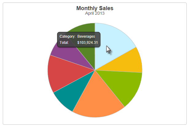
The Series.Pie element generates a Pie chart, which is a circular chart divided into sectors, illustrating numerical proportion.

The example above shows a simple Pie chart, presenting one month's sales of different product categories.

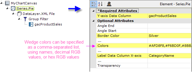
As shown above, the chart is created by adding Series.Pie to the canvas, along with a datalayer and, typically, some child elements that may include Time Period Column elements, a Group Filter, and a Group Aggregate Column element. Very few attributes need to be set for the Series element in order to produce a basic chart. In the example, a list of custom wedge colors was provided.
![]() A datalayer element can be used either beneath Series.Pie, as shown above, or beneath Chart Canvas. If used as a child of Chart Canvas, its data is available to all child Series elements. This can improve performance if you have several series, all using the same data, beneath the same Chart Canvas element.
A datalayer element can be used either beneath Series.Pie, as shown above, or beneath Chart Canvas. If used as a child of Chart Canvas, its data is available to all child Series elements. This can improve performance if you have several series, all using the same data, beneath the same Chart Canvas element.

The properties of the X- and Y-axis, including captions, are set using the X-Axis and Y-Axis elements. For example, in order to angle the X-axis labels, add an X-Axis element beneath Chart Canvas (none of its attributes need to be set) and add its child Label Style element. Set the Label Style element's attribute as shown above.