Series.Bar Range
The Chart Canvas element's Series child elements cause a data visualization (the chart) to be rendered in the canvas.
The following topics discuss the Series.Bar Range child element:
- Using Multiple Series
- Series.Bar Range Attributes
- Using the Data Labels Element
- Using the Quicktips Element
- Using Action Elements
- Using Input Selection
- Using the Refresh Series Timer
About Series.Bar Range
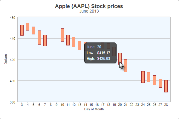
The Series.Bar Range element generates a Bar Range chart, which is commonly used to represent separate events that have starting and ending values, over time.

The example above shows a simple Bar Range chart, presenting daily low and high stock prices for a month.

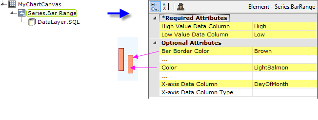
As shown above, the chart is created by adding Series.Bar Range to the canvas, along with a datalayer. Very few attributes need to be set for this Series element in order to produce a basic chart.
![]() A datalayer element can be used either beneath Series.Bar Range, as shown above, or beneath Chart Canvas. If used as a child of Chart Canvas, its data is available to all child Series elements. This can improve performance if you have several series, all using the same data, beneath the same Chart Canvas element.
A datalayer element can be used either beneath Series.Bar Range, as shown above, or beneath Chart Canvas. If used as a child of Chart Canvas, its data is available to all child Series elements. This can improve performance if you have several series, all using the same data, beneath the same Chart Canvas element.

The properties of the X- and Y-axis, including captions, are set using the X-Axis and Y-Axis elements. For example, in order to provide a caption for the X-axis, add an X-Axis element beneath Chart Canvas and set its Caption attribute, as shown above. Repeat for the Y-axis.