Series.Bar - Using Multiple Series
You can add additional series to the chart by adding additional Series elements:
 +
+
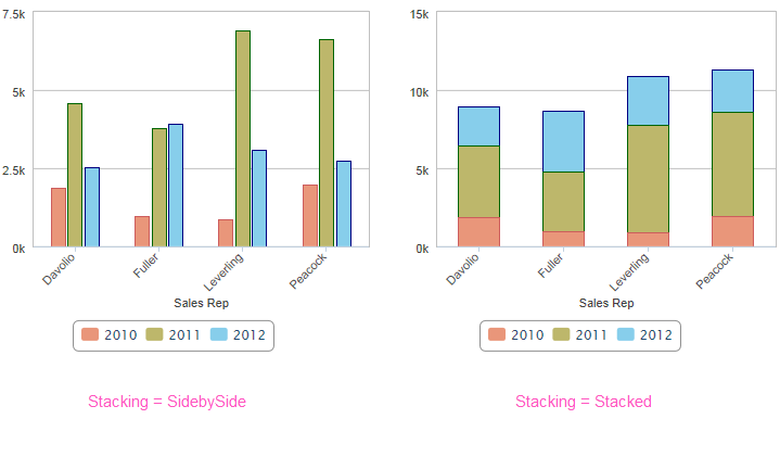
The example above uses three Series, one for each year, and two different "stacking modes" are shown, along with a legend. Overlay and StackedPercentage stacking modes are also available. Combinations of stacking modes are also possible, for example, two years stacked, and one year beside them.
![]() The scaling of the data axis may change depending on the stacking mode.
The scaling of the data axis may change depending on the stacking mode.

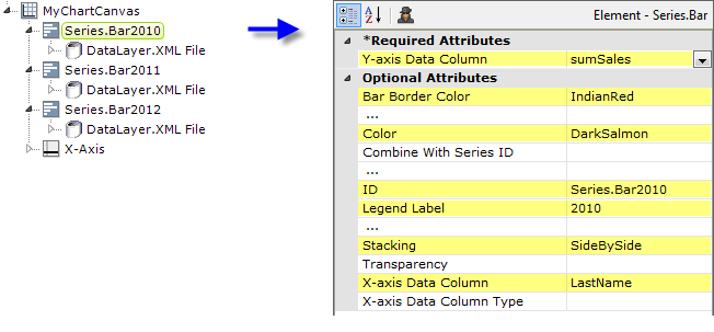
The example above shows the two Series elements, their datalayers, and an X-Axis element used to produce the previous chart. You can adjust the order of the series in the chart and the legend by changing the order of the Series elements in the definition. Setting the Series elements' Legend Label attribute will automatically cause the legend to be displayed.
 New for 14.2 Charts with multiple series or aggregations are encouraged to use the ChartCanvas element's attribute, Tooltip Split. This attribute allows you to split a chart's tooltip into one label per series, rather than per segment. The default value for this attribute is False. Once enabled, when hovering over a data point, it displays all the values for the series. This method is recommended over shared tooltips for charts with multiple line series, and as such, takes precedence over tooltip.shared.
![]() When using multiple series, you may be able to reduce the number of data queries and improve performance by using local data to read all of the data once, see Datalayers. Then, link its datalayer to share it to the series, see Link Datalayers. At each Series element,
link its datalayer to the shared Local Data datalayer and filter the data to meet the needs of each individual series.
When using multiple series, you may be able to reduce the number of data queries and improve performance by using local data to read all of the data once, see Datalayers. Then, link its datalayer to share it to the series, see Link Datalayers. At each Series element,
link its datalayer to the shared Local Data datalayer and filter the data to meet the needs of each individual series.
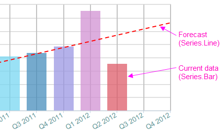
You can combine different types of Series elements, for example, Series.Bar and Series.Line, to produce combinations of visualizations. A good example of this is when you wish to use forecasting.
Forecasting
Forecasting elements use a variety of techniques to produce projected values by analyzing existing values. The future values they "predict" are, in most cases, added as rows or columns to a datalayer so the data can be displayed along with the existing data. When using Chart Canvas charts, the forecast data is typically displayed using a Series.Line element, in conjunction with other series elements.

Forecasting elements add a "forecast value" column to the datalayer, and this column is used as the series' Y-axis data column. For more information about using forecasting elements, see The Forecasting Elements.