Input Time
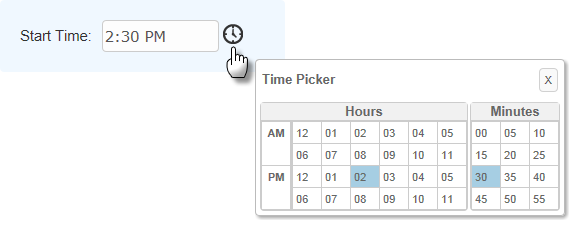
The purpose of this element is to allow the entry of time. It's similar to the Input Text element and a time can be typed right into it. It can also include an icon or link beside it, which allows a time to be selected from a small pop-up panel.

As shown above, the pop-up panel has separate sections for hours and minutes, and selections are highlighted with a special color. Colors can be configured with CSS by overriding style classes found in <yourApp>\rdTemplate\rdClock\rdTimePickerStyle.css.
Using It
This element shares many of the attributes of the Input Text element and also includes these special attributes:
| Attribute | Description |
|---|---|
Clock Link | These three attributes specify the type of popup link, if any, that appears beside the text box. A small clock image is provided, or a custom image or text link may be used. |
Default Value | Specifies the default time that will appear in the text box. Can be used with @Function.Time~ token to display the current date in mm:hh:ss format. |
Format | Specifies one of the three standard formats (Short, Medium, or Long Time) or your own custom format. More format information can be found in Format Data. |
Input Time Reformat | Causes the time entered to be reformatted into one of several formats before being made available as a request variable. |
The Input Time Clock element can be added as a child of Input Time and used to configure the popup panel. Input Time Clock has the following optional attributes:
| Attribute | Description |
|---|---|
Clock Caption | Specifies a specific title in the popup panel. Default: Time Picker |
Hours Header | Specifies a title for the Hours section. Default: Hours |
Minutes Header | Specifies a title for the Minutes section. Default: Minutes |
Seconds Header | Specifies a title for the Seconds section. Default: Seconds |
Show Minutes | Specifies if the Minutes section is displayed. Default: True |
Show Seconds | Specifies if the Seconds section is displayed. Default: False |
Time Picker Hours | Specifies the hour scheme: 12-hour, 24-hour, or whatever the browser's Locale setting requires. Default: BrowserLocale |
This element can be used by itself or within an Input Grid element to make alignment with other Input elements easier, and a special element, Validation.Time, is available to ensure that a valid time value is entered by the user.
Getting Its Data
The data placed into this element will be available in the next report or process by using an @Request token. For example, if the element's ID is set to inpStartTime, then its data will be available as the token @Request.inpStartTime~.
Globalization and Localization
The format and presentation of times varies depending on country and/or language. Some aspects of the time-related input elements are controlled by the "preferred language" settings of the browser being used and others may be affected by the default time format settings of the client operating system.
At the application level, time-related aspects of your Logi application can also be changed by adding and configuring a Globalization element in the application's _Settings definition. For example, it has two attributes, Default Input Time Format and Default Input Time Reformat, that can be used, if desired, to specify a format with global scope.
More information about the Globalization element can be found in Internationalization and Localization .
![]() In a "globalized time" scenario, when passing/submitting dates and times from your input controls to other definitions for use within tokens, as filters on queries, or within elements such as Condition Filters, we highly recommend utilizing the ISO-standard date format (hh:mm:ss, with leading zeros) to avoid any locale/browser time conflicts that might arise. The input element's
Input Time
Reformat
attribute can
be used for this purpose.
In a "globalized time" scenario, when passing/submitting dates and times from your input controls to other definitions for use within tokens, as filters on queries, or within elements such as Condition Filters, we highly recommend utilizing the ISO-standard date format (hh:mm:ss, with leading zeros) to avoid any locale/browser time conflicts that might arise. The input element's
Input Time
Reformat
attribute can
be used for this purpose.
More Information
For additional information, see the Element Reference entry for Input Time.