Customizing Menu Appearance
An easy way to customize the appearance of Menu Tree menus is by customizing the theme used with the report or application, Using the Theme Editor. Menu border, background, and item colors can be set in the Colors category, Menus section of a custom theme. You can also apply styling using CSS classes directly to the Menu Tree, Menu Branch, and Menu Leaf elements. For example, to make the menu item fonts larger, select a class like ThemeTextLarger to an element's Class attribute. If you're using your own style sheet, assign a class from it that specifies a larger font size to the attribute. You can also use Conditional Class elements beneath any of the Menu Tree Menu elements in order to apply classes dynamically. For more information about Conditional Class elements, see Using Style Sheets. Here's an example of how to use CSS to change the appearance of the Menu Tree pop-up panel:

The pop-up panels shown above have these qualities: they have no border, they appear just below the header, and they're a little transparent. To achieve that, you'll need to override an existing theme class by adding it to your own style sheet:
- .rdPopupMenu { border: 0px; opacity: 0.8; top: 39px !important; }
You'll need to adjust the "top" attribute to align it correctly with the bottom of your header.
![]() This change may affect all pop-up panels in your application.
This change may affect all pop-up panels in your application.
Adding a "Separator" Menu Item
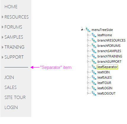
When using vertical menus, sometimes it's desirable to provide some kind of visual separator between menu items:

In the example shown above, a "separator" item provides visual separation between one category of menu items and another. This is easily created by adding a Menu Leaf element that has no action associated with it (so it's not a link) and has a Caption that provides the desired visual. In the example above, several of the Unicode characters "Horizontal Bar" (U+2015) were used.