Configuring Major Ticks and Grid Lines
Tick marks and grid lines help associate the labels with the axis and provide visual reference points inside the plot area. "Major" tick marks and grid lines generally reference the labels and data, "minor" marks and lines are between them. Major tick marks and grid lines can be configured using the Ticks and Grid child element.

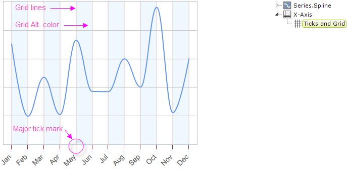
Grid lines and the space in between them can be customized, as shown above, in a number of ways, including color, width, and transparency. Tick marks can be customized similarly and their length, position and interval can also be set.
By default, charts are drawn without any X-axis (vertical) grid lines; you must add an X-Axis element with a Ticks and Grid child element beneath it to draw them.
By default, charts are drawn with Y-axis (horizontal) grid lines; you must add a Y-Axis element with a Ticks and Grid child element beneath it, then set the Ticks and Grid element's Grid Line Thickness attribute to 0 to suppress this.

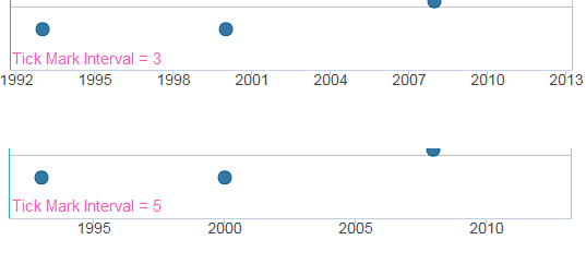
As shown above, setting the Ticks and Grid element's Tick Interval attribute allows you to determine how many labels, tick marks, and grid lines will be shown for the axis.
The Tick Interval is sensitive to the axis data type. For DateTime data, you can select standard values including Years, Weeks,Hours and more. For Numeric data, you should enter a numeric value such as 100 or 1000. The default value, Auto, automatically calculates the Tick Interval based on the data values.
![]() Setting the Tick Interval for numeric data to an unrealistically small value will cause an error when the chart is rendered. For example, using a value of 2 for a chart whose data values range from 0 to 50,000 will cause the Logi engine to time-out after attempting to render 25,000 tick marks and labels.
Setting the Tick Interval for numeric data to an unrealistically small value will cause an error when the chart is rendered. For example, using a value of 2 for a chart whose data values range from 0 to 50,000 will cause the Logi engine to time-out after attempting to render 25,000 tick marks and labels.