Series.Pie - Adding Data Labels
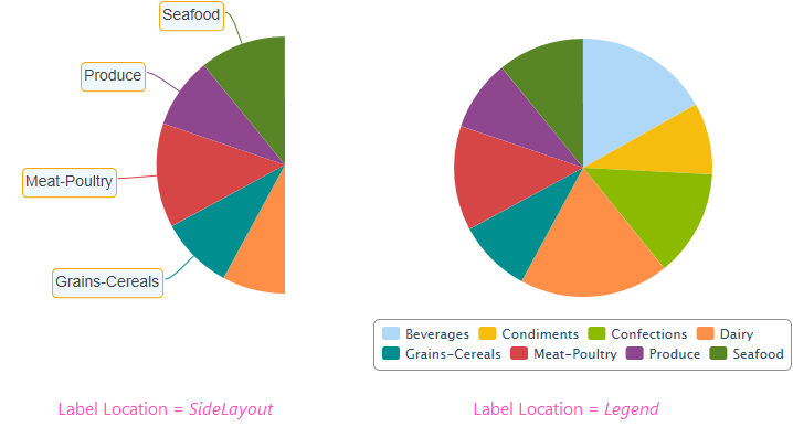
A "data label" is text that can be shown adjacent to each pie slice that shows its X-axis data value. This is controlled using the Label Location attribute.

As shown above, labels can be placed beside the slices, or in a legend, or not shown at all.
When side labels are shown, the Side Label Style element can be used to style them and their connector lines.
When the legend option is selected, "legend filtering" is active: clicking a slice's entry in the legend will toggle its appearance in the chart. For more information about legends, see Legend.

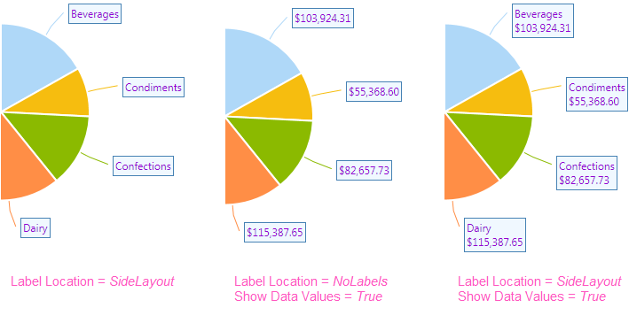
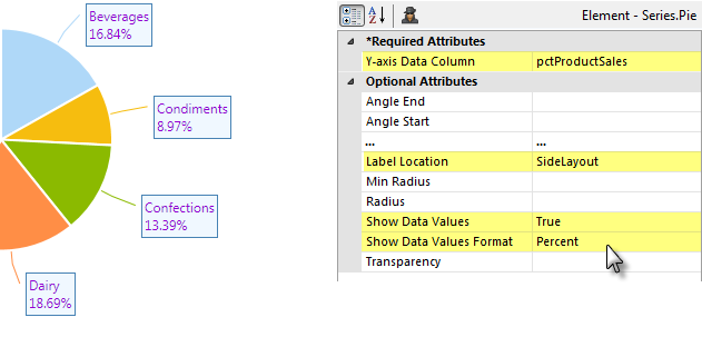
If you want to show the data values instead of, or with, the data labels near each pie slice, as shown above, use the Series.Pie element's Label Location, Show Data Values, and Show Data Values Format attributes.

In the example shown above, the data values are displayed as percentages. This is done by adding a Percent of Total Column element to your datalayer and using it as the chart's Y-axis Data Column. The Show Data Values and Show Data Values Format attributes are then set as shown.
The values displayed can also be styled using the Side Label Style element. Its attributes allow you to control the font family, color, size, and weight, the data format, background color, border color, connecting lines and more. The side labels in the image above have been styled.
The Side Label Style element's Maximum Label Length attribute lets you specify the maximum number of characters that will be displayed for a label before the text is truncated and ellipsis (...) is appended.