Lesson 4: Creating a Chart Report
In this lesson, we will create a chart report, format the chart, and export it to an Excel file.
The fourth quarter of the year has just ended, and you have been asked to produce a chart that shows product annual sales for each sales region. The sales manager wants to compare the historical sales data with the current data. Here's a sketch of the report that the sales manager has given to you, a bar chart:
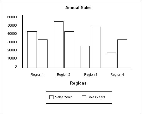
Logi JReport supports more than 10 general chart types, and most of them have many sub-types or variations. After showing the sales manager the available bar chart types, he chose the 2-dimensional clustered bar chart.
Additionally, the sales manager requests that the report should be provided in Microsoft Excel file. This is not a problem, because all pre-defined reports in Logi JReport can be exported to HTML, PDF, Excel, RTF, XML, Text, Postscript, Mail and Fax.
Follow the tasks below to finish creating the report:
Task 1: Create the Chart
- In Logi JReport Designer select File > New > Page Report.
- In the Select Component for Page Report dialog, keep the default selected component type Chart and select OK.
Be sure that JinfonetGourmetJava.cat is specified as the current catalog because it is the catalog we use in this track. For information about specifying this catalog, see Task 1, Step 2 and 3 of Lesson 1.
- In the Data screen of the Chart Wizard, select the query AnnualSalesbyRegion from the Queries node of Data Source 1 and then select Next.
- In the Type screen, keep the default chart type Clustered Bar 2-D, then select Next.
In this chart, we want to display the region name on the category (X) axis, and annual sales of each region on the value (Y) axis. However, as the region names are too long to be displayed completely on the category axis, we will create a formula here to just get the abbreviations of the region names.
- In the Display screen, scroll down to the Formulas node in the Resources box, and then select <New Formula...>.
- Input the formula name Region_AbbreviationName in the Enter Formula Name dialog and select OK, then define the formula in the Formula Editor as follows (you can copy the formula to the formula editing area directly), select Save on the toolbar to save the formula, and close the editor.
if (@Customers_REGION == "Asia-Pacific")
    "APAC"
else if (@Customers_REGION == "Europe, Middle East, Africa")
    "EMEA"
else if (@Customers_REGION == "Latin America")
    "LATAM"
else if (@Customers_REGION == "North America")
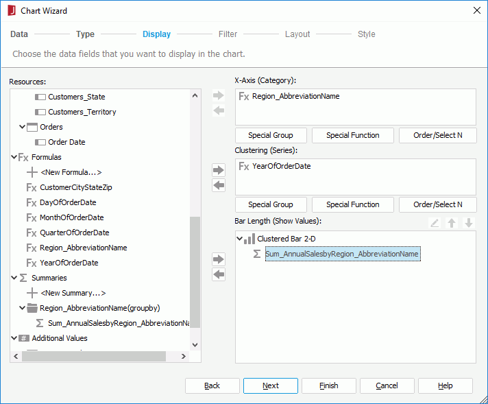
"NA" - Add the formula Region_AbbreviationName to the Category box and YearofOrderDate to the Series box one by one by selecting each and selecting
 beside the corresponding box. In the Show Values box, a numerical value is required.
In this lesson, we need to show the annual sales of each region, so a summary which is created on the column Annual Sales, and grouped by the formula Region_AbbreviationName is needed.
- Select <New Summary...> under the Summaries node in the Resources box of the Display screen.
- In the New Summary dialog, specify the aggregate function as Sum, add the field Annual Sales from the Customers table to the Summary On field, specify the Group By field as the Region_AbbreviationName formula, then select OK.
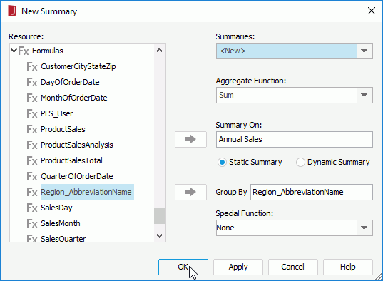
- Input Sum_AnnualSalesbyRegion_AbbreviationName in the Enter Summary Name dialog and select OK to create the summary.
- Select the newly-created summary and select
 beside the Show Values box. The Display screen appears as follows:
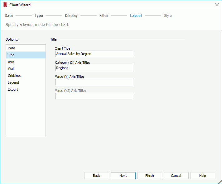
Next we will use the Layout screen of the Chart Wizard to add titles to the chart. The Layout screen provides options for customizing the layout of a chart, for example, you can hide some chart elements such as the legend and wall, set the offset of the category and series axes and so on.
- Select Layout to switch to the screen, select Title from the Options box, and then enter Annual Sales by Region in the Chart Title text box and Regions in Category (X) Axis Title.
Logi JReport provides a set of CSS styles that can be applied to reports to easily change the format and appearance of the report. We will apply the Classic style to the chart.
- Select Next to go to the Style screen and select Classic from the style list.
- Select Finish to create the chart report and the report shows as follows in the design view:
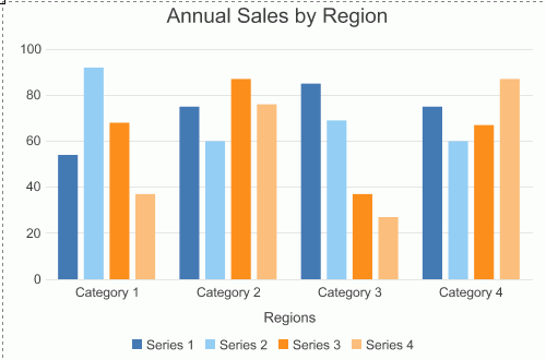
- Select the View tab to view this chart, and it appears as follows:
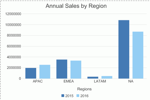
Task 2: Format the Chart
The chart is accurate, but a little simple. We can add some polish to it by setting some of the chart properties. For each part of the chart object, such as the axes, legend, wall and so on, Logi JReport provides a corresponding format dialog, with which we can easily edit properties of a chart.
- Select the Design tab to return to the design mode to do the adjustments.
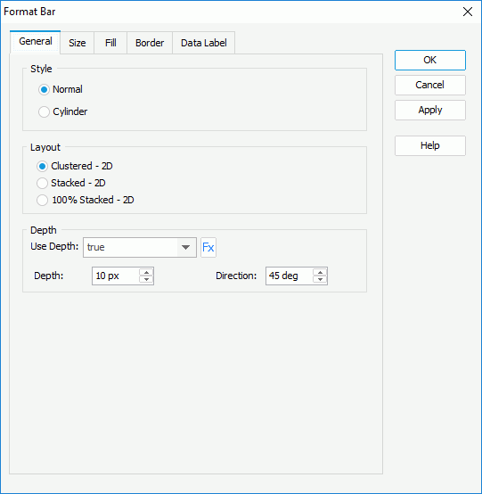
- Double-click a bar of the chart, and the Format Bar dialog appears.
- In the General tab of the dialog, set the Use Depth option to true. Keep the default Depth and Direction.
In the Format Bar dialog, you could also choose another sub-type for the chart in the Layout box if desired. In this lesson, we will continue using Clustered - 2D.
- Switch to the Data Label tab, specify Font Size to 10 pt.
The Data labels that charts contain can be either static or dynamic. You can check the Show Static Data Label option and specify the Position for data labels according to your requirements, so that the labels are displayed statically in the chart. But in this lesson, we will just use the labels as dynamic ones, which will appear when the cursor is placed on bars.
- Select OK to apply these property settings to bars of the chart.
- Right-click the legend and then select Format Legend from the shortcut menu.
- In the Format Legend dialog, select the Font tab, set Font Size to 10 pt.
- Switch to the Mark tab, keep Item 0 selected in the Mark Items box, and select circle from the mark drop-down list.
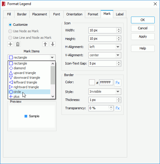
- Select Item 1 in the Mark Items box, and apply upwardtriangle to it in the same way.
- Select OK in the Format Legend dialog to apply these changes.
- Right-click the chart and then select Format Axes > Format Value (Y) Axis from the shortcut menu.
- In the Format tab of the Format Value (Y) Axis dialog, select $#,##0 in the Number category, and then select Add.
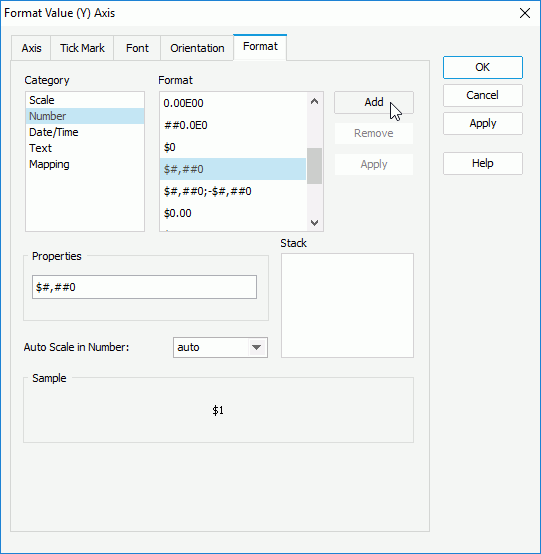
- Select OK in the Format Value (Y) Axis dialog.
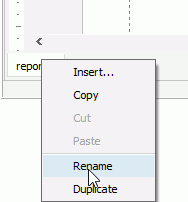
- On the report tab bar, right-click the report tab and select Rename to rename it to AnnualSales.
- Select File > Save to save the report as AnnualSalesbyRegion.cls.
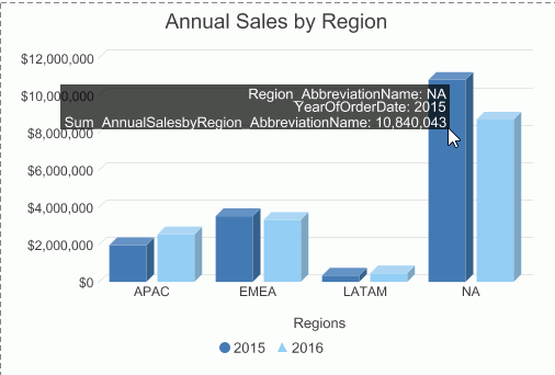
Select the View tab to preview the report and it looks somewhat as follows. We can easily compare the sales per region over a two-year period.
Note: If the report does not look correct, you can compare it to the final version of the report provided by Logi JReport. To do so, you will need to save and close this catalog and then open the JinfonetGourmetJava.cat catalog file located at <install_root>\Demo\Reports\TutorialReports.
Task 3: Export the Report to Excel
Now we can export the report to different formats as required. The sales manager requires an Excel file for the report so we will export it to the Excel format.
- Select File > Export > To Excel.
- In the Export to Excel dialog, keep the default settings and select OK.
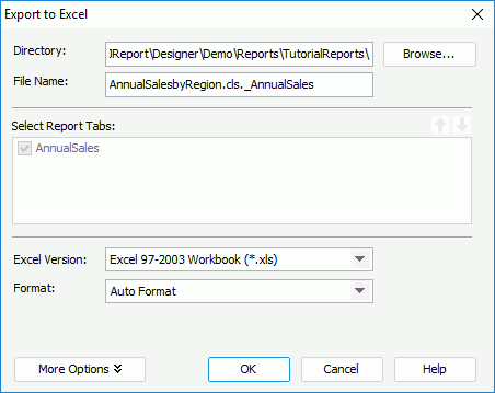
- Open the file AnnualSalesbyRegion_AnnualSales.xls saved in
<install_root>\Demo\Reports\JinfonetGourmetJava. It appears as follows: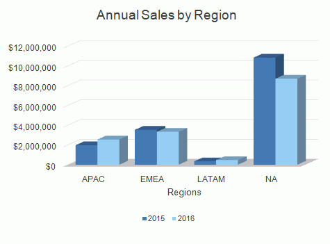
 Previous Topic