Customizing the JDashboard UI
Users can customize the appearance of the JDashboard UI by modifying the CSS file. JDashboard supports five themes to show different visual effects, including blue, default, green, module and steel. Each theme is controlled by the CSS files stored in the <install_root>\public_html\webos\style\theme_name directory. After determining which theme you would like to apply to JDashboard, you can customize the appearance of your JDashboard UI by modifying the file dashboard.css among these CSS files to change the width, height, color, font, borders, padding and so on of the JDashboard window elements.
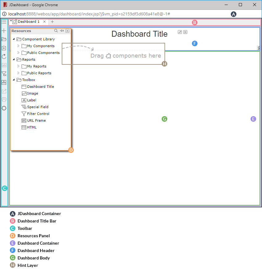
The following diagram shows the JDashboard window elements that can be customized:

In dashboard.css, the selectors are mainly class selectors which consist of a dot "." followed by a class name. Selectors are the links between the JDashboard window elements and the style. They specify what elements are affected by the CSS declarations. You can modify or add CSS declarations for a selector or a group of selectors or add CSS rules. After editing dashboard.css, you need to run make.bat/make.sh in the <install_root>\public_html\bin directory with the argument "jsvm" to make the changes work (take the Windows platform as an example, run the command make.bat jsvm).
The following table shows the mapping relationship between the JDashboard window elements and the class names in the class selectors in dashboard.css.
| JDashboard Window Element | Child Element | Class Name in dashboard.css |
|---|---|---|
| JDashboard container | - | dashboardApp_app |
| Dashboard title bar | - | taskbar |
| Toolbar | - | vtoolbar dshVToolbar |
| Resources panel | - | rspanel |
| Title bar | win_title | |
| Resources tree | rspanel_tree | |
| Hint layer | hint-layer | |
| Dashboard container | - | dashboard |
| Dashboard header | - | headpanel |
| Component | sadget | |
| Component title | sadget_title | |
| Component body | sadget_client | |
| Dashboard body | - | bodypanel |
| Library component | gadget | |
| Library component title | gadget_title | |
| Library component body | gadget_client |
In addition, when you hover the mouse pointer over an item in the Resources panel, you can find the background color of the item changes to yellow. A disabled button has lighter color than a working button. These are achieved by the combination of state mechanism and CSS. Logi JReport marks element states using an 8-bit binary number which will be converted to a decimal number. The decimal number is appended to the end of the class name in a CSS selector to indicate the state of the element, for example, taskbar_16 means that the dashboard title bar is invisible. The following table lists the most commonly used decimal numbers in dashboard.css and the corresponding element state:
| Decimal Number | Element State |
|---|---|
| 0 | Normal state. Usually not added in class names. |
| 1 | Disabled |
| 2 | Hovered |
| 3 | Usually having the same style effect as 1.
For example: |
| 4 | Triggered |
| 6 | Triggered + hovered |
| 16 | Invisible |
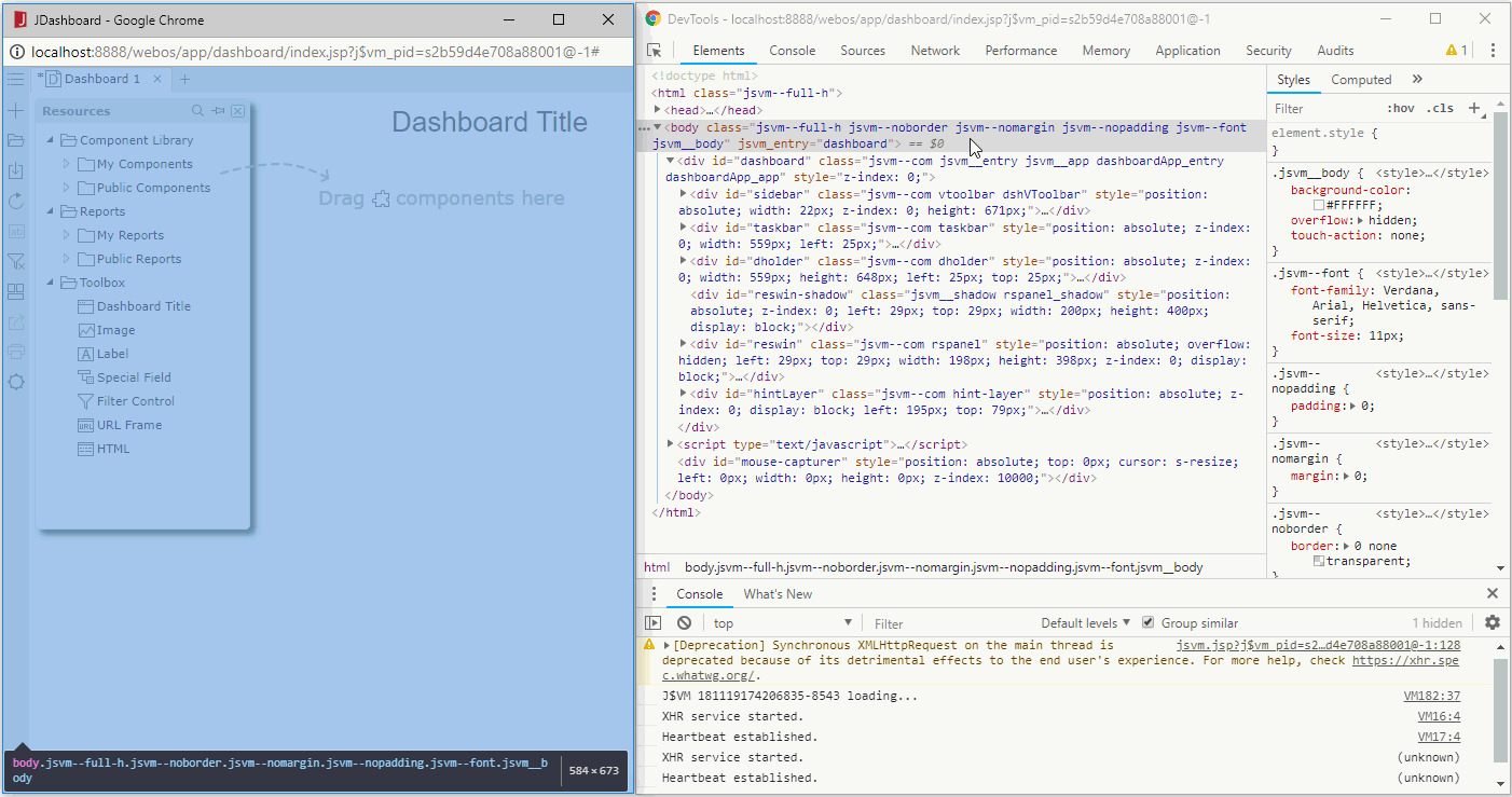
Tip: You can access Developer Tools on Internet Explorer, Google Chrome or Mozilla Firefox to get the code about how CSS is applied to the JDashboard window elements. To do this, access JDashboard by running a dashboard or creating a new dashboard, then press F12.

 Previous Topic