KPI Properties
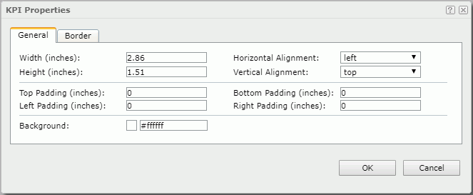
The KPI Properties dialog appears when you right-click a KPI component or the blank area in a KPI component and select Properties from the shortcut menu. It helps you to specify the properties of the KPI component and contains the following tabs:
OK
Applies the settings and closes this dialog.
Cancel
Cancels the settings and closes this dialog.

Displays the help document about this feature.

Ignores the setting and closes this dialog.
General
This tab shows some general information of the KPI component. See the tab.
Width
Specifies the width of the KPI component.
Height
Specifies the height of the KPI component.
Horizontal Alignment
Specifies the horizontal alignment of the objects in the KPI component.
Vertical Alignment
Specifies the vertical alignment of the objects in the KPI component.
Top Padding
Specifies the space between the objects of the KPI component and its top border.
Bottom Padding
Specifies the space between the objects of the KPI component and its bottom border.
Left Padding
Specifies the space between the objects of the KPI component and its left border.
Right Padding
Specifies the space between the objects of the KPI component and its right border.
Background
Specifies the background color of the KPI component.
To change the color, select the color indicator to select a color, or select More Colors in the color indicator to access the Color Picker dialog in which you can select a color within a wider range or input a color string in the format #RRGGBB. If you want to make the background transparent, input Transparent in the text box.
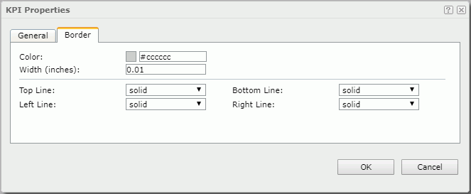
Border
This tab shows information about borders of the KPI component. You can modify all the border settings in this tab. See the tab.
Color
Specifies the border color.
Width
Specifies the border width.
Top Line
Specifies the style of the top border line.
Bottom Line
Specifies the style of the bottom border line.
Left Line
Specifies the style of the left border line.
Right Line
Specifies the style of the right border line.
 Previous Topic
 Back to top
