Group Header Properties
The Group Header Properties dialog appears when you select anywhere in a table group header row, then select the button  that appears on the group header to select the row, right-click on the row and select Properties from the shortcut menu. It helps you to specify the properties of the group header and contains the following tabs:
OK
Applies the settings for the group header properties and closes this dialog.
Cancel
Cancels the settings and closes this dialog.

Displays the help document about this feature.

Ignores the setting and closes this dialog.
General
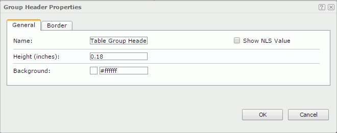
This tab shows some general information of the group header. See the tab.
Name
Specifies the display name of the group header.
Show NLS Value
Specifies to show the translated name of the display name of the group header in the Name text box if you have enabled the NLS feature and translated it.
If checked, this option takes effect only when the display name of the group header is not modified.
Height
Specifies the height of the group header.
Background
Specifies the background color of the group header.
To change the color, select the color indicator to select a color, or select More Colors in the color indicator to access the Color Picker dialog in which you can select a color within a wider range or input a color string in the format #RRGGBB, or select More Fill Effects to specify a gradient or an image as the fill effect in the Fill Effects dialog. If you want to make the background transparent, input Transparent in the text box.
Border
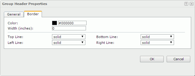
This tab shows information about borders of the group header. See the tab.
Color
Specifies the border color.
Width
Specifies the border width.
Top Line
Specifies the style of the top border line.
Bottom Line
Specifies the style of the bottom border line.
Left Line
Specifies the style of the left border line.
Right Line
Specifies the style of the right border line.
 Previous Topic
 Back to top
