Data Field Properties
The Data Field Properties dialog helps you to edit the properties of a DBField. It contains the following tabs:
OK
Applies the settings and closes this dialog.
Cancel
Cancels the settings and closes this dialog.
Help
Displays the help document about this feature.
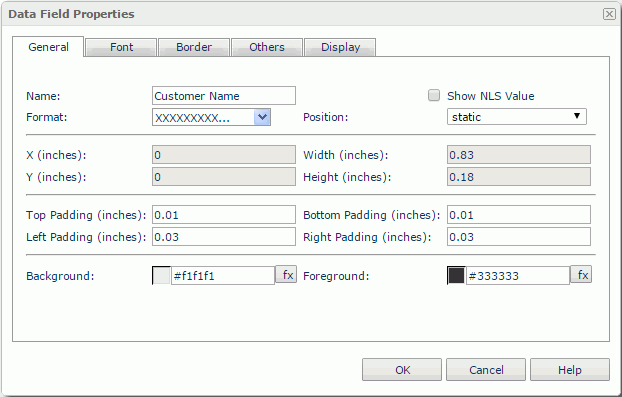
General
This tab shows some general information of the data field. See the tab.
Name
Specifies the display name of the data field.
Show NLS Value
Specifies to show the translated name of the display name of the data field in the Name text box if you have enabled the NLS feature and translated it.
If checked, this option takes effect only when the display name of the data field is not modified.
Format
Specifies the data format of the data field.
Position
Displays the position mode of the data field. If the data field is directly contained in the report body, a tabular cell, or a text box, its position mode can be modified.
- Absolute: The data field's position will be decided by its X and Y property values.
- Static: The data field will be positioned at the default location in its container. If selected, the X, Y and other position-related properties will be hidden or disabled.
X
Specifies the X coordinate of the data field.
Y
Specifies the Y coordinate of the data field.
Width
Specifies the width of the data field.
Height
Specifies the height of the data field.
Top Padding
Specifies the space between the text of the field and its top border.
Bottom Padding
Specifies the space between the text of the field and its bottom border.
Left Padding
Specifies the space between the text of the field and its left border.
Right Padding
Specifies the space between the text of the field and its right border.
Background
Specifies the background color of the data field.
To change the color, select the color indicator to baccess the Select Color dialog and then specify a new color, or input a color string in the format #RRGGBB. If you want to make the background transparent, input Transparent in the text box.
Foreground
Specifies the foreground color of the data field.
To change the color, select the color indicator to access the Select Color dialog and then specify a new color, or input a color string in the format #RRGGBB.
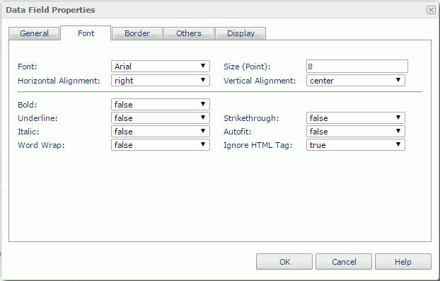
Font
This tab shows the font-related information of the data field. See the tab.
Font
Specifies the font face of the text.
Size
Specifies the font size of the text.
Horizontal Alignment
Specifies the horizontal alignment mode of the text in the data field.
Vertical Alignment
Specifies the vertical alignment mode of the text in the data field.
Bold
Specifies whether to make the text bold or not.
Underline
Specifies whether the text will be underlined or not.
Strikethrough
Specifies whether or not to attach a strikeout line to the text.
Italic
Specifies whether to make the text italic or not.
Autofit
Specifies whether or not to automatically adjust the width of the data field according to the maximum length of the contents.
Word Wrap
Specifies whether or not to wrap the text to the data field width.
Ignore HTML Tag
If this option is set to false, Logi JReport will parse HTML tag elements in the field value while the report is to be saved as an HTML file; or the field value will appear in the HTML file the same as that in Page Report Studio (HTML tag elements in the field value, if any, will not be parsed).
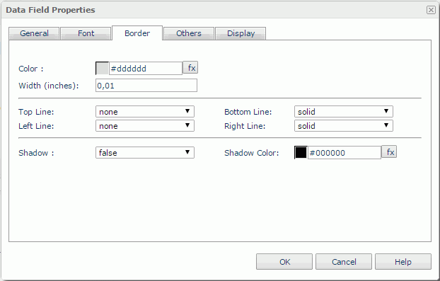
Border
This tab shows information about borders of the data field. See the tab.
Color
Specifies the border color. To change the color, select the color indicator to access the Select Color dialog and then specify a new color, or input a color string in the format #RRGGBB. If you want to make the border transparent, input Transparent in the text box.
Width
Specifies the border width in inches.
Top Line
Specifies the style of the top border line.
Bottom Line
Specifies the style of the bottom border line.
Left Line
Specifies the style of the left border line.
Right Line
Specifies the style of the right border line.
Shadow
Specifies whether the borders will have a shadow effect or not.
Shadow Color
Specifies the color of the border shadow. To change the color, select the color indicator to access the Select Color dialog and then specify a new color, or input a color string in the format #RRGGBB.
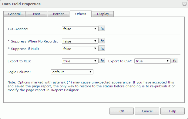
Others
You can use this tab to view and configure some miscellaneous settings. See the tab.
TOC Anchor
Specifies whether or not to add the node that represents the data field to the TOC tree that is displayed in the TOC Browser.
Suppress When No Records
If true and no records are returned by the report, the data field will not be displayed.
Suppress If Null
If true and the field value is null, the data field will not be displayed.
Export to XLS
If true, the data field will be exported when you save the report result as an XLS file (make sure to check Data Format in the Export dialog).
Export to CSV
If true, the data field will be exported when you save the report result as a TXT file with Delimited Format selected.
Scope
Available only for data fields in a table or crosstab. It is a representation of the standard HTML attribute scope. This attribute specifies the set of data cells for which the current header cell provides header information.
- Row - The current cell provides header information for the rest of the row that contains it.
- Column - The current cell provides header information for the rest of the column that contains it.
- None - The scope attribute will not be generated when exporting to HTML.
Logic Column
Specifies whether to show the data field in the next visible table cell in the same row when the column which holds the field is hidden.
Display
You can use this tab to modify the display type of the data field as one of the following: Text, Barcode, Image, Text Field, Text Area, Checkbox, Radio Button, Image Button, Button, Submit, Reset, and Hidden. What you need to do is select the display type from the Display Type drop-down list, and then set the corresponding options.
Note: For the display type Text, there is no option available. For a field displayed as rank, you cannot change its display type.
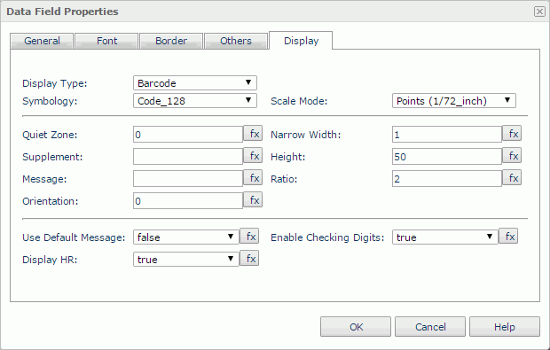
Barcode
Specifies to display the data field as barcode. See the tab.
Symbology
Specifies the barcode type.
Scale Mode
Specifies the unit for the values of the quiet zone, narrow width, supplement, height, and ratio.
Quiet Zone
Specifies the space around the barcode.
Narrow Width
Specifies the width of the narrowest barcode bar.
Supplement
Specifies the supplement of the barcode.
Height
Specifies the height of the barcode bars.
Message
Specifies the default value of the barcode.
Ratio
Specifies the width ratio of the thick bar to the thin bar.
Orientation
Specifies the rotation angle in degrees.
Use Default Message
Specifies whether or not to use the Message value as the barcode value when you view the report result.
Enable Checking Digits
Specifies whether or not to include check digits in the barcode.
Display HR
Specifies whether or not to display the characters together with the barcode bars.
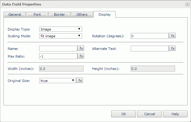
Image
Specifies to display the data field as image. See the tab.
Scaling Mode
Specifies a way to decide the size of the image. This option is enabled when Original Size is false. The mode can be:
- Actual Size: The image will be shown in its actual size.
- Customize: You can customize the size of the image by setting the Width and Height properties.
- Fit Height: The image will be scaled largest under the limitation of Max Ratio to fit the height of the field.
- Fit Image: The image will be scaled largest under the limitation of Max Ratio to wholly show in the field.
- Fit Width: The image will be scaled largest under the limitation of Max Ratio to fit the width of the field.
Rotation
Rotates the image at a specified angle in degrees. The following is the meaning of different values:
- 0 - No rotation.
- Positive value - Rotates the image clockwise.
- Negative value - Rotates the image anticlockwise.
Note: When you rotate an image, the rectangle that holds the image maintains its original size, which may result in that the image exceeds the field border and therefore the parts that extend outside of the border will be cut off.
Name
Specifies the name of the image. It is mapped to the HTML element attribute "name".
Alternate Text
If the image cannot be displayed, the alternate text will be used instead.
Max Ratio
Specifies the maximum scaling ratio of the image.
Width
Specifies the width of the image, applying if Scaling Mode is set to Customize. This option is enabled when Original Size is false.
Height
Specifies the height of the image, applying if Scaling Mode is set to Customize. This option is enabled when Original Size is false.
Original Size
Specifies whether or not to show the image in its original size.
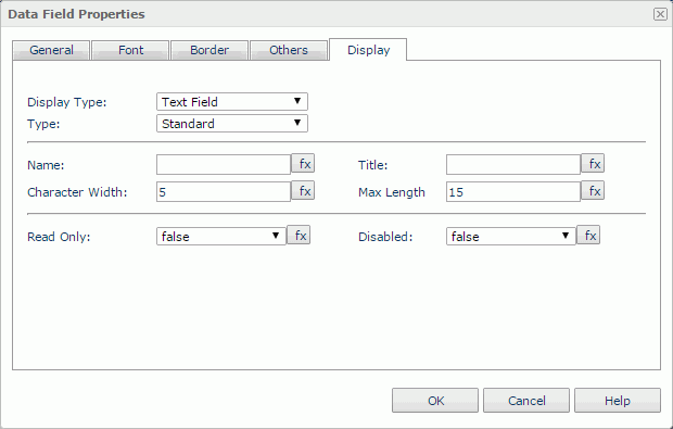
Text Field
Specifies to display the data field as text field. See the tab.
Type
Specifies whether to render the field as a normal text field or to a password box.
Name
Specifies the name of the text field. It is mapped to the HTML element attribute "name".
Title
Specifies the tip information which will be shown when you hover the mouse over the text field. It is mapped to the HTML element attribute "title".
Character Width
Specifies the width of the text field mesured in the number of characters.
Max Length
Specifies the maximum number of the characters that can be input into the text field.
Read Only
Specifies whether or not to make the text field read-only.
Disabled
Specifies whether or not to make the text field disabled.
Note: When a data field is displayed as text field, the value you have specified for the field's font property Vertical Alignment will no longer take effect. This is because the property is not supported in HTML standards.
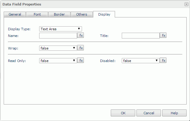
Text Area
Specifies to display the data field as text area. See the tab.
Name
Specifies the name of the text area. It is mapped to the HTML element attribute "name".
Title
Specifies the tip information which will be shown when you hover the mouse over the the text area. It is mapped to the HTML element attribute "title".
Wrap
Specifies whether or not to wrap text to the width of the text area.
Note: When a data field is displayed as text area, the value you have specified for the field's font property Vertical Alignment will no longer take effect. This is because the property is not supported in HTML standards.
Read Only
Specifies whether or not to make the text area read-only.
Disabled
Specifies whether or not to make the text area disabled.
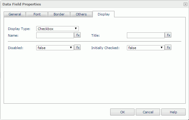
Checkbox
Specifies to display the data field as checkbox. See the tab.
Name
Specifies the name of the checkbox. It is mapped to the HTML element attribute "name".
Title
Specifies the tip information which will be shown when you hover the mouse over the the checkbox. It is mapped to the HTML element attribute "title".
Disabled
Specifies whether or not to make the checkbox disabled.
Initially Checked
Specifies whether or not the checkbox is selected by default.
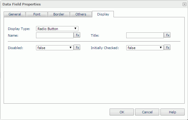
Radio Button
Specifies to display the data field as radio button. See the tab.
Name
Specifies the name of the radio button. It is mapped to the HTML element attribute "name".
Title
Specifies the tip information which will be shown when you hover the mouse over the radio button. It is mapped to the HTML element attribute "title".
Disabled
Specifies whether or not to make the radio button disabled.
Initially Checked
Specifies whether or not the radio button is selected by default.
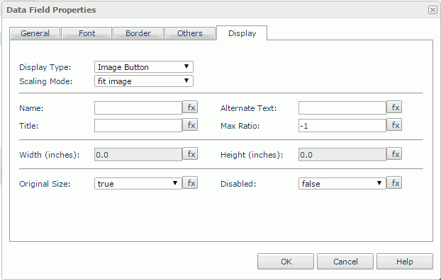
Image Button
Specifies to display the data field as image button. See the tab.
Scaling Mode
Specifies the scaling mode of the image. This option is enabled when Original Size is false. The mode can be:
- Actual Size: The image will be shown in its actual size.
- Customize: You can customize the size of the image by setting the Width and Height properties.
- Fit Height: The image will be scaled largest under the limitation of Max Ratio to fit the height of the field.
- Fit Image: The image will be scaled largest under the limitation of Max Ratio to wholly show in the field.
- Fit Width: The image will be scaled largest under the limitation of Max Ratio to fit the width of the field.
Name
Specifies the name of the image button. It is mapped to the HTML element attribute "name".
Alternate text
If the image cannot be displayed, this attribute value will be used as the alternate text.
Title
Specifies the tip information which will be shown when you hover the mouse over the image button. It is mapped to the HTML element attribute "title".
Max Ratio
Specifies the scaling ratio of the image button.
Width
Specifies the width of the image button, applying if Scaling Mode is set to Customize. This option is enabled when Original Size is false.
Height
Specifies the height of the image button, applying if Scaling Mode is set to Customize. This option is enabled when Original Size is false.
Original Size
Specifies whether or not to show the image button in its original size.
Disabled
Specifies whether or not to make the image button disabled.
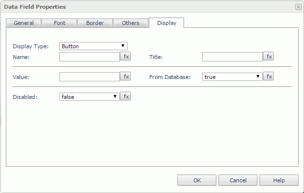
Button
Specifies to display the data field as button. See the tab.
Name
Specifies the name of the button. It is mapped to the HTML element attribute "name".
Title
Specifies the tip information which will be shown when you hover the mouse over the button. It is mapped to the HTML element attribute "title".
Value
Specifies the text displayed on the button by directly inputting or using a formula. To make this property work, you need to set From Database to false.
From Database
If true, the current DBField value will be kept as the display text on the button. If false, you can use the Value property to specify the display text.
Disabled
Specifies whether or not to make the button disabled.
Note: When a data field is displayed as button, the value you have specified for the field's font property Vertical Alignment will no longer take effect. This is because the property is not supported in HTML standards.
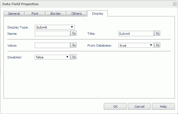
Submit
Specifies to display the data field as submit button. See the tab.
Name
Specifies the name of the submit button. It is mapped to the HTML element attribute "name".
Title
Specifies the tip information which will be shown when you hover the mouse over the submit button. It is mapped to the HTML element attribute "title".
Value
Specifies the text displayed on the submit button by directly inputting or using a formula. To make this property work, you need to set From Database to false.
From Database
If true, the current DBField value will be kept as the display text on the submit button. If false, you can use the Value property to specify the display text.
Disabled
Specifies whether or not to make the submit button disabled.
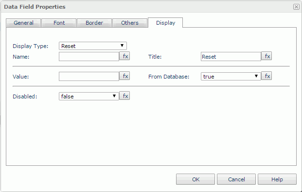
Reset
Specifies to display the data field as reset button. See the tab.
Name
Specifies the name of the reset button. It is mapped to the HTML element attribute "name".
Title
Specifies the tip information which will be shown when you hover the mouse over the reset button. It is mapped to the HTML element attribute "title".
Value
Specifies the text displayed on the reset button by directly inputting or using a formula. To make this property work, you need to set From Database to false.
From Database
If true, the current DBField value will be kept as the display text on the reset button. If false, you can use the Value property to specify the display text.
Disabled
Specifies whether or not to make the reset button disabled.
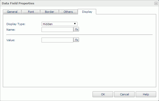
Hidden
Specifies to render the data field as hidden field. See the tab.
Name
Specifies the name of the hidden field. It is mapped to the HTML element attribute "name".
Value
Specifies the value of the hidden field by directly inputting or using a formula.
 Previous Topic
 Back to top