Track 4: Creating Library Components
Library components are used by end users to build dashboards using JDashboard which is a separately licensed product in Logi JReport Server. Library components are created and edited in Logi JReport Designer, and then published along with their catalog to the component library in Logi JReport Server for use in dashboards.
In this track, we will create two library components in Logi JReport Designer as the role of a report developer, based on the business view WorldWideSalesBV created in the previous track. One library component contains a table that shows each product's order details, including order ID, quantity, unit price, and the total sales for each order. Another library component contains a chart that demonstrates the total sales of each product. We will apply some features that are specific to library components only, such as Message, Slider and Configuration Panel.
Note: A JDashboard license for Logi JReport Designer is required in order to perform this track. If you do not have the license, please contact your Jinfonet Software account manager to obtain it first.
This track contains the following tasks:
- Task 1: Create Two Library Components
- Task 2: Deliver a Message Between the Library Components
- Task 3: Insert a Slider to Filter Data
- Task 4: Use Text Field in the Configuration Panel to Change Property Value
Task 1: Create Two Library Components
First, we will create two library components, including a table and a chart.
- Select Start > Logi JReport 15 > Report Designer to start Logi JReport Designer. The Logi JReport Designer window with the Start Page appears. Close the Start Page.
- Select File > Open Catalog.
- In the Open Catalog File dialog, browse to select the JinfonetGourmetJava.cat catalog file in
<install_root>\Demo\Reports\JinfonetGourmetJava, then select the Open button.The Catalog Manager is displayed. Close it since we will not use it in the lesson.
- Select File > New > Library Component. The Select Component for Library Component dialog appears.
- Input Product Order Details in the Library Component Title text field, select the Table (Group Above) component type, then select OK.
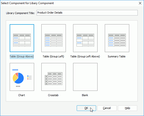
The Table Wizard is then displayed.
- In the Data screen of the wizard, select WorldWideSalesBV and select Next.
- In the Display Screen, drag the following fields to be displayed in the table: Order ID, Quantity, Unit Price, and Total one by one. Select Next.
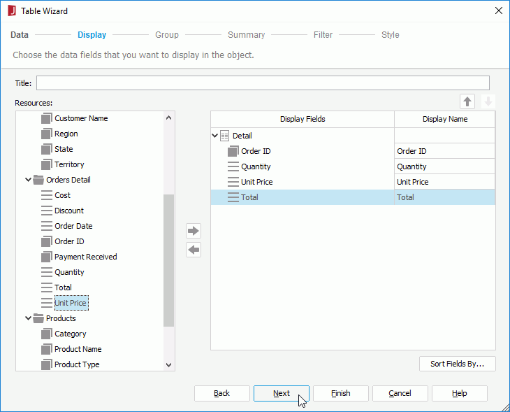
- In the Group screen, add Product Name as the group by field.
- Select Style to switch to the screen and select Commercial from the style list. Select Finish to create the table.
- Resize the group by field to make sure all the product names can be shown completely. The table displays as follows:

- Select File > Save to save the library component as ProductOrderDetails.lc.
Next, we will create the second library component that contains the chart.
- Select File > New > Library Component.
- In the Select Component for Library Component dialog, input Product Sales in the Library Component Title text field, select Chart as the component type and select OK. The Chart Wizard is displayed.
- In the Data screen of the wizard, select WorldWideSalesBV, then select Next.
- Keep the default selections in the Type screen. Select Next.
- In the Display Screen, add Product Name to the X-Axis box and Total Sales to the Bar Length box.
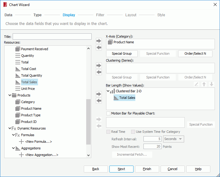
- Select Style to switch to the creen, select ClassicBlue as the chart style.
- Select Finish to create the chart. The chart displays as follows.
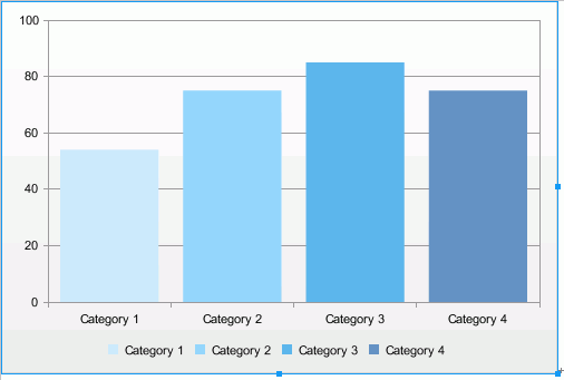
- Select File > Save to save the library component as ProductSales.lc.
Task 2: Deliver a Message Between the Library Components
In order for end users to view sales information by order ID in the table, we will define to deliver a built-in message 0002-Sort between the two library components. We will use the chart to send the message, and the table to receive the message.
- Double-click any bar in the chart. The Format Bar dialog appears.
- Switch to the Behaviors tab, select Select from the drop-down list in the Events column, then select
 in the Actions column.
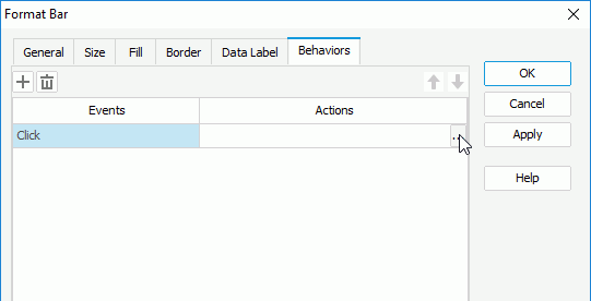
- In the Web Action List dialog, select the *SendMessage action and select OK.
- In the Send Message - Web Action Builder dialog, select the built-in message 0002 - Sort from the drop-down list, then in the Value column, select Descending from the drop-down list for Sort Order.
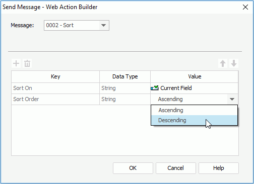
- Select OK to close the Send Message - Web Action Builder dialog.
- Select OK in the Format Bar dialog to finish defining the message.
- Select File > Save to save the library component.
Next, we will define to make the table receive the sort message that will be sent out from the chart once the select action is triggered on the chart bars.
- Select Window > Switch Window > ProductOrderDetails.lc to switch to the table library component.
- Select the table, right-click on it and select Receive Message from the shortcut menu.
- In the Receive Message dialog, select
 to add a message line, select the built-in message 0002 - Sort from the drop-down list of the Message ID column, then select
  in the Actions column.
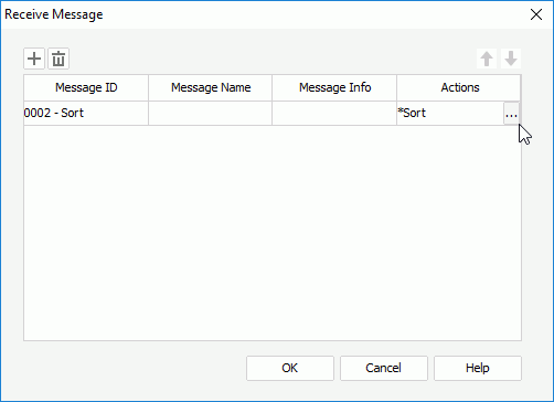
- In the Sort dialog, select Order ID from the Sort On column and Descending from the Sort Value column. Select OK to close the dialog.
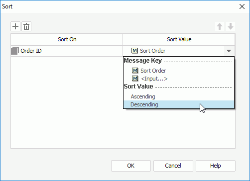
- Select OK in the Receive Message dialog to finish defining the message.
- Select File > Save to save the library component.
By now, the message between the chart and table is created and it is defined as follows: when any bar on the chart is selected at runtime, the built-in message 0002 - Sort will be sent out from the chart to the table, and when the table receives the message, it will make the order IDs sort descending as a response to the message.
Task 3: Insert a Slider to Filter Data
To help end users easily get product sales information in a specific time period, we will insert a slider to filter on the Order Date field for the table.
- Select Insert > Web Control > Filter Control.
- In the Insert Filter Control dialog, select Range Slider as the control type, from the Select Fields drop-down list check Order Date, then select outside of the field drop-down list in the dialog to finish selecting field.
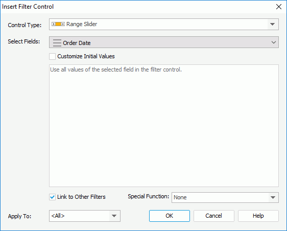
You can also select Customize Initial Values to customize the values you want to show on the slider. Here, we will use all the values in the Quantity field on the slider.
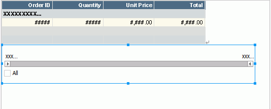
Select OK to insert the slider. The slider displays as follows in the library component:
- Select File > Save to save the library component.
Task 4: Use Text Field in the Configuration Panel to Change Property Value
In this task, we will insert a text field into the configuration panel of the table library component and bind the Change Property web behavior to it so that end users can use the text field to dynamically change the background color of the Quantity field at runtime.
- Check the Display Configuration Panel checkbox on the top-right corner to display the panel.
- Select Insert > Web Control > Text Field to insert it in the configuration panel.
- Right-click the text field and select Web Behaviors > Change Property from the shortcut menu. The Change Property - Web Behavior dialog appears.
- Select Quantity from the Apply Action To drop-down list, Background from the Properties drop-down list, and TextField from the Value drop-down list, then select OK.
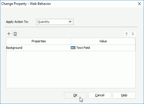
Then at runtime, end users can input a hexadecimal RGB value in the text field to change the background color of the Quantity field in JDashboard.
Next we will add a label ahead of the text field to help end users identify what it is used for.
- Select Insert > Label to add a label ahead of the text field.
- Double-click the label and edit its text to Background Color of Quantity. Resize the label to make the whole text in it shown.
The label and text field display as follows in the configuration panel:

Select File > Save to save the library component.
 Previous Topic