The Relevance Filter
Logi developers may find themselves working with data that contains records that are not relevant to the presentation. This data could, for example, have values that are too small for individual inclusion. The Relevance Filter element provides developers with a method of distinguishing between relevant and irrelevant data.
- About the Relevance Filter
- Apply the Relevance Filter
About the Relevance Filter
The concept of irrelevant data is at the heart of understanding the Relevance Filter. Data relevance is determined by some criteria the developer establishes - cost or quantity, for example - and data that fails to meet the criteria may be left out of a report.
At the same time, it may be useful to collect the irrelevant data and present it collectively, rather than leave it out altogether. It might be useful to present it, for example, grouped together as "Other".
The Relevance Filter element, used with a datalayer, allows Logi developers to establish relevance criteria and cause data rows that don't meet that criteria to be removed from the datalayer. Optionally, the irrelevant data rows can be retained and grouped together for presentation along with relevant data groupings.
Dynamic Filtering
Beginning in v10.0.319, the Relevance Filter element has an Include Condition attribute:
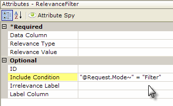
If the value of this attribute is left blank or contains a formula that evaluates to True, the element is applied to the datalayer. If the value evaluates to False, the element is ignored and does not affect the datalayer. This powerful feature allows developers to dynamically determine if the datalayer will be filtered or not.
Apply the Relevance Filter
The following examples show how a Relevance Filter can be used with a pie chart:
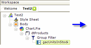
- As shown above, we start with a simple pie chart, working with product data, and use a Group Filter element to group on the CategoryName column.
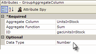
- A Group Aggregate Column element is added beneath the Group Filter to sum the UnitsInStock column for each category group. This produces a new column in the datalayer, named gacUnitsInStock.
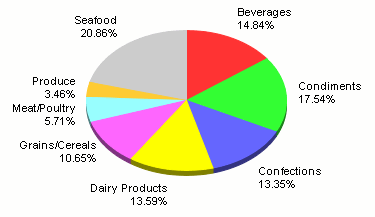
When the report is run, the pie chart shown above is displayed. Note that there are several smaller wedges for the Produce, Meat/Poultry, and Grain/Cereals categories. These are the categories (and data) we're going to target in the next example as irrelevant.
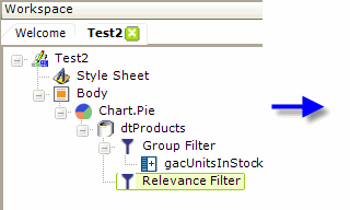
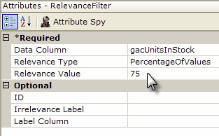
- In this example, a Relevance Filter element is added beneath the datalayer, as shown above. Its Data Column attribute is set to the ID of the column that sums the number of units in stock for the categories.
- Its Relevance Type attribute value is set to PercentageOfValues and its Relevance Value attribute to 75. This indicates that rows in the datalayer whose gacUnitsInStock column value is less than 25% of the total will be removed. In other words, the "bottom 25%" will be dropped.
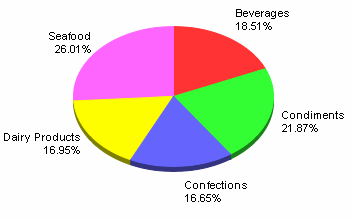
Now you can see, as shown above, that the smaller wedges - the irrelevant data - no longer appear in the pie chart. We also have the option of keeping the irrelevant data, collected in a separate group, as shown in the next example.

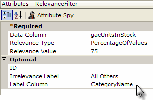
- In order to use the irrelevant data as a group, the Relevance Filter element's Irrelevance Label attribute is given the value we want to appear identifying this group in the chart.
- Its Label Column attribute is set to the column in the datalayer whose value we want to replace with the Irrelevance Label value we just specified, in this case CategoryName.
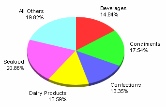
And, as shown above, the irrelevant data has been grouped into a category of its own, called "All Others", and added to the chart.
The Relevance Filter can use three different methods for calculating relevant values:
- Percentage of Values - as we've seen, this method removes rows that fall below a certain percentage of the total value.
- Number of Rows - this method retains the top n rows based on value and discards the rest.
- Value - this method retains rows whose value falls at or above below the value specified and discards the rest.
By using the Relevance Filter, we're able to reduce the visual clutter that a lot of small wedges might create, while still accounting for their value in the chart (the wedges still add up to 100%).