Creating Your Own Themes
Beginning with v12.1, Logi Studio includes the Theme Editor wizard, a tool that allows you to quickly and easily create your own custom themes. This tool is also available as an element, if you'd like to build an application that lets administrative users modify the application's appearance at runtime. For more information, see Use the Theme Editor.
Developers working with earlier Logi Info versions can create custom themes manually. You're encouraged to examine the standard themes and use them as the basis for creating your own themes. The remainder of this topic discusses this process.
Creating a Custom Theme Manually
At a minimum, themes consist of a Theme Modifier file, which does the work. Themes that impart an appearance generally also include a collection of images and a theme style sheet. Each theme is contained in its own folder, which bears the name of the theme. You can view the currently available themes in action in the Sample Themes Library, as well as the Sample Themes Application.
When you create a Logi application, the standard themes distributed with Logi products are stored in separate folders in the <yourApp>\rdTemplate\rdTheme folder; these should never be edited.

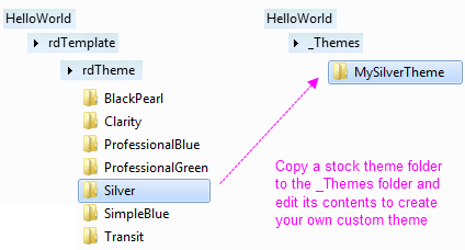
However, you can copy standard theme folders and then customize the files within them to create your own custom theme. Copy the standard theme folder to the _Themes folder beneath your application folder, i.e. <yourApp>\_Themes, (which you may have to create) and rename it to the name of your new custom theme, as shown above.
Apply your customizations to the files in this folder. Your custom theme will then be available for your application, by name, along with the standard themes, in the Style and Global Style elements' Theme attribute selection list, and will also be available for deployment with Studio's Deployment Tool.
One of the key mechanisms in a theme is the "template modifier file" or TMF. In your copied Theme folder, you'll find such a file, named ThemeModifier.xml. A TMF is an XML file that includes instructions for modifying the elements and attributes in a report definition. The TMFs in the standard themes are quite complex, as they attempt to cover all of the elements available for use in a report. Your custom TMF doesn't necessarily have to be so all-encompassing; it could, for example, only address the charts or other elements that are specifically used in your reports.
If you examine the TMF and style sheet in one of the standard themes, you'll see that the class and ID names are all carefully constructed to be unique, which is very important and which you are also encouraged to do.
![]() The standard ThemeModifier.xml file may contain references to the standard style sheet and standard images in the rdTemplate/rdTheme/<Theme> folder. In
your custom TMF, you
may need to change these to reference the style sheet and images in your custom Theme folder.
The standard ThemeModifier.xml file may contain references to the standard style sheet and standard images in the rdTemplate/rdTheme/<Theme> folder. In
your custom TMF, you
may need to change these to reference the style sheet and images in your custom Theme folder.
Template Modifier Files provides detailed information about creating and using TMFs.
DevNet's Element Gallery page has information about all of the elements and their attributes and may be useful when creating your own themes.
Your Themes in the New Application Wizard
If you want your custom theme to be available in Studio's New Applicationwizard, copy its folder to (you may have to create the _Themes folder):
- (.NET) C:\Program Files\LogiXML IES Dev\LogiStudio\BaseApp\<version>\_Themes
(Java) C:\Program Files\LogiXML IES Dev\LogiStudio\BaseApp\<version>\_Themes
The New Application wizard displays a thumbnail image of each theme and, if you want to include images for your custom theme, place it, as a 225x160px .JPG image with the same name as your theme, in this folder:
- C:\Program Files\LogiXML IES Dev\LogiStudio\bin
Finally, If you create a custom appearance-specific theme that you think looks cool, it would be great if you shared it here on DevNet.
Element-Specific Theme Classes
Theme definitions also include an element-specific class filtering mechanism. This mechanism ensures that theme-related style classes meant for a specific element will appear in the Class attribute drop-down list for that element and only for that element. If you're creating your own theme, use the following text in its Theme.css file to indicate the start of those class definitions:
- /*User classes*//*rdElement: elementName */
where elementName is the name of the element (the XML source name, which appears at the top of the Attributes panel, not the name that appears in the Element Tree, which may have embedded spaces)
Classes that apply to multipleelements can be specified by using the | character to combine the element names, like this:
- /*rdElement: element1Name | rdElement: element2Name */
Classes defined like this will appear in the class list for the named elements, along with all the other appropriate theme classes and style sheet classes.
Here's a more complete example (don't enter the directions, within square brackets):
[ add after all other standard classes, just before end of file ]
/*User classes*/
/*rdElement: Label */
.font12pt {
font-size: 12pt;
}
/*rdElement: Division */
.font16pt {
font-size: 16pt;
}
/*rdElement: InputText | rdElement: InputPassword*/
.alignMiddle {
vertical-align: middle;
}
/*End Element*/ [ this is already in the file ]
Once the custom theme is applied, the class "font12pt" will appear in the list of Class attribute choices for all Label elements, and "font16pt" will appear in the list of class choices for all Division elements. "alignMiddle" will appear in the list of choices for both the Input Text and Input Password elements.