Working with Column Headers
A column header contains optional information at the top of a specific Data Table column. Generally, column headers consist of text but, in a Logi application, they can include images and even user input controls, like buttons and links. Text or images may be a link that, when clicked, sorts the table on the column in alternating ascending and descending order.
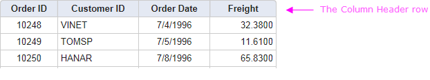
The Column Header row is the first row in the table, as shown above. To configure a column header:
- Select one of the Data Table Column elements in the definition.
- Set the Header Type attribute to Image if an image is desired in the column header. If left blank, the default value is Text.
- In the Column Header attribute value, type the desired text or choose an image from the drop-down list of choices.
- The column header text is centered by default. However, you can apply a different class to all of the column headers at once by setting the parent Data Table element's Column Header Class attribute, or apply one individually to one or more columns by using their own Column Header Class attribute.
Using Extra Column Headers
Column headers normally consist of a single line title, but Logi Studio makes it easy for developers to add additional content if necessary. Developers can create extra column headers with multiple rows, containing text, links or images.
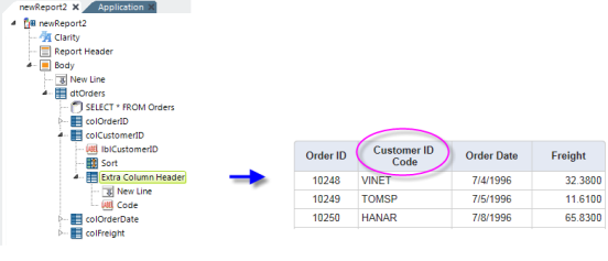
In the example above, an Extra Column Header element has been added as a child of a Data Table Column. It contains New Line and Label elements and the effect is to make a 2-line column header for the Customer ID column, as shown.
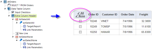
Another example, shown above, includes a column with a check box, for selecting rows, a common implementation in Data Tables. The Extra Column Header in this case includes two links that refresh the table, checking or unchecking all rows. The Link Parameters elements pass either a "1" (All) or nothing (None) when the report is refreshed, and the Input check box element uses the passed Request variable as its Default Value and "1" as its Checked Value.
Hiding Table Headers
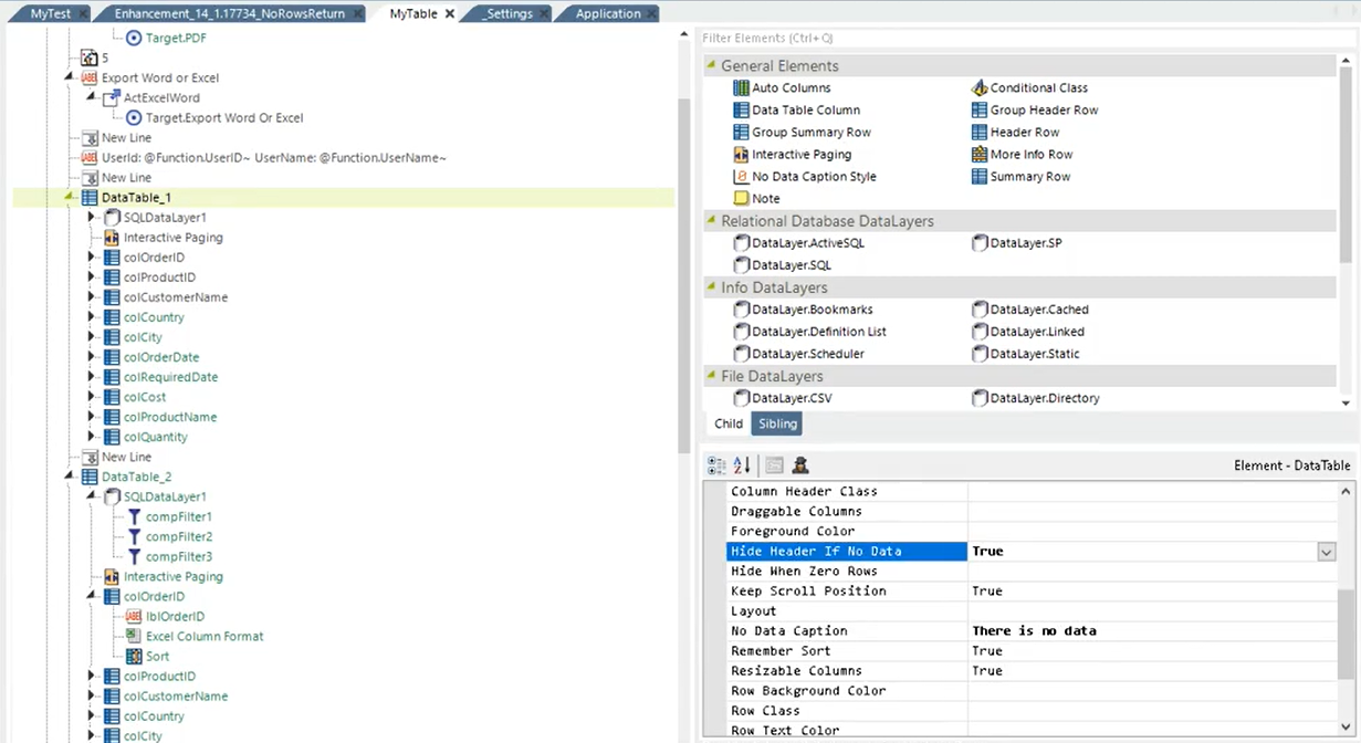
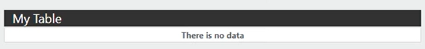
 New for 14.1 Control whether your message includes table headers on an individual Data Table when there is no data to display by setting the new attribute 'Hide Header If No Data' to "True":
As a result, your message will look like this:
To control the header display for all Data Tables on an application level, set the InfoGo constant 'rdHideDatatableHeaderIfNoData' to "True". By default, this constant is "False". For more information, see Configuring InfoGo Constants.

For managed Data Tables/Crosstabs, the 'Hide Header If No Data' attribute overrides the 'rdHideDatatableHeaderIfNoData' constant, while AG/SSRM Data Tables/Crosstabs take the constant value.
By default, the values for both the attribute and the constant is "False" and "Default", respectively.