Thinkspace - Working with Crosstab Charts
Let's start by visualizing "cross-tabbed" data in a chart.
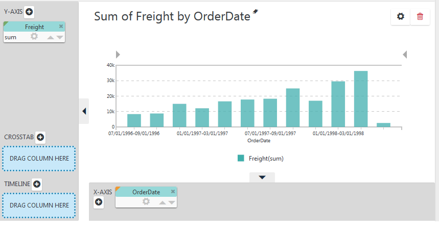
Our starting point will be a regular Column chart, showing Freight by OrderDate, as shown above.
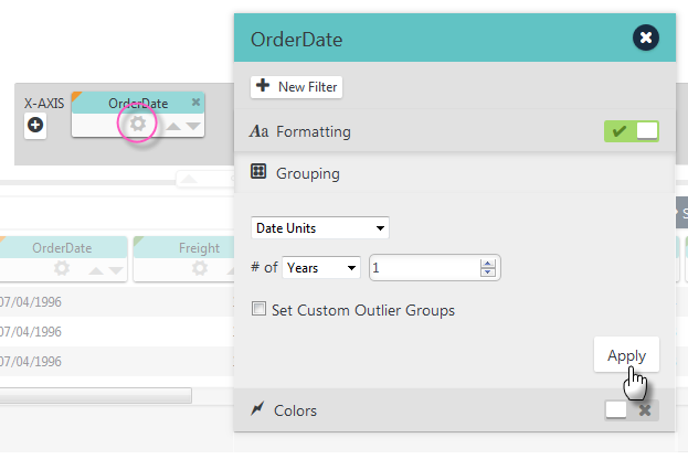
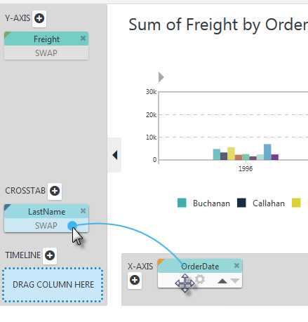
Open the OrderDate pill using its gear icon, and change its Grouping to use Date Units, with # of Years = 1, as shown above. The chart will be re-drawn accordingly.
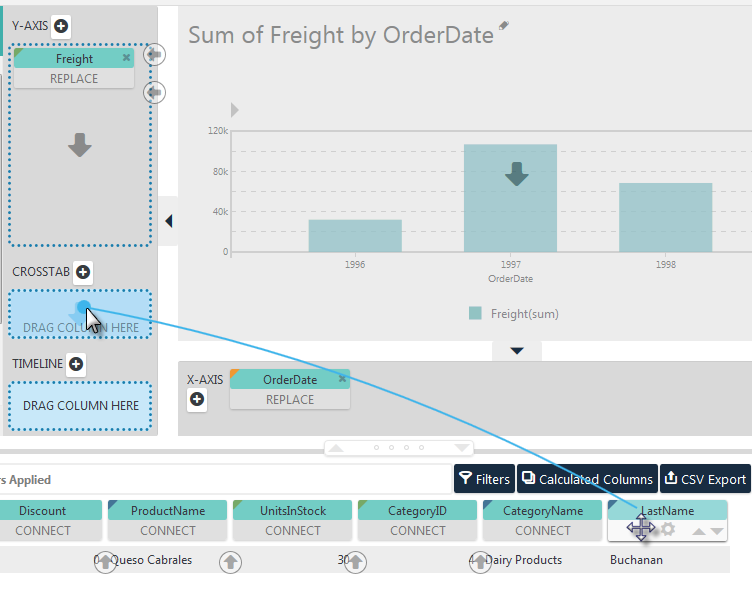
Drag and drop the LastName pill from the Data Table into the CROSSTAB drop zone, using the Blue Dot Connector, as shown above. The chart will be re-drawn accordingly.
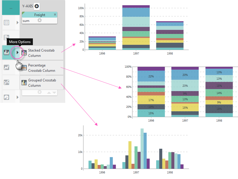
The cross-tabbed data can be shown as stacked (values), stacked
(percentages), or grouped side-by-side. When the LastName pill was
dropped, the option for the selected chart type in the Visualization menu
acquired a "More Options" arrow icon, circled above. Click it to see the
crosstab charting options and select the Grouped Crosstab Column option.
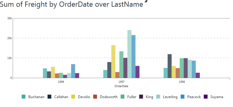
The resulting chart will look like the example above.
If you'd like to view the data a little differently, for example, grouped by LastName instead of OrderDate, it's easy to do - just drag and SWAP the two column pills, as shown above.
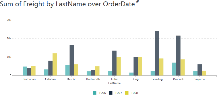
And the resulting chart is shown above.