General Chart Appearance
When reports are generated, each charting element is rendered in an "image space" and the elements have attributes that allow developers to control the size and background color of that space. The shape of the image space may not match the shape of the data portion of the chart.
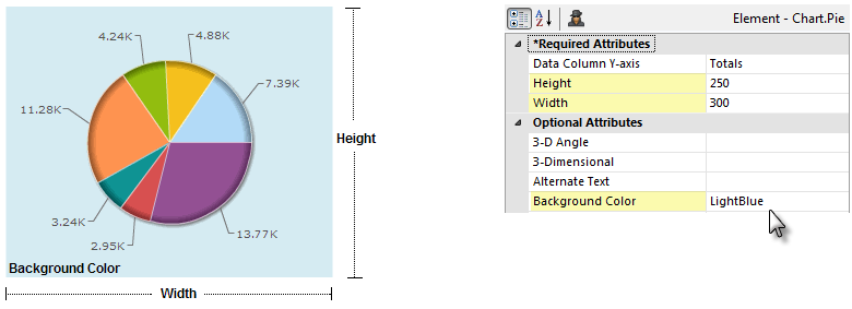
For example, as shown above, even though the chart is round, the Height, Width, and Background Color attributes refer to its rectangular image space. The Height and Width values use pixels as their unit of measurement and can be set using tokens.
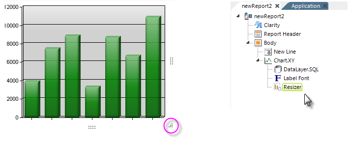
The Resizer element can be added as a child of Static charts. It causes "resizing handles", circled above, to be displayed when the cursor hovers over them. Users can drag these handles at runtime to dynamically resize the chart. Resizer changes are maintained between sessions, so the chart will maintain its size on subsequent page visits. You can specify maximum and minimum size limits for the chart.

Many charts have a Colors attribute for setting the colors of data portions of the chart. If this attribute is left blank, a default color set is used. A custom color set can be entered, in a comma-separated list, as shown above.
Color values may be entered as a name ("LightBlue"), a decimal RGB value (255,255,255) or a hex RGB value (#112233).
Chart.Pie and Chart.XY include a "Color Data Column" attribute that identifies a column in the datalayer as the source for the color information for static pie and bar charts, allowing you to set the colors from data.
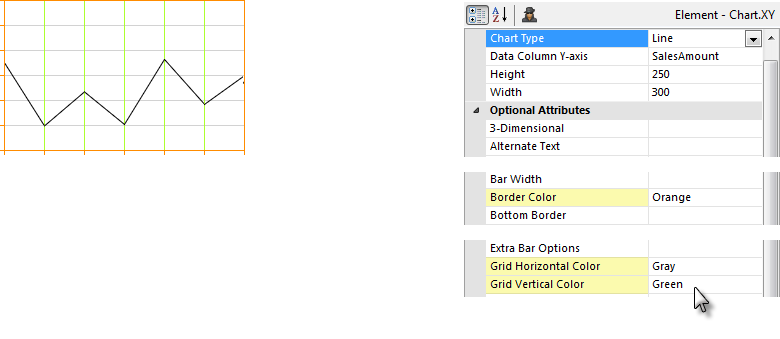
Line, Area, Bar and other charts can use a background grid of lines to help the eye follow values, as shown above. The color of the chart area border and grid lines can be set. Color values may be entered as a name ("Orange"), a decimal RGB value (255,255,255) or a hex RGB value (#112233).

The tick marks displayed just outside the axis borders in Static Chart.XY charts can be shown or hidden, by setting the Tick Marks attribute in the Data Font and Label Font elements.
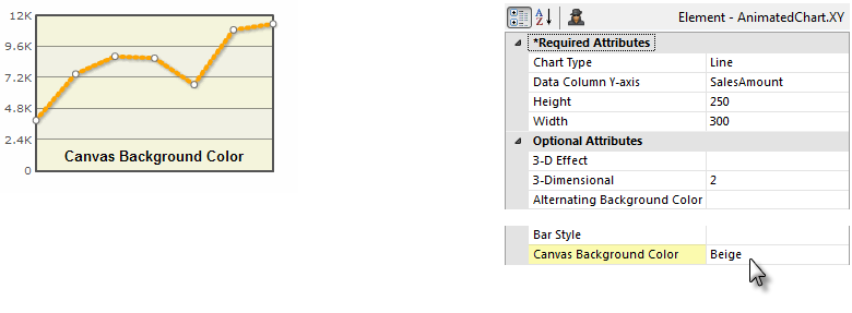
The data portions of Animated Chart.XY charts are rendered on a "canvas", which can have its own background color, as shown above, which is set using the Canvas Background Color attribute. A compatible color is automatically generated for alternating values.
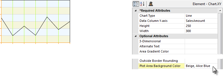
In a Static Line chart, shown above, the attribute that controls the canvas color is the Plot Area Background Color. Different colors for alternating values can be shown by entering a comma-separate list of values.
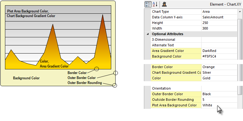
In Static Chart.XY charts (Area, Bar, Line) individual attributes control the colors of the data, plotting area background, and borders. There are also attributes for applying color gradient effects and for rounding outer border corners.
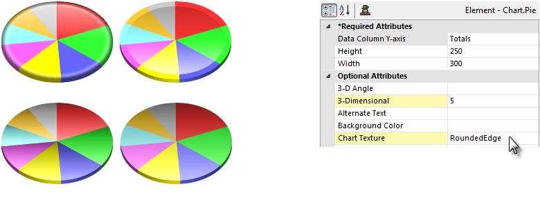
Static Chart.Pie charts include 3-Dimensional and Chart Texture attributes that can be used to apply different appearances to the chart surface. 3-D depth and 3-D angle can also be configured. The Chart Texture attribute is also available for the Chart.Heatmap element, as well.

Many charts also have a 3-Dimensional attribute which controls rendering in 2-D or 3-D, as shown above. The 3-D rendering process affects not only the data portions of the chart but the canvas, too. In the case of Gauge.Needle, the Needle Gauge Enclosure attribute can even add a very realistic-looking "glass cover" over the face of the gauge.
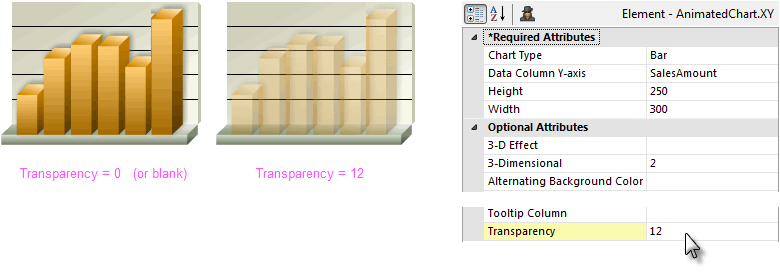
As shown above, many charts also have a Transparency attribute, which can be useful for letting different chart layers show through each other. The lowest value for this attribute is 0 (or blank), which makes the chart opaque, and the highest is 15, which makes the chart completely transparent.
![]() This does not affect the canvas itself.
This does not affect the canvas itself.
Saving Charts
All charts can be saved as image files by right-clicking them and selecting Save from the pop-up menu. Animated Pie charts have additional runtime features available via their pop-up menu, including Rotation and Slicing (clicking a slice to explode it out from the pie).