Gallery of Deprecated Classic Charts
These Classic Charts are still supported and will continue to work, but their elements are no longer available in Studio. Use alternate elements as indicated.
| Chart | Description |
|---|---|
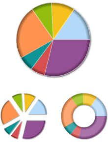
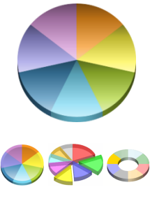
| Element name: Animated Chart.Pie Deprecated - use Chart Canvas instead. This Flash-based chart "draws itself" when the page is displayed or refreshed. A pie chart (or circle graph) is a circular chart divided into sectors, illustrating relative magnitudes, frequencies, or percentages. It's named for its resemblance to a pie which has been sliced. Alternate visual styles of this chart include exploded pie wedges and the Doughnut shape. |
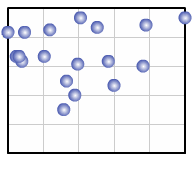
| Element name: Animated Chart.Scatter Deprecated - use Chart Canvas instead. This Flash-based chart "draws itself" when the page is first displayed. A scatter chart uses Cartesian coordinates to display values for two variables from a dataset. The data is displayed as a collection of points, each having the value of one variable determining the position on the horizontal axis and the value of the other variable determining the position on the vertical axis. |
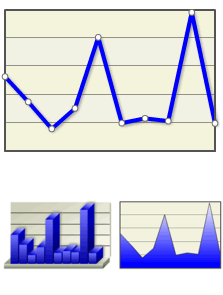
| Element name: Animated Chart.XY Deprecated - use Chart Canvas instead. This Flash-based chart "draws itself" when the page is first displayed and is capable of producing Line, Bar, and Area charts. Cartesian coordinates are used to display values for two variables from a dataset and plot them as points on the chart. These points are used to create the visual representation of the data. Alternate visual styles of this chart include Bar, Area, and 3-Dimensional renderings. |
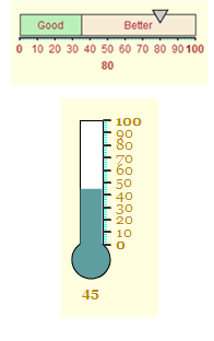
| Element name: Animated Gauge.Bar Deprecated - use Gauge.Balloon Bar, Gauge.Bullet Bar, or Gauge.Bar instead. This Flash-based chart "draws itself" when the page is first displayed. A single data value is plotted along a either a Horizontal Bar or a Vertical Thermometer scale, providing a quick at-a-glance indication of its value. |
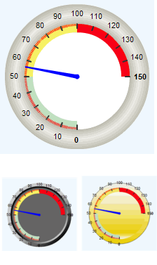
| Element name: Animated Gauge.Needle Deprecated - use Gauge.Angular instead. This Flash-based chart "draws itself" when the page is first displayed. This chart resembles an automotive speedometer or tachometer and provides an eye-catching data visualization. Alternate visual styles of this chart include Bevel and Lens. |
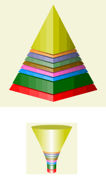
| Element name: Animated Gauge.Pyramid Deprecated - use Chart Canvas instead. This Flash-based chart "draws itself" when the page is first displayed. This chart provides a striking comparison of data, using the thickness of its layers to denote relative values. An alternate visual style for this chart is the Funnel shape. |
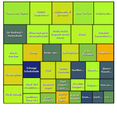
| Element name: Chart.Heat Map Deprecated - use Chart Canvas instead. This element produces one of the most unusual charts found in Logi reporting products, with a unique arrangement of rectangles representing data and relationships using color and size. It produces an image-based chart that can be exported. |
| Element name: Chart.Pie Deprecated - use Chart Canvas instead. A pie chart (or circle graph) is a circular chart divided into sectors, illustrating relative magnitudes, frequencies, or percentages. It is named for its resemblance to a pie which has been sliced. Alternate visual styles of this chart include 2-Dimensional, exploded pie wedges, and 2-D and 3-D doughnuts. |
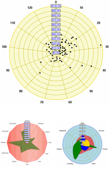
| Element name: Chart.Polar Deprecated - use Chart Canvas instead. This a circular graph in which data is displayed in terms of values and angles. Also known as a "radar chart", this is an X-Y graph drawn on a circular grid, displaying value trends on the basis of angles. Alternate visual styles of this chart include Area,Spline Area, Scatter, Bubble, Spline Line, Line, and Radar. |
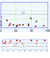
| Element name: Chart.Scatter Deprecated - use Chart Canvas instead. A scatter chart uses Cartesian coordinates to display values for two variables from a dataset. The data is displayed as a collection of points, each having the value of one variable determining the position on the horizontal axis and the value of the other variable determining the position on the vertical axis. Alternate visual styles of this chart includes point symbols that are circles, crosses, diamonds, triangles, or "X"s. |
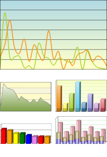
| Element name: Chart.XY Deprecated - use Chart Canvas instead. This multi-faceted element can be used to product a wide variety of charts. Cartesian coordinates are used to display values for two variables from a dataset and plot them as points on the chart. In a Line chart, a line connects these points to create the visual representation of the data. Multiple datasets can be combined in one chart, using the same or different visual representations. Alternate visual styles of this chart include Area, Bar, Spline, Stacked, and 3-Dimensional. |
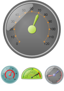
| Element name: Gauge.Needle Deprecated - use Gauge.Angular instead. This chart resembles an automotive speedometer or tachometer and provides an eye-catching data visualization, plotting a single data value on its perimeter. Round, half-round, quarter-round, and rectangular formats are available. |
