Dashboard Designer: Image Tiles (v2019.2+)
An image file can be added to the Dashboard in an Image tile. Most image files supported by a modern web browser (for example JPG, PNG, GIF, SVG, ICO, BMP, WEBP, etc…) can be displayed in an Image tile.
To add an Image tile to a Dashboard, review the Dashboard Designer topic. Tiles can be added from the  New Tile menu.
Controls for interacting with the Image tile are contained in the Tile Properties Pane on the right side of the screen. Click on the tile to select it and the Tile Properties Pane will fill with the properties for the selected tile.
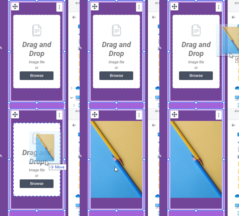
Once the tile is created on the canvas, an image file can be:
- dragged-and-dropped onto the Image tile

- the browse your files link in the tile can be clicked to open a standard file browser
Tile Properties Pane
Content
The Content tab for Image tiles allows the image file to be changed. Either drag-and-drop the image file to the pane, or click the browse your files link to open a standard file browser to choose an image.
The Attached Image field displays the file name of the image contained within the tile.

Style
The Style tab for Image tiles is further broken down into two areas: Fit and Tile.
Fit sets how the image fits inside the tile. There are three options to select from.
- Fit will change the dimensions of the image so that the entire image can be seen in the tile, maintaining the image’s aspect ratio. This is the default Tile Fit mode for new Image tiles.

- Stretch will stretch the image to completely fill the tile dimensions, ignoring the aspect ratio of the image file

- Keep original size will not change the dimensions of the image at all. The image appears with its original dimensions.

The Tile section is where tile appearance can be changed. The settings here override the Canvas Format defaults.
- Check Background to set a background color for the tile. Click Color to open the color selector and choose a background color. Unchecking the Background checkbox makes the tile transparent.
- Check Tile Header to set a background color for the tile’s header. Click Color to open the color selector and choose a background color. Unchecking the Tile Header checkbox makes the header background transparent.

The Tile Header options are only shown if the Tile Header is visible on the canvas.
- Check Shadow to show a slight shadow effect around the tile.
- Check Border to apply a border to the tile.
- Check Customize Border to set the properties of each of the four tile borders individually. Leave unchecked to have the border properties applied equally to the four sides.
- Click Color to open the color selector and choose a border color.
- Width sets the border width in pixels.
- Round sets the roundness of the corners.
Advanced
The Advanced tab is not available for Image tiles.