Gallery of Classic Chart and Gauge Elements
The following table describes the charts that are available:
| Chart | Description |
|---|---|
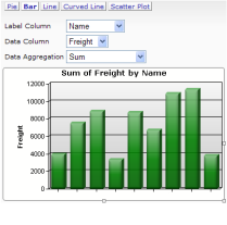
| Element name: Analysis Chart The Analysis Chart is a dynamic chart set that offers users interactive data analysis capabilities. While viewing a report in their browser, users can select chart types and chart data. Chart options include: Pie, Bar, Line, Spline, and Scatter. |
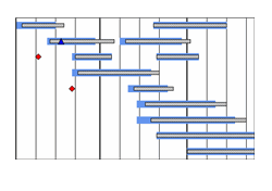
| Element name: Chart.Gantt A Gantt chart is a popular type of bar chart that illustrates a project schedule. Gantt charts illustrate the start and finish dates of the terminal elements and summary elements of a project. Terminal elements and summary elements comprise the work breakdown structure of the project. Chart.Gantt is limited to 1,000 data rows and only supports one Extra Gantt Column child element. |
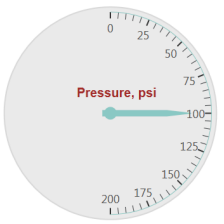
| Element name: Gauge.Angular Gauge.Angular displays
an angular gauge chart, similar to a speedometer. Upper and lower values define the bounds of the gauge, and a value indicates where the needle points. Angular gauges may have labels, tick marks, and differently-colored rings. You can also customize the size of the gauge to be smaller, or larger, within the gauge area by defining a percentage in the "Gauge Size Adjustment" attribute. |
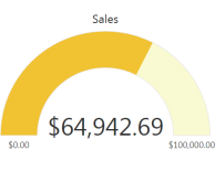
| Element name: Gauge.Arc Arc gauges are simple, clean visualizations which show a beginning and ending values, with an arched color bar between. The data value number is shown within the arc. The gauge may have multiple ranges in different colors. The color of the arc is determined by which range contains the value. |
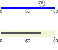
| Element name: Gauge.Balloon Bar and Gauge.Bullet Bar Balloon Bar gauges show a value inside a prominent balloon box, with a pointer
going into the bar. Bullet Bar gauges show a bar within a bar. These are especially good for presenting key values in an easy-to-read image. |
| Element name: Gauge.Bar A single data value is plotted along a vertical thermometer scale, providing a quick at-a-glance indication of its value. Alternate visual styles of this chart include Horizontal Thermometer, Vertical Bar, and Horizontal Bar. |
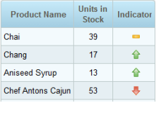
| Element name: Gauge.Indicator This chart provides multi-colored signals associated with a single dataset, providing a quick at-a-glance indication of value. Alternate visual styles of this chart include a choice of standard signal images (Rectangle, Circle, Up Triangle, or Down Triangle) or your own custom images. |
|
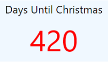
Element name: Gauge.Number Displays a value as number or text. The value automatically resizes to fit the container. The value may be displayed in different colors, typically indicating how the value compares to goals defined by the ranges. |
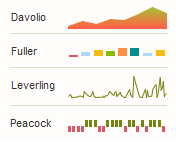
| Element name: Sparkline.Area, .Bar,
.Line, .WinLoss Sparklines are tiny charts appropriate for showing many trends at once, as a set of small timelines. They are typically drawn without axes or gridlines and are often shown inside Data Tables, alongside labels. |
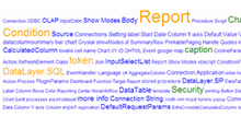
| Element name: Text Cloud This chart creates unique visual depiction of the relative weightings of words and phrases. Greater weightings or frequencies can be denoted through color and font size. |
Exporting Gauges as Images
Many gauges can be exported as a .PNG image, including the following:
- Gauge.Arc
- Gauge.Angular
- Gauge.Balloon Bar
- Gauge.Bullet Bar
More information about how to configure them to be exportable can be found in Export Chart Canvas Charts.
