Cell Color Sliders
This topic introduces developers to the Cell Color Slider element. As a child element of the Data Table Column, it provides a new methods of depicting data values using color.
The Cell Color Slider element is similar to the Cell Bar Gauge element in that it generates a graphic depiction of the data within its Data Table column.
As shown above, the Cell Color Slider element shows a column's numeric values with a colored indicator or background. The color for a particular column varies depending on where its value fits into the overall population of values for that column in the table. Low values are one color, middle values a second, and high values, a third color; everything in between is given shades of those colors. The Cell Color Slider element makes it easy to visualize how values in a column relate to each other.
At runtime, the user can manipulate an optional slider control at the top of the column to adjust the "middle value" color and the color indicator can be a square, a circle or the entire cell background.
 Cell Color Slider elements should not be used in reports that will
be exported, for example, to PDF or Excel formats.
Cell Color Slider elements should not be used in reports that will
be exported, for example, to PDF or Excel formats.
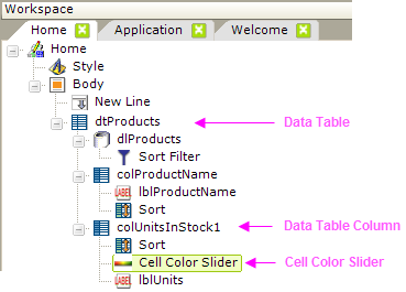
The report definition elements for the first part of the earlier example are shown above. The Cell Color Slider element is the child of a Data Table Column element, which is in turn the child of the Data Table element.
You cannot use the Cell Color Slider element in a
SubData Table.
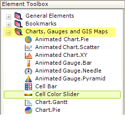
When a Data Table Column is selected, the Cell Color Sliderchild element can be found in the Charts and Gauges folder in the Suggestions panel, as shown above.
Setting Cell Color Slider Attributes
The attributes associated with the Cell Color Slider element in our example are shown below:
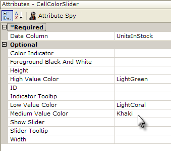
- The Data Column attribute has been set to the name of the data column retrieved in your Data Layer element (the actual column name, not the @Data.ColumnName~ token).
- The Color Indicator allows you to choose between Square, Circle, or Background indicators. Default: Background
- The Foreground Black and White attribute, when set to True, automatically sets the foreground color of text in each cell depending on the background color. If the background color is dark, the foreground font is set to white; if the background is light, the font becomes black.
- The High Value Color attribute sets the "high" end of the color scale; representing the highest data values. Default: Green
- The Middle and Low Value Color attributes set the "middle" and "low end" of the color scale; representing the median and low data values. Defaults: Yellow and Red
- The Show Slider attribute determines whether a slider appears below the column header caption; when visible, the slider can be moved by users at runtime to fine tune the Middle value color.
- Height and Width determine the physical size of the bar -
 it can be smaller than the cell itself; allowing you to put
both a Cell Color Slider and a label in a column.
it can be smaller than the cell itself; allowing you to put
both a Cell Color Slider and a label in a column.
- ID and Slider Tooltip are the usual identifier and "hover text" attributes.
What About the Data?
You don't need to do anything other than identify the Data Column. The Cell Color Slider element automatically evaluates all of the values for its column and adjusts the colors accordingly.
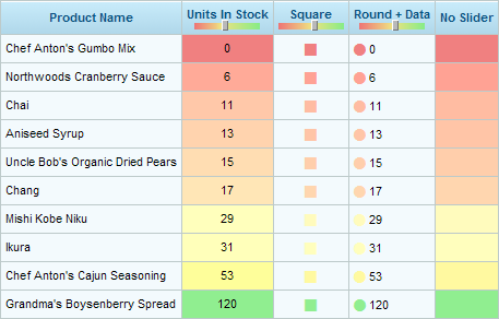
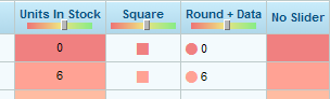
A example of a Data Table using Cell Color Slider is shown above.
The arrangement in the Units In Stock column was achieved by using both a Cell Color Slider and a Label element, and setting the Data Table Column element's Class attribute to ThemeAlignCenter.
If you include and configure a Sort element in your Data Table Column, the Cell Color Slider will sort when the column header is clicked, just like any data value.
Cell Color Sliders Can Be Links
Cell Color Slider elements, like Labels, can be links to other reports or URLs.
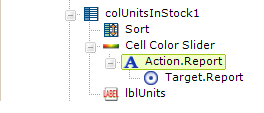
As shown above, the Cell Color Slider element can be a parent to any of the Action elements.