Popup Panels
Logi Info includes the Popup Panel element, which opens a fully-functional, configurable window that can include Data Tables, charts, sub-reports, images, and other standard visualizations.
The following topis discuss the Popup Panel element, as well as the Tooltip Panel:
- Popup Panel Attributes
- Using a Popup Panel with a Link
- Using a Popup Panel with the onMouseOver Event
- Passing Parameters to a Popup Panel
- Data Entry in Popup Panels
- The Tooltip Panel
About the Popup Panel
A Popup Panel is a separate window that you can open "on top" of your existing report page. You can control its size, initial location, modal state, style, and, of course, its contents. It can contain almost every other element you would use in a regular report, with the exception of the super-elements (Dashboard, Analysis Grid, etc.). and a few others.
The visibility of a Popup Panel is controlled using the
Action.Show Element element and therefore it can be shown or hidden
when a user clicks a link, button, image, or data, or when a DHTML event
occurs.

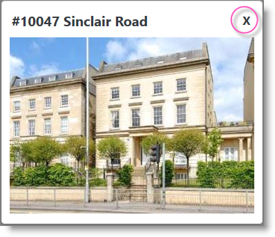
As you can see in the example above, Popup Panels include a
Title Bar, where the element's Caption attribute value
appears, and an optional"Close Button" that appears at the
right end of the title bar.

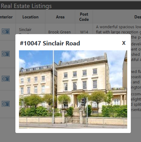
Panels can either be displayed as Modal or non-Modal. A Modal window is one that requires users to interact with it before they can return to using the application. As shown above, when a Modal panel is displayed, the underlying page is disabled and shaded until the panel is closed.
The Popup Panel uses its own style classes to set colors, font sizes, spacing and other presentation values. These can be overridden by adding classes with the same names to your own style sheet. The panel's style sheet is:
<application folder>/rdTemplate/rdPopup/rdPopupPanel.css
In order for the style class override effect to work, your style sheet must be named in a Style Sheet element that is lower in your report definition's element tree than the Popup Panel element.